comparison.のTwitterイラスト検索結果。 2,235 件中 10ページ目
Rework of Meta Knight from last week, old version shown for comparison.
#kirby #nintendo #smashbros
Good afternoon everyone. I was experimenting on another style of painting. What do you thing? I'll do my current style for comparison. #illustration #animation #commissionsopen #opencommission #opencommissions #animation2d #Animations #anime #Vtuber #streamer #DnD #animegirl
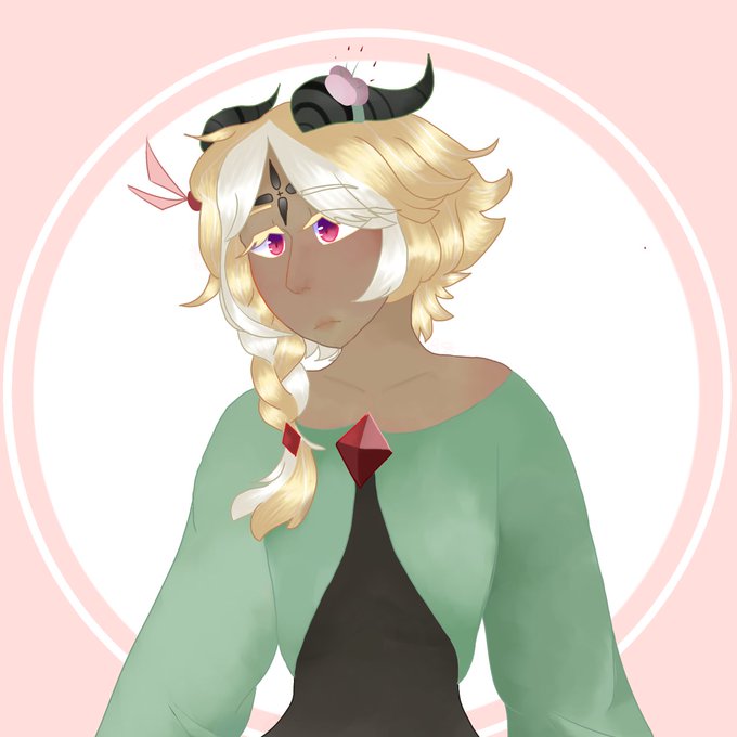
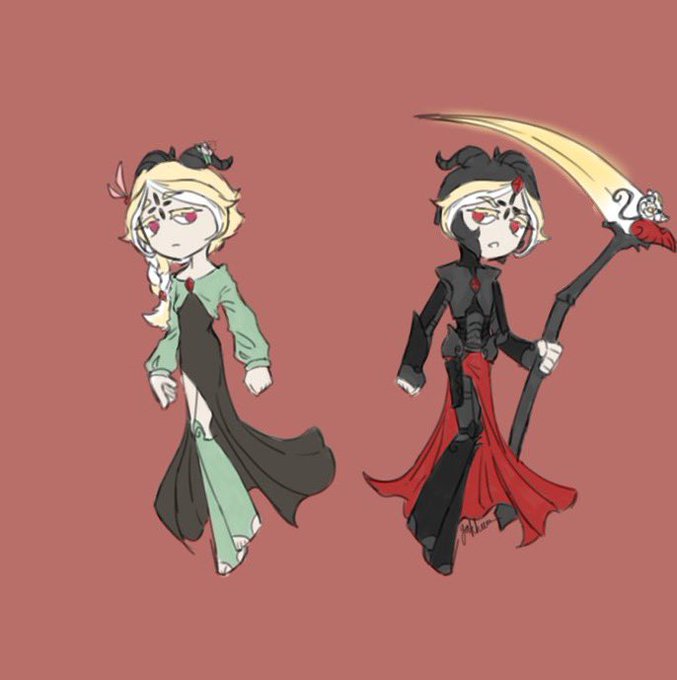
Here's my OC's Thirteen's "Blessed Eternal" form, and Scarlett's "Judgement Angel" form (needs new art lol). First image here is just their base forms for comparison.
Day 126!
This is Cover 2/7, I really like just how much Cecily and Carter got fixed in the #NovelAI version, the previous one felt way too messy in comparison.
Left is DALLE-2, right is NovelAI
✨New Art Alert!✨
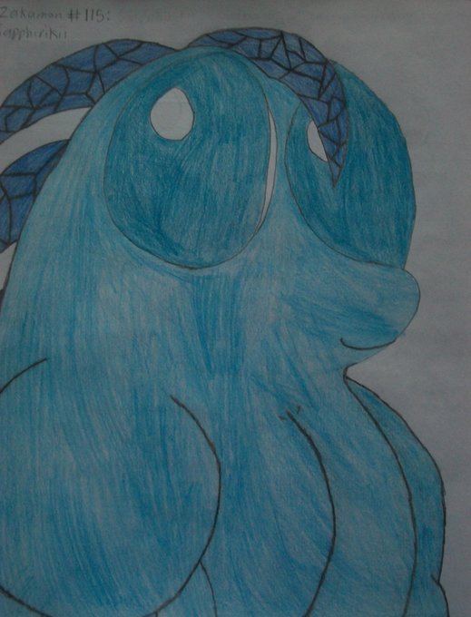
Here it is! My first official design remake: The gemstone/fighting type Sapphirikii. And I've got the old one from 2012 on the left for comparison.
Safe to say that this is quite the improvement! 🤯
SO @LocalViolet started playing Bugsnax for the first time recently and we collabed on making a little grumpsona for them.. I had so much fun w it i decided to revamp my own guy Roofle!! +bonus height comparison.. Grumpuses are so fun to draw heehee #Bugsnax
Randomly decided to draw one of @ArtistEclipse dragon chars and then drew one of mine in comparison. he definitely big
#arttwt #artmoots #ArtistOnTwitter
Was trying to explain the triangle between Namor, Sue, and Reed to my wife who came up with this comparison. I immediately had to draw it. [by Joba_Fett]
#comics #comicbooks
Was trying to explain the triangle between Namor, Sue, and Reed to my wife who came up with this comparison. I immediately had to draw it because it fits almost too well. [by Joba_Fett]
#comicbook #art
@_nymphlover @drawingllamas Thank youuu! Yeah I switched to digital in 2020 and the first year was CRAZY.
This is my jump from 2021 to 2022 😁
It's not the same character but they're quite similar pieces so perfect for comparison.
“ Maiden of the Garden “
First commission for a small follower celebration is complete!
This piece was requested by @Yakkuo_13 ! Thank you so much for your support.
Side by side comparison. Left is mine!
-
-
#whitelilycookie #crkfanart #crk #crkartists #cookierun
this is a fun comparison. blorbos in horny energies on white backgrounds with their names in print, Not Intentional. genji is from 2020
Hi, since some of us know that the very harsh vague tweet from @IllyXIV about a sculpt, was about my Monique for Miqo, I can now make this post. It has came to my attention that she is also in possession of my Tomie sculpt when she has NOT paid for it. Pics for comparison. cont>>


