CONTRASTのTwitterイラスト検索結果。 91ページ目


Warm contrasts with Cold.
Finaly !!After all this work this looks amazing !It's just the looking judgmental (boyfriends)wearing wacky clothes :D
#jjba #jjbafanart #giornogiovanna #panacottafugo


Bubbles 🫧
I loved the extreme contrast between their personalities, Bubbles can hit hard and I seriously love that about her 💖
More info on Insta ✨
#art #cartoonart #cartoonnetwork #comicartwork #comicartist #magicalgirl #powerpuffgirls #bubbles #retrocartoons #cute✨🫧


My new personal dark and gloomy collection of illustrations is done 🌙
I made a ton of sketches, and it’s 9 artworks in final.
The idea was to keep it b&w, to work with contrasts mainly and convey the atmosphere of H.P. Lovecraft’s creepy stories. 🖤
#darkart #lovecraft


Watercolor #painting of the dramatic #storm sky, titled "Sky No. 6'" (30 x 40,8 cm, 2017). I just love those contrasting colors!
You can find the original watercolor and signed art prints of it here:
https://t.co/BO4WBAbZvy
https://t.co/cSVqObeDlM


I was a bit off with the contrast on this painting previously, and i just noticed i forgot to undo some contrast and brightness changes i did to my drawing tablet.
Turns out adding some more contrast REALLY helps this painting pop out more....
Welp, too late now lol https://t.co/heZI7IPD4K

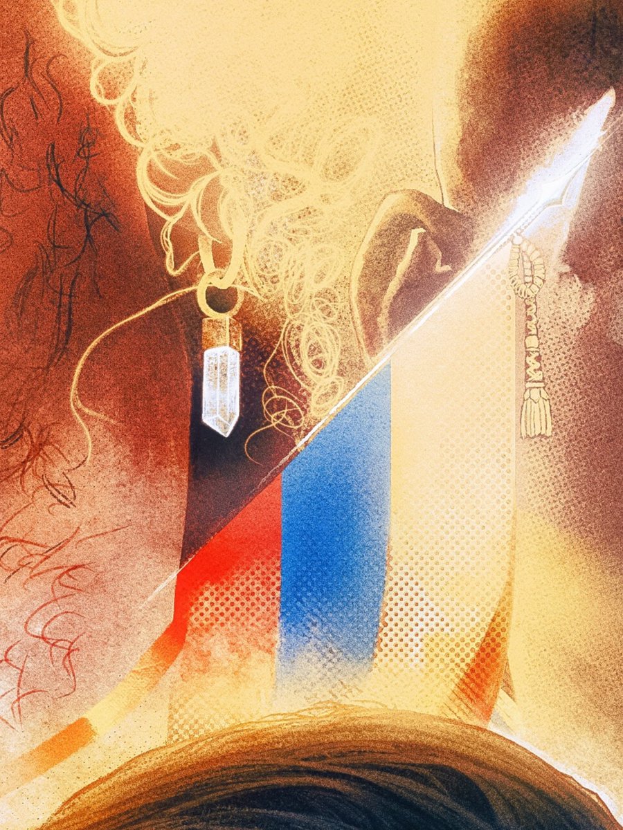
Don't mind me just posting an insanely zoomed crop of a process test to just establish that me obsessively losing my mind for weeks had a point, and the contrast between fully rendered & half finished elements proves it was all worth it.


Punched up the contrast a tad.
Coloring can look different going from Photoshop to social media lol.


@thepropgallery These pieces are from my "Memories" collection, where I portray places I used to visit in my hometown, thinking about how to show my art to the world... The chaos of that city contrasting with the natural beauty of its landscapes... I hope u can see some potencial here!


With the flat parts in mind, I tried to use it in different parts on my painting. I have already used a lot of purple in different Synergy paintings, so I needed to find something that would stand out. For this one I tried to use the brown/orange as a strong contrast color.
4/8


In the Mood for Love character study. I wanted to practice contrast through grayscale.
#art #artist #characterart #characterdesign #photostudy #procreate #illustration


Her <3
I like the contrast of the bg :D
-
#OCart #OC #digitalart #art

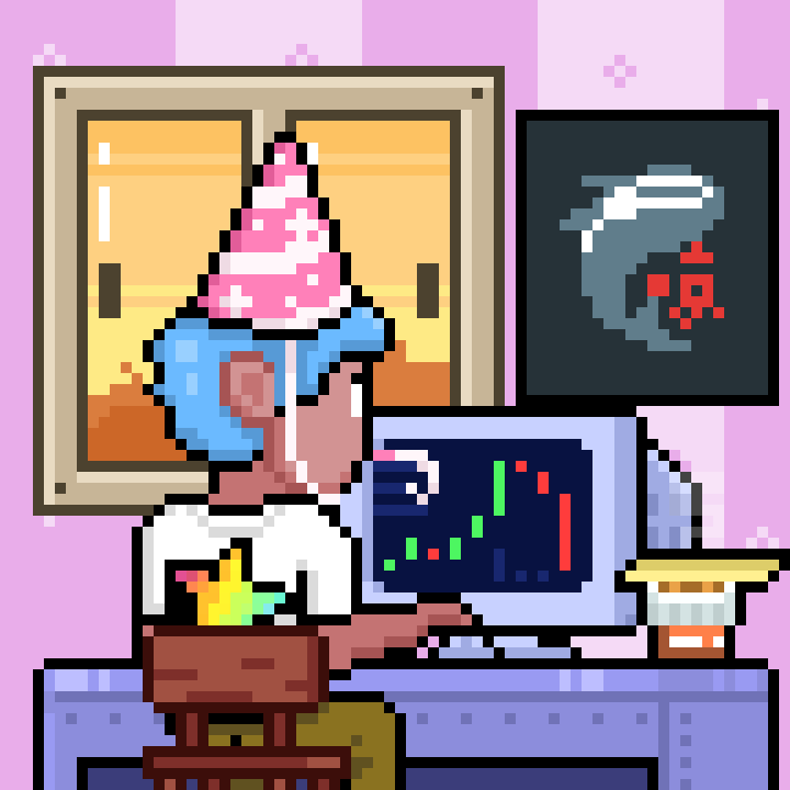
@skrillaaaaaaaaa @Gelotto2 Contrasting charts in happy hats lol.
i am very happy🥳🥳
And you can earn $Loop by staking @TradooorsNFT ! @skrillaaaaaaaaa Thank you!



Figured I'd make her brother Zan too cause why not lol. Also shows the contrast in their personalities.


@Scazrelet Thanks for the art share! A fun fact about my process is that I do a majority of my work in Procreate because I like the simplified layout. Then I’ll sometimes move over to CSP to do very minor final touches like upping the contrast.


@AugustZol Wow your Stunning! I see it not really your thing @AugustZol but you are literately walking on a gold mine as a redhead with very fair skin. Redheads have this reputation in the foot fetish world of having Pink Rosie Soles and that contrast makes you magnetic.