ContrastのTwitterイラスト検索結果。 91ページ目


Next up is my Durian Plate, which is clearly a play on Judy Chicago’s Dinner Party, particularly the Mary Wollsonecraft plate. I highlighted the contrasting spiky exterior with a softer interior to depict the complex nature of this deeply misunderstood fruit.


Warm contrasts with Cold.
Finaly !!After all this work this looks amazing !It's just the looking judgmental (boyfriends)wearing wacky clothes :D
#jjba #jjbafanart #giornogiovanna #panacottafugo


Bubbles 🫧
I loved the extreme contrast between their personalities, Bubbles can hit hard and I seriously love that about her 💖
More info on Insta ✨
#art #cartoonart #cartoonnetwork #comicartwork #comicartist #magicalgirl #powerpuffgirls #bubbles #retrocartoons #cute✨🫧


My new personal dark and gloomy collection of illustrations is done 🌙
I made a ton of sketches, and it’s 9 artworks in final.
The idea was to keep it b&w, to work with contrasts mainly and convey the atmosphere of H.P. Lovecraft’s creepy stories. 🖤
#darkart #lovecraft


Watercolor #painting of the dramatic #storm sky, titled "Sky No. 6'" (30 x 40,8 cm, 2017). I just love those contrasting colors!
You can find the original watercolor and signed art prints of it here:
https://t.co/BO4WBAbZvy
https://t.co/cSVqObeDlM


I was a bit off with the contrast on this painting previously, and i just noticed i forgot to undo some contrast and brightness changes i did to my drawing tablet.
Turns out adding some more contrast REALLY helps this painting pop out more....
Welp, too late now lol https://t.co/heZI7IPD4K

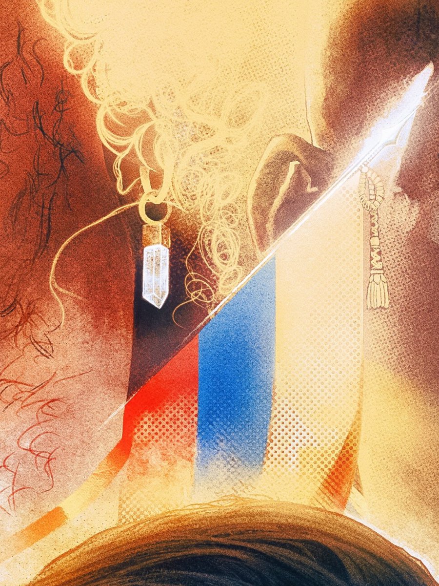
Don't mind me just posting an insanely zoomed crop of a process test to just establish that me obsessively losing my mind for weeks had a point, and the contrast between fully rendered & half finished elements proves it was all worth it.


Punched up the contrast a tad.
Coloring can look different going from Photoshop to social media lol.


@thepropgallery These pieces are from my "Memories" collection, where I portray places I used to visit in my hometown, thinking about how to show my art to the world... The chaos of that city contrasting with the natural beauty of its landscapes... I hope u can see some potencial here!


With the flat parts in mind, I tried to use it in different parts on my painting. I have already used a lot of purple in different Synergy paintings, so I needed to find something that would stand out. For this one I tried to use the brown/orange as a strong contrast color.
4/8


In the Mood for Love character study. I wanted to practice contrast through grayscale.
#art #artist #characterart #characterdesign #photostudy #procreate #illustration


Her <3
I like the contrast of the bg :D
-
#OCart #OC #digitalart #art

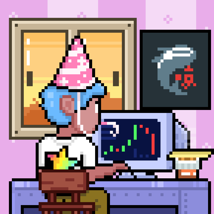
@skrillaaaaaaaaa @Gelotto2 Contrasting charts in happy hats lol.
i am very happy🥳🥳
And you can earn $Loop by staking @TradooorsNFT ! @skrillaaaaaaaaa Thank you!



Figured I'd make her brother Zan too cause why not lol. Also shows the contrast in their personalities.


@Scazrelet Thanks for the art share! A fun fact about my process is that I do a majority of my work in Procreate because I like the simplified layout. Then I’ll sometimes move over to CSP to do very minor final touches like upping the contrast.