ContrasのTwitterイラスト検索結果。 10,818 件中 93ページ目

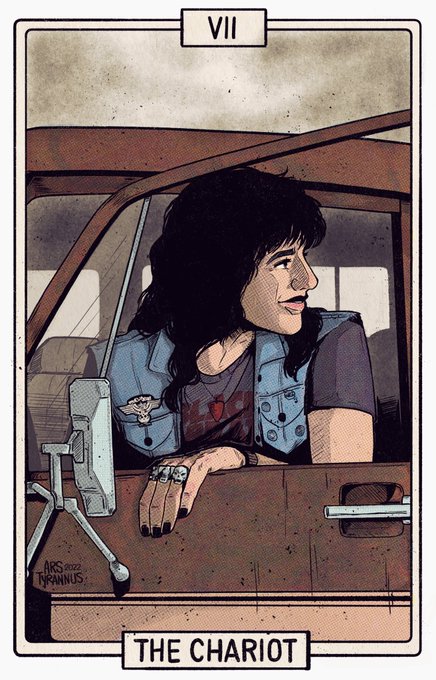
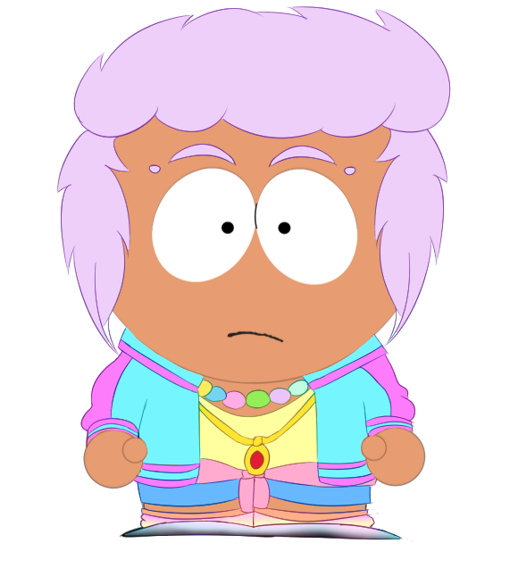
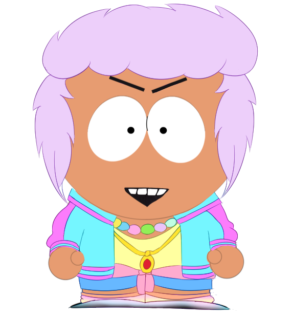
Re-inked some of the chariot- it needed more contrast!
I’ve got 2 or 3 more planned and then I can rest

@scornhex’s work speaks to us of the character & past stories we’ve come to love with this art form.
As he continues to toy with contrasting styles, we're just beginning to witness the creative flair hatching from his mind.
For everything @scornhex:
https://t.co/HEpIbUW0ZO


the parallels between them 3 amaze me, 3 of my favorite characters, 3 girls who share so many things in their stories…
i always talk about how similar Morgana and Hitagi are, but Nadeko completes a wonderful triangle of contrasts and nuances 🦋🤍


Kinda like this contrast
Both from this year so idk if it’s necessarily an “improvement” but it’s a nice comparison all the same https://t.co/s7AqD155uq


This Beast panel is gonna be a perfect contrast with this future Fifteen manga one,from "You have to obey" to "I set you free"


Next up is my Durian Plate, which is clearly a play on Judy Chicago’s Dinner Party, particularly the Mary Wollsonecraft plate. I highlighted the contrasting spiky exterior with a softer interior to depict the complex nature of this deeply misunderstood fruit.


Warm contrasts with Cold.
Finaly !!After all this work this looks amazing !It's just the looking judgmental (boyfriends)wearing wacky clothes :D
#jjba #jjbafanart #giornogiovanna #panacottafugo


Bubbles 🫧
I loved the extreme contrast between their personalities, Bubbles can hit hard and I seriously love that about her 💖
More info on Insta ✨
#art #cartoonart #cartoonnetwork #comicartwork #comicartist #magicalgirl #powerpuffgirls #bubbles #retrocartoons #cute✨🫧


My new personal dark and gloomy collection of illustrations is done 🌙
I made a ton of sketches, and it’s 9 artworks in final.
The idea was to keep it b&w, to work with contrasts mainly and convey the atmosphere of H.P. Lovecraft’s creepy stories. 🖤
#darkart #lovecraft


Watercolor #painting of the dramatic #storm sky, titled "Sky No. 6'" (30 x 40,8 cm, 2017). I just love those contrasting colors!
You can find the original watercolor and signed art prints of it here:
https://t.co/BO4WBAbZvy
https://t.co/cSVqObeDlM


I was a bit off with the contrast on this painting previously, and i just noticed i forgot to undo some contrast and brightness changes i did to my drawing tablet.
Turns out adding some more contrast REALLY helps this painting pop out more....
Welp, too late now lol https://t.co/heZI7IPD4K


Don't mind me just posting an insanely zoomed crop of a process test to just establish that me obsessively losing my mind for weeks had a point, and the contrast between fully rendered & half finished elements proves it was all worth it.


Punched up the contrast a tad.
Coloring can look different going from Photoshop to social media lol.


@thepropgallery These pieces are from my "Memories" collection, where I portray places I used to visit in my hometown, thinking about how to show my art to the world... The chaos of that city contrasting with the natural beauty of its landscapes... I hope u can see some potencial here!


PNG!!!!! PNG!!!!
olvide mi contraseña de discord y quiero ponerme este png!!!! XDD