ContrastのTwitterイラスト検索結果。 10,555 件中 94ページ目


This was the year my friend Klume inspired me to pick up digital painting and well I haven’t stopped. This was one of the first pieces where I realized: Oh shit contrast in art is sexy and now I can’t stop. Plus this piece is blue. I like it


Y usar ropa bonita, sinceramente me hubiera gustado que Heewon se hubiera ido por el lado Narumi Sena tipo "me gusta la ropa bonita y el maquillaje pero no es todo lo que soy" y se hubiera creado un contraste con la prota pero mostrando que ambas son válidas.


i'm always looking for people with interesting contrasts -- very skinny frames with super baggy clothes, or this guy on the right with a beard the likes of which i've never seen and i'm not convinced i did justice


⚜️Dance Of Sorrow
💠 This painting depicts the contrast between joy of dancing and sadness of the soul💃
🔺In this sad world, dancing frees the human soul from the attachments and sorrows of the world
.
Reserve 0.14 $ETH
.
📌Link https://t.co/cS1Amw83d6
#nft #animation


Collected "tattoo" by @thierry_tillier
Fascinated by the juxtaposition of both vintage and modern imagery and beauty, in harmonious contrast.
#collage #collageart #nftarti̇st #tezos


the Forth Rail bridge was built in 1889 and soon after that the phrase ‘Painting the Forth Bridge’ was coined as a colloquial expression for a never ending task… by contrast I have only been painting for nigh on 15 years
Forth RailBridge (continued)
oil on panel ca.2008-22


@the_real_mr_tut Thanks for the words Ser!🙏
The colors are even more contrasting because of the textures that give the focus to some parts of the art✨
Enjoy the day Ser!☀️


Hunter J is one of my favorite characters in the history of the Pokémon anime. Her cruelty set her apart as one of the most antagonistic people in the Pokémon world, which is such a contrast from what we are used to seeing. #anipoke


I’ve been trying to boost arty knowledge a bit and try things out, this is actually a colour piece but been using a black/white gradient map to gauge the contrast and tone. Was really interesting :3


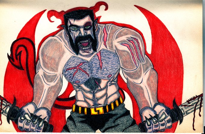
@beigriff Hello, I'm WolfPrime666. Traditional artist, something that I love when I add color to my art is the saturation, to made contrast to some details. I use a lot Black and red most of it, but sometimes I use variety to change a bit the peace.🥺🥺🥺🥺💞💞💞🔥🔥🔥

📷Arrived, acrylic and oil on linen 2022
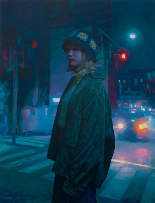
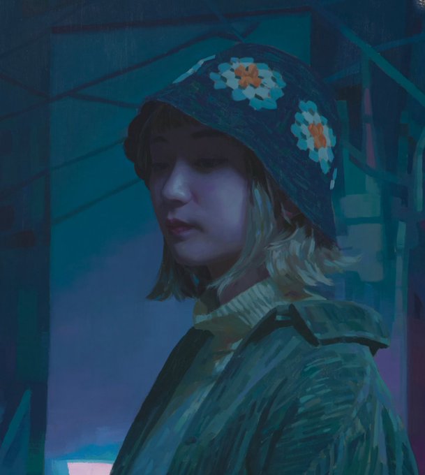
Keita Morimoto "Contrasting Memories"
Sep 10 - Oct 1, 2022
Opening Reception: Saturday, Sep 10, 1 - 3pm
@MetivierGallery


#pikart Pikamee meeting Kson in minecraft was a pretty touching moment :)
(no background in too because like the contrast xD)


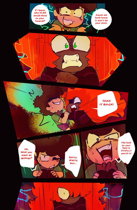
the contrast in color and energy in these two panels means a lot to me. I hope I can convey that. Thank you for reading


@beigriff Hi!! 🖤✨️ i'm Vil, enby latino & B&W illustrator of dark art and ocs 🦇✨️ what i love about my work the most is how much contrast i'm able to pull off using b&w only 😳


Glenise's piece is perfect to inspire a colourful 2023 scheme!
Pearlescent contrasts!
#australianart by #gleniseclelland
#interiordesign #2023trends #adesignexcursion


Okay I am a bit obsessed with using a black/white gradient map to check that I’m getting tonal and contrast things right. There are prob still things a bit wrong here but I am *learning*, and I’m actually having a LOT of fun with this >.>


My favorite design tip that helped me a lot with full color work was learning to take out the saturation so it's more clear what the contrast is between each color. Also, I'm working on a thing 🌲🌞🌲


When you just KNOW you’re going to be late for school…
A little sketch for #colour_collective #beaublue & #deepmahogany, based on a vintage photo - if you want to see the original to compare and contrast, I’ll pop it over on IG. 💜
#sketch #kidlitart