comparison.のTwitterイラスト検索結果。 2,015 件中 94ページ目


Redoing the lineage chart for my OCs and of course we gotta start with Tits McGee.
With this 2015 version for comparison.


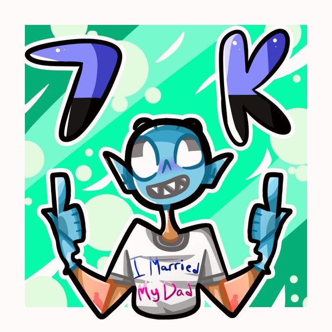


@halkione That is very true. The point where I fail at that is when I compare what I currently work on with a recent piece and feel like nobody would even want to see something that looks so low effort in comparison. I gotta just force myself to make more somehow to overcome that. l:


I'm amused about the transformation of that hellpuppy pic I made (full traditional, watercolor) over the course of yesterday. Here's a side-by-side comparison. They're so different in each stage! ✨Please rt! ✨
#art #artist #watercolor #hellhound #beast #ink #traditionalart


Illustration of Mario as the referee from Punch-Out on the NES, from the Swedish Nintendomagasinet magazine. The original sprite is provided for comparison.


As Voted by you! a Redo of one of last years inktobers :) Old one in comments below for comparison.
*-(Rt's, critique appreciated!)-*
Like my art? consider supporting me on https://t.co/sO2H2FBbjO
or donating to https://t.co/REaTyYjepq


Did a digital version of the last piece. A lil side by side comparison. Which is your fave? #cartooning #clipstudiopaint #copicmarkers


[I11] | [TRYPO?]
ART PROGRESS COMPARISON.
2018 DRAWING DONE IN ~30 MINS.


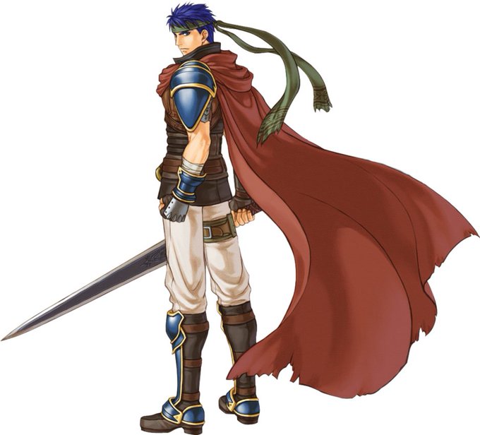
@Hamada_520 Not sure where else to put it so I guess I'll add it here:
I think Radiant Dawn Ike has a better 3D model but for whatever reason I just LOVE the official Path of Radiance art in comparison.



Side-by-side comparison. A lot better shape in the face and th eyes are not fucked anymore, some minor changes too.

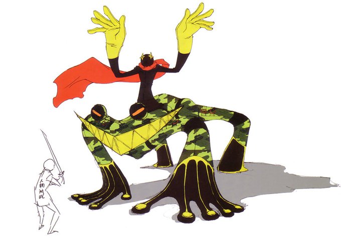


Have you guys heard of... Size comparison... Yu Narukami ...


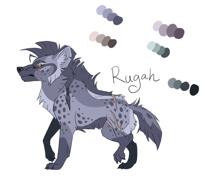

I wasn't satisfied with Rugah's design, so I tried some over color pallets and markings. Ended up deciding on cool de-saturated colors. She is Feyn's antagonist and he is more saturated warm colors now, so I think this is better.
The comparison.




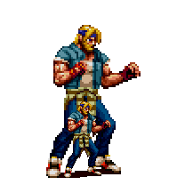
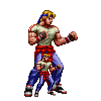
Gave it my all, I actually have a version of SoR4 axel without the jacket with a muscle shirt that I kind of like more (the power of layers) but here it is! Mania Axel for comparison. #StreetsofRage4 #BareKnuckleIV #AxelStone #Sega #BeatEmUp #Pixelart #Mania


@omiza_somi @Chizzynooo I'm in awe, jesus that's amazing even for the 10 seconds one
This took me an hour or so in comparison...


2018 and 2012 comparison. So much improvement from @SpookieLee_
I recommend her work, this was a very quick piece done today. Again if you like the things I post RT and Follow me for more. Like and comments are always welcome too. Thanks everyone! 💞


Did this as a redraw of an image from a year or so ago. Original included for comparison.