DefaultのTwitterイラスト検索結果。 9,824 件中 95ページ目

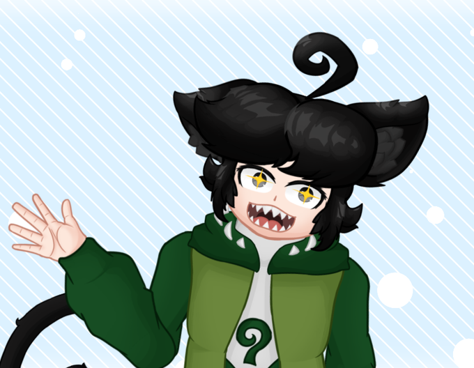
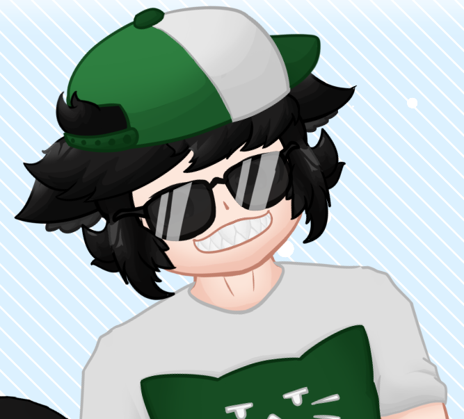
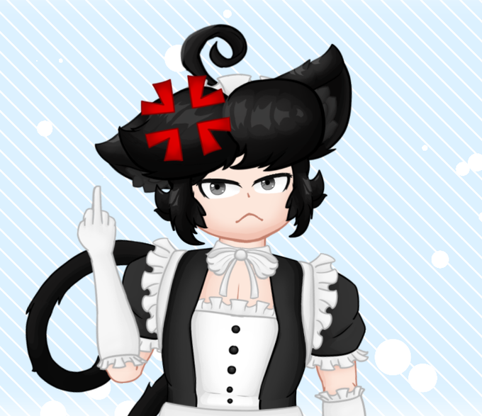
Aha! I finally lingered with a model style for long enough to have 2 alternative outfits!
Here we have:
-Geo18 [Default]
-Geo18S [Summer]
-Geo18M [Maid]
(it sounds a lot like a size classification i know)
#VTuberEN #ENVtuber #Vtuber #VtubersUprising #Live2D


6/30
i drew this on a whim pls have mercy idk how to draw space (also the default stars brush on csp kinda meh)
here is close up c:


girlfriend who installed herself on your computer and offers you free vpn and safe web browsing and ip protection and asks to become your default web browser and shows up on windows startup don't uninstall she's benign we swear :) ☸


i'm also a fan of the new stylize argument. here, i used --s 2000 (down from the default, 2500) as I had a specific image in my mind to chase. however, when sketching/forming a prompt i've generally been cranking it up (~4000->25000) just to see what the ai dreams up on its own.


Disguised Baterra shifting back into their default forms, https://t.co/dBa25UexYA #Bionicle

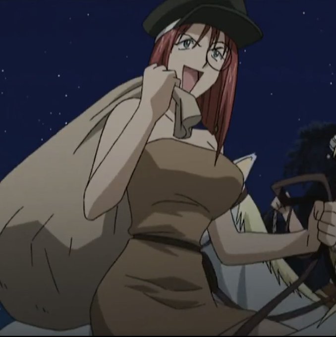
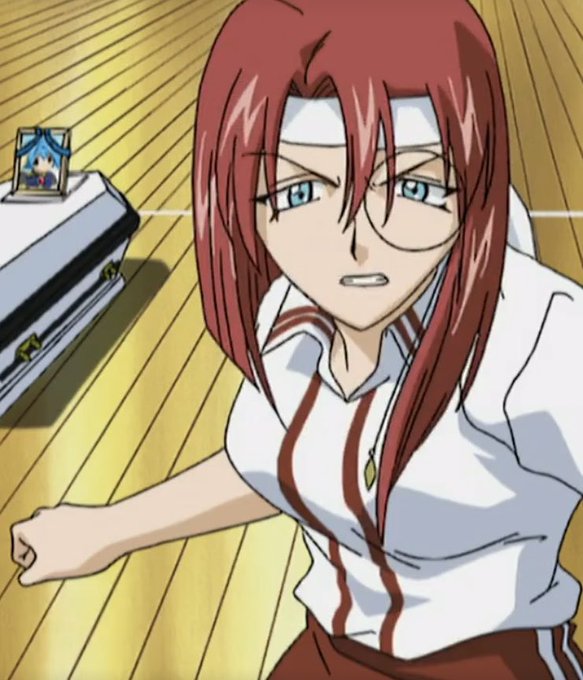
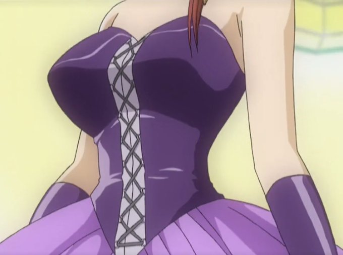
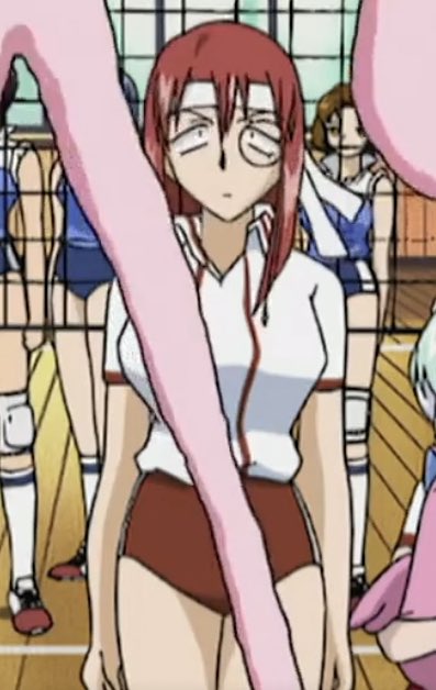
Outfits that show off her body more than her default outfit>>>>>>


these 2 have become my default profile pictures when i don't know what to use lmao


There’s a current Glitch in Pokémon Masters where some characters are stuck with a straight face default expression.


finally finished!!✨🥺
‘the artist and the critic’
brushes:
basic round (default)
graphite
watercolor wash, soft


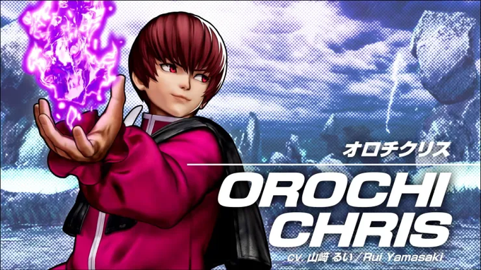
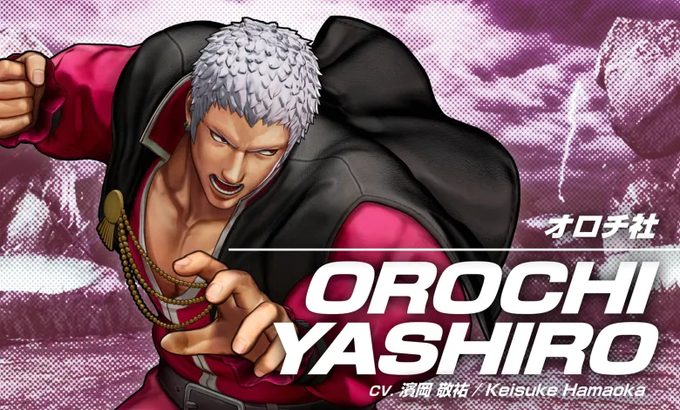
Team Awakened Orochi's default outfit is based on one of their ending illustrations from The King of Fighters '98.


@SNKPofficial Too bad they don't have dark skin like in KOF 2002 for their default :(
Nona's artwork of them is still one of my favorites.
I like his artstyle.


Anyway, about the extending neck thing. Midjourney's default aspect ratio is 1:1. It's pretty good with wider ARs, too. But tall images sometimes look like the machine tried to fill up the space by doubling the image. So I tried 3:4 and 1:1. Why did these turn out so creepy???


Enough grayscale, though! Let's try some color stuff. Left: "color". Right: "colorful". Unsurprisingly, both are brighter and more stylized than the default Obamas, and "colorful" moreso than just "color". Top-left Obama is acting weird again.


That "::1" bit defines the weight or importance of the term (1 being the default), "--ar 2:3" is the aspect ratio, and "--seed 1" sets the seed for the generator so that I can get more consistent results. Running the same prompt again produces ALMOST identical Obamas.