DifferencesのTwitterイラスト検索結果。 5,382 件中 95ページ目


Today, the 9th, was the first day I posted art of Ulner, one year ago.
The differences between Jan 9 2021 and today is huge and I'm so proud of myself for making this journey
I mean, see for yourself like damn gurl she got identity


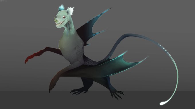
Got around to finishing the remake of my bat monster, now including a male variant! (Smaller bat)
I've also decided on a name for them with the help of my Discord friends, Siren Bats. The old art is also attached to show the differences! c:


the saturation slider is an indiscriminate beast with no regard for the inherent brightness differences between colors, eg fully-saturated yellows and blues are different brightnesses. if you put a filled black Color layer over your image it'll show you the "true" greyscale.
eg:


i always gotta check the sub for these differences in otogi's dialogue oml https://t.co/IJJJLiPq4n


I learned that for illustrations, I should use less lineart and emphasize shape and forms through shading and highlights (color differences I think). I learned that decals make things look cooler. And I learned some funky detail-up shapes (rivets, bolts, screws, etc).


《day 7》 Running out of ideas...food's been low ever since the 2nd...I don't know how long I'll last...
here's the OMORI drawing... #OMORI #OMORIFANART #digitalart #DigitalArtist
height differences


@M0N0CHR0MEL0VER Like an alternate world or something? I mean even we have differences as well. Strange how it is, but cool

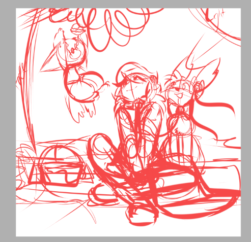


@MeabotVT And here's a fun alt version - can you spot the differences?





Then vs now
Their design has hardly changed but I think the subtle differences make a massive improvement!


X-Force (2019) #23
Mikhail Rasputin’s plots against Krakoa multiply. Writer Benjamin Percy, Artist Martin Coccolo, Colorist Guru-eFX: Percy is doing some remarkable work on the the differences and the parallel operational philosophies of Rasputin and McCoy. 4/5


So, KLONOA NEWS! (Kinda?)
Props to @mushroom32x for spotting this.
Bandai Namco's Spot the Difference game, QuickSpot has been localised and released out of nowhere: https://t.co/7Fio6488W8
QuickSpot has quite a bit of Klonoa art to spot differences in, some of which include:


Every King of Fighters Saga has deeper meaning:
The Rugal Saga: The power of friendship can conquer evil
The Orochi Saga: Mankind can put aside their differences in times of crisis
The NESTS Saga: We are the ones in control of our own destiny
The Ash Saga: Don’t trust femboys


Good morning! Today's “Onsen Nyanko” is “Nyan and ducks taking a bath”!
On Thursday. It seems that children are basically from elementary school to men's and women's baths. (There are differences depending on the region) I wish you the lucky ☆ of Nyanko today! Please enjoy it.

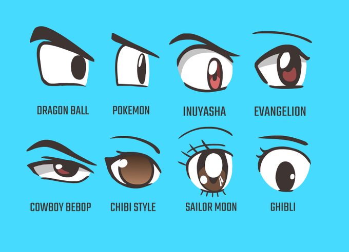
I made this for someone to showcase the differences between eyes in some of my favorite anime, just wanted to share it with you guys, cause why not I guess! ^^


Drawing Once a Day in 2022, Pokémon 369: Relicanth
((Shiny, gender differences))
They look like a grandma fish and a grandpa fishing going on a morning stroll
#relicanth #PokemonGo #Pokemon #shinypokemon #pokemon #Dailydrawing #DrawDaily #shiny #DailyDrawingChallenge


Corporate needs you to find the differences
between this picture and this picture

