differencesのTwitterイラスト検索結果。 5,397 件中 95ページ目


BABBY NOOR-KIDS DOODLE
I just think these dweebs woulda made good friends as kids. 😭
(Also this doesn't perfectly align with their age differences in canon please ignore that OOPS)


#FantasyIndiesJanuary 10. Pets in WIP
Rascal is Celine’s pet/familiar. He’s a kitsper—a creature born out of the merging of the magical and ordinary worlds. As you can see, he’s a bit like a cat…with some notable differences. He’s a fav.
Art by @stratosmacca
@FantasyIndies


Halfling Bards for @CriticalCoreRPG @GametoGrow I enjoyed the opportunity to rehash old concepts with new spin-offs. We wanted to keep the same rockstar androgynous flare for the Halflings. To keep it fresh, I was thinking about differences between a town bard vs a city bard.


We really like heartbreaking SF drama A Radical Shift of Gravity. No rights or wrongs, just differences of opinion. "a terribly moving story with humanity at its heart". @NickTapalansky @katiecrimespree @topshelfcomix
https://t.co/6kR55oqAEV


if you've been waiting for the PG version, it is NOW AVAILABLE. it looks a little different than the og version because of printer differences but it is quality vinyl ;D


Si a while back I did a drawing of dick and Barbara hanging out, and people seemed to think he was Damian, so here’s the robins I’ve drawn so far, just so y’all can se the differences, first one is dick, second one is Jason and third one is Damian, I haven’t done Tim or Steph yet



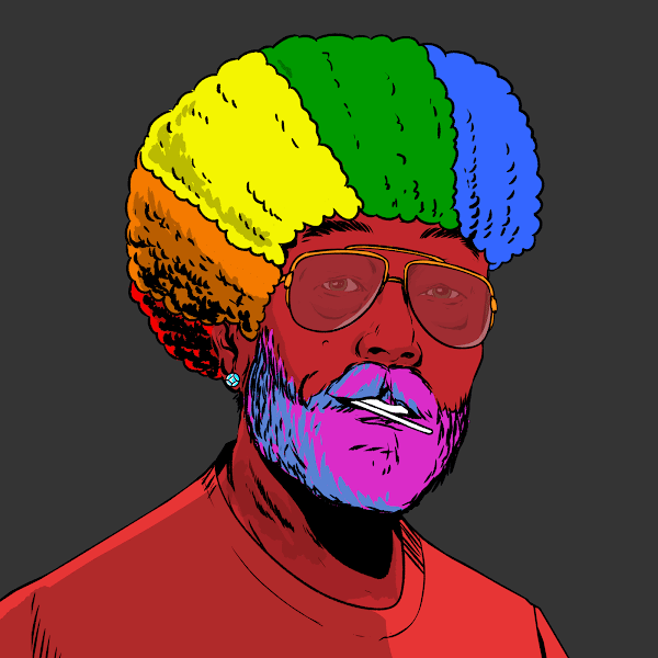
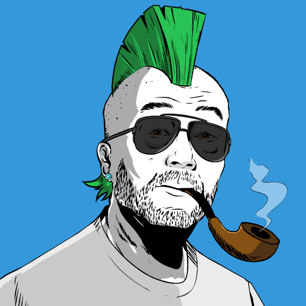
Strength lies in differences, not in similarities. This why there are so many different versions of @satoshibles. $Sats like #BTC is about inclusion, not exclusion
#WeAreSatoshi
Join us
https://t.co/gSYHxQCKVb
Sat Courtesy of @Hoss078 @Fex72805324 @poetlesstrodden @0xFrancisc


corporate needs you to find the differences between this picture and this picture


Today, the 9th, was the first day I posted art of Ulner, one year ago.
The differences between Jan 9 2021 and today is huge and I'm so proud of myself for making this journey
I mean, see for yourself like damn gurl she got identity


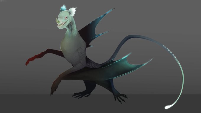
Got around to finishing the remake of my bat monster, now including a male variant! (Smaller bat)
I've also decided on a name for them with the help of my Discord friends, Siren Bats. The old art is also attached to show the differences! c:


the saturation slider is an indiscriminate beast with no regard for the inherent brightness differences between colors, eg fully-saturated yellows and blues are different brightnesses. if you put a filled black Color layer over your image it'll show you the "true" greyscale.
eg:


i always gotta check the sub for these differences in otogi's dialogue oml https://t.co/IJJJLiPq4n


I learned that for illustrations, I should use less lineart and emphasize shape and forms through shading and highlights (color differences I think). I learned that decals make things look cooler. And I learned some funky detail-up shapes (rivets, bolts, screws, etc).


《day 7》 Running out of ideas...food's been low ever since the 2nd...I don't know how long I'll last...
here's the OMORI drawing... #OMORI #OMORIFANART #digitalart #DigitalArtist
height differences


@M0N0CHR0MEL0VER Like an alternate world or something? I mean even we have differences as well. Strange how it is, but cool

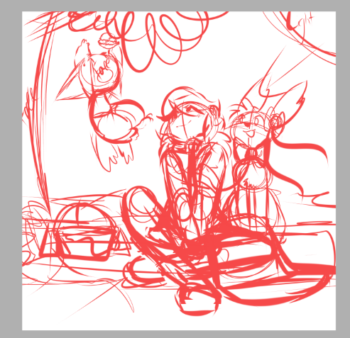


@MeabotVT And here's a fun alt version - can you spot the differences?





Then vs now
Their design has hardly changed but I think the subtle differences make a massive improvement!