GreysのTwitterイラスト検索結果。 96ページ目


@ManiacXVII with greyscale, you can color directly over it using the multiply layer mode. I coloured this in doing that.
https://t.co/MxNwnFKGwU


Greyscale WIP for first fruit of day
#art #workinprogress #blackandwhite


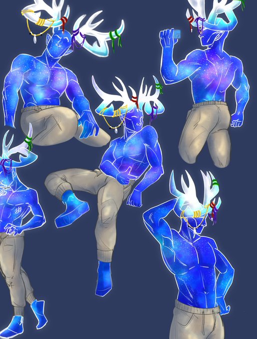
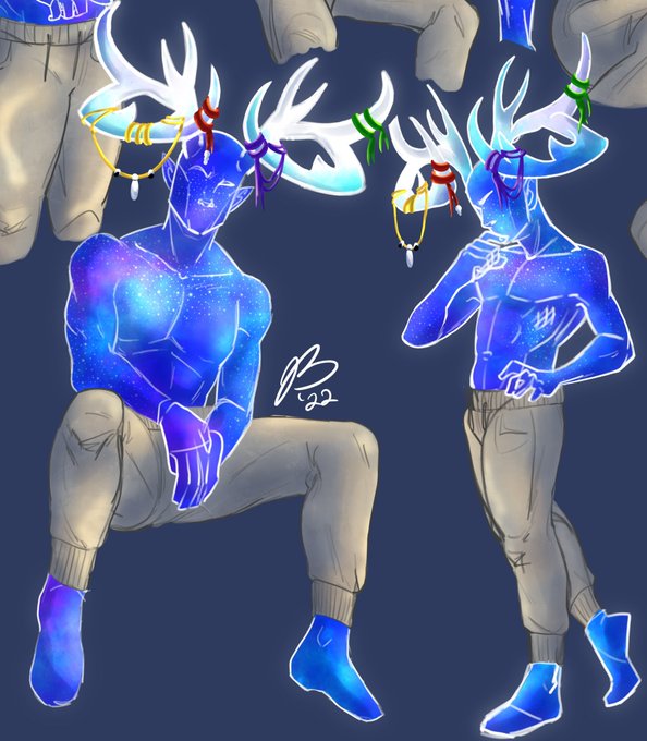
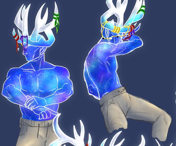

"Blergh"
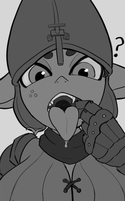
quick sketch request i did. tried greyscale for some reason
#shortstack #goblin



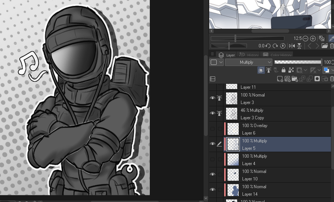

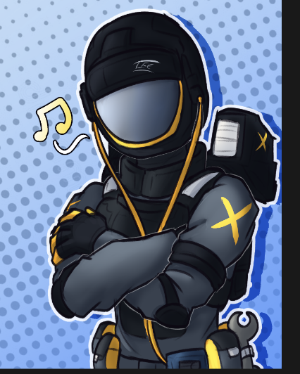
@P_Protocoll 4- using an desaturated blue, on a multiply layer i do the shading of the shadows and depth of clothes at best
4.5- and another one for the highlgihts as a overlay layer
5- from there i just delete the solid color layer and disable the greyscale gradient
and bam!
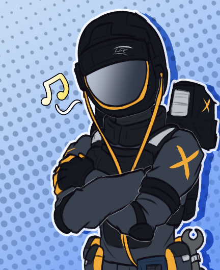
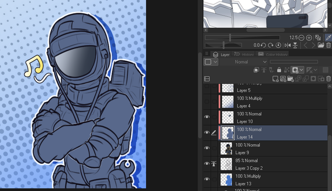

@P_Protocoll its kinda of a 50/50 sometimes, even tho im changing it a bit
recently i been using a bit of an tricky method but that i feel like it works better for my workflow
1-flat colors
2-make an new layer of an dark-ish color
3-make an greyscale gradiant to know the values more


Another lil something of Cyrus, I actually really enjoy doing these greyscale drawing and have added them to my comms list now.


NGL I'm a little stuck on the colour scheme. I don't want to stick to the usual greys associated with the AEM01 hoodies.
Also I have no idea why her hair colour turned black when I uploaded this.

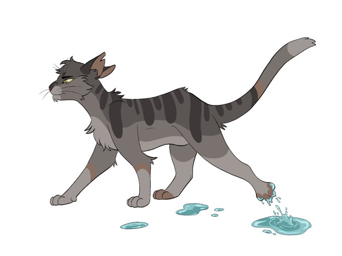


And a bunch of #warriorcats (Wetfoot, Nightstar, Greystripe and Mapleshade ) while where at it


My last drawing for this year. I tried drawing in greyscale and it´s interesting! I definetly have to work more on texture next year, but I think I like it.
Also I want to fancy up Rama´s design a bit

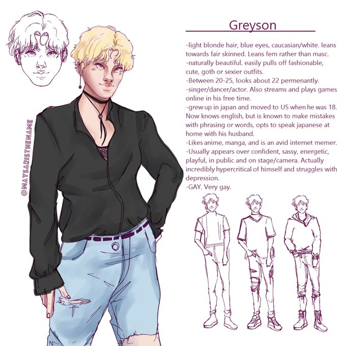
@Le_Dealter This is interesting 👀 my boy Greyson (he/him)?

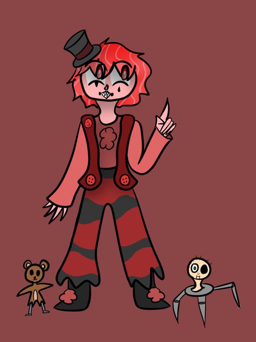
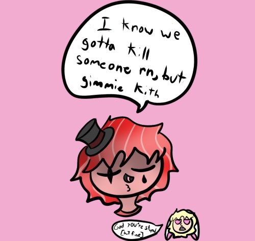
Today's clown of the day is @Wholesomelesbo's OC, Giggling Greyson AKA GG! He is a clown! 🤡🌈

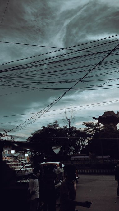




The nonbinary asexual of the day is Shuichi Saihara from Danganronpa V3 Killing Harmony! More specifically, he's greysexual!
he/it

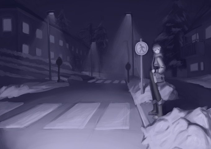
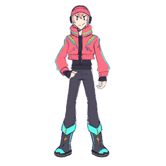
The greyscale and the outfit I designed for this drawing


Greysocks is a soft spoken bard with a big floof and a small meow. #catsoftwitter #dndart #dndcommission
*Commissions reopening in January 2022! ✌️