ContrastのTwitterイラスト検索結果。 10,512 件中 97ページ目


#NewNFTProfilePic Gotta show love to @steezyapegang the contrast on this guy 🔥

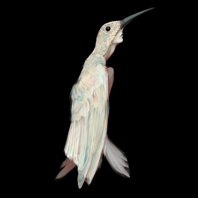

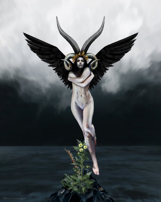

@KairaEridan Buenas, ya encontraste a alguien? Te dejo mi portafolio y contacto por si acaso,estoy disponible
mirenleyzaola@gmail.com
https://t.co/LPWiWhhi1i
https://t.co/3Gz2xmp4hW


purple fingertips? i think the purple in her design is just to contrast her yellow ink. as for the fingertip coloration itself: its something weve previously seen on octolings but not on inklings... perhaps with new cultural integration, inklings have learned how to as well?


Experimenting with blue for the wrist and ankle bands so he'll already be wearing most of his SS4 outfit before going SS4.
Looks better that way than I expected, though I might fiddle with making the tunic a different shade for contrast. Maybe venture into "turquoise" territory.


sorry shiver I did the red eye markings contrasting with the bright blue ink color first sorry!


@Itsana004 @aruanievents the colors, the contrast is showing in lines. It's not like that in og file.


In contrast, of course he's happy with Octavia! Holding her, playing with her and having fun, just as she is! Her outfit is cute too, she looks adorable in this one! It's probably the best of her painted portraits! She's even mimicking his pose, which is even cuter


Seeing what folks are calling "storyboards" is WILD. Every bit on that conversation is important because the contrast is, again, WILD.
I don't have a stake in the debate but THIS is a storyboard:


@jesterbonbon Going off your steampunk idea, I think it could be a fun retro theme to contrast w the futuristic theme and maybe Akari isn't up to date on all the latest trends yknow!



【VOCALOID4】The vocal synth of the hour is Kobayashi Matcha.
Matcha is a calm and collected girl who tends to hide her emotions, in contrast to her best friend Masaoka Azuki.
Originally released for VOCALOID2, her voicebank wasn’t public until her V4 release.


experimenting with some colors and [head in hands] the contrast is nicer compared to the blue one i made before, and he looks so worm im !!!!!!!!! aaaaa I'LL JUST GIVE ALL COLORS AND LET THE MAN HIMSELF DECIDE


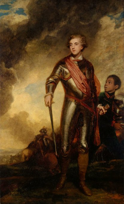
In contrast to her sister Lady Worsley (previous #ArtLovers), Jane Fleming enjoyed a happy marriage to Chas Stanhope, Earl of Harrington. They were an immensely popular couple throughout their long lives.
Lady H twice by Reynolds 1775 & 1779
Lord H “& servant” by Reynolds 1782


@beetlelunch Basically these are two drawings that already exist but I decided to make a mini montage to show the contrast of the two characters


Exploring her costume design, I inverted the spider to descend on its web. It felt more menacing, contrasting with the sporty pops of white.
Of course, drawing a spider-theme straight on is easy. Figuring out how it would wrap around her body in motion was a challenge!


@feltyninja hei! don't take it wrong way but I genuinely had hard time seeing it. cool design - Love it
did some contrast adjustments


Art is mine, but the draw is a copy Of Yamato from onepiece someone drew! I can’t remember the artist name, please tag them if you know! But this was an intriguing study in terms of style. It pushed me to concentrate on contrasting colors. Timelapse ⬇️ #ONEPIECEFILMRED

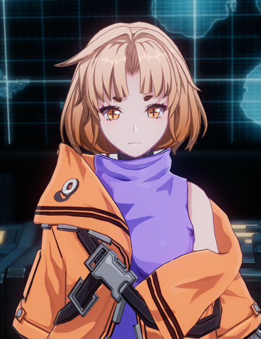
ALRIGHTY, this the look we're happy with? maybe i'll change the orange jacket for more contrast.... https://t.co/ckAaRxjcWI

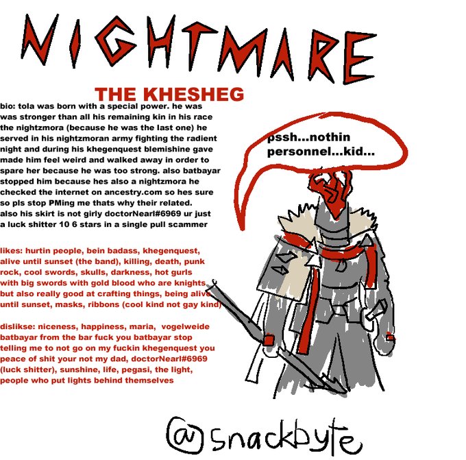


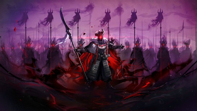
23. Nightmare Knight!
(ALSO MANIFESTING) Tola is a char. put in direct contrast with Maria. He forces himself to continue his fallen race's legacy, convinced this is the path to the end of his internal struggle. Both he and Blemishine learn from each other.
Also super cool.


Take a look at the #illustration developed as a part of the collaboration with the Tinloof agency on the EdgeTag project: it aims to reflect the nature of digital services boosting sales and marketing packed in stylish line art and bold color contrast.
https://t.co/Pngkr1btRj