SaturationのTwitterイラスト検索結果。 97ページ目

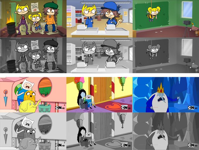
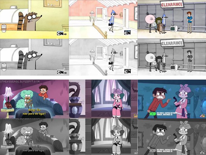
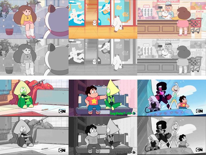
@thetomska @CrashZoomToon @Eddache_ Crash Zoom has a lot of dark, high saturation colors. It makes the show look darker over all, especially when you use those colors in the backgrounds.


Saturation might be a little too much or not enough idk which screen to trust but HERE HE IS HAPPY #BLACKWATCHGENJI MONTH🖤
#Overwatch #genji


redraw babey !!
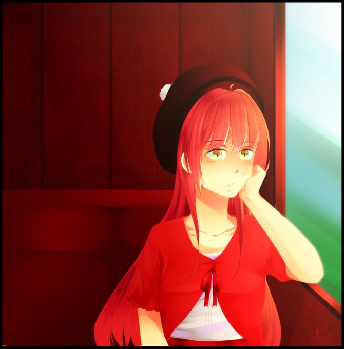
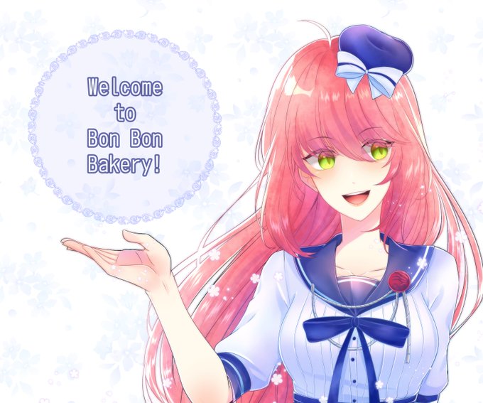
christ look at that colour saturation difference fantastic


2007 - i got my first tablet!! i draw fursonas only
2013 - few years back i got tired of lineart and got rly into painting. colour saturation level: all the way up baby!!!
2019 - this is what ive become


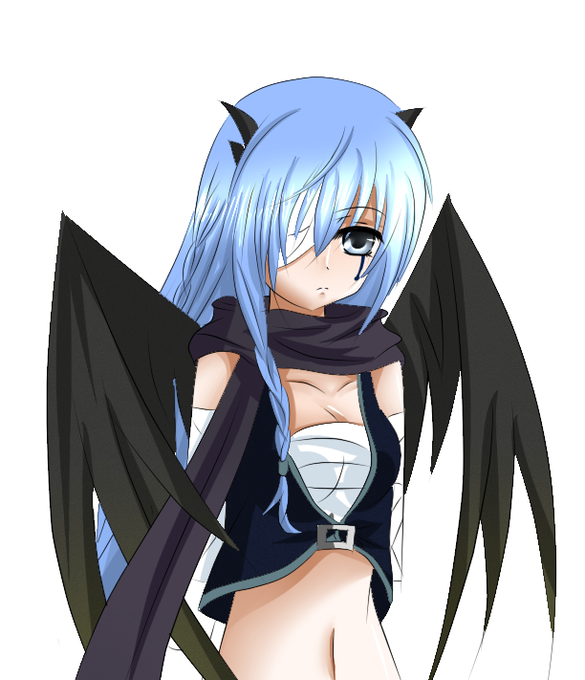


Flow WIP : Next step
I have taken yesterday's paintings and am creating differences in shapes, size, value and saturation.
I think the ocean one is closer than the other one to being realized
Let's see where these end up. Tomorrow is another day.

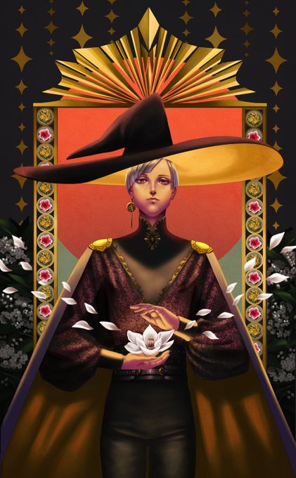
i'm pretty happy with this one. i learned a lot on visual hierarchy and i think i'm starting to understand how to play around with contrast in saturation more. / q \


another commission for @/muttchops on tumblr this time in my actual main style!
(i hope you dont mind the higher saturation but i couldnt help myself!) i also just realized the designs are flipped whoops


Currently working on a pallete based on my EBF weapons. I'll release it fr sometime soon~
Focus is on high-saturation and vibrant hues.
#pixelart


what has changed about the bandori style specifically over time:
-saturation has gone up! especially for hair/eye/skin color
-lighting is more bold and creates good contrast in the outfit
-the backgrounds have grown in complexity! they've gotten good at making the girl stand out


normal colors vs saturation because idk which is better
"i did this in the vr training"... ok baby #mgs


This one was hue! So I kept the saturation and value the same and changed the color :p


excuse me while i slightly fixed this pic, and cant decide whether i like it with more or less saturation


wanted to draw a dress based off of the rgb tv broadcast colors (of course, I toned down the saturation quite a bit to keep it from being too much of an eyesore.


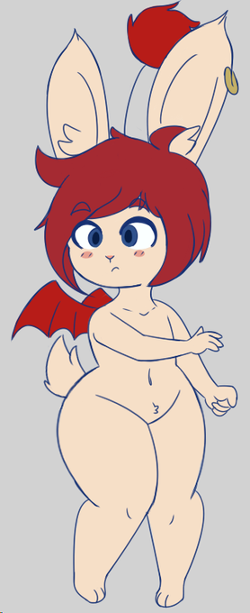

So I felt Erina's palette was too bland. She got a big saturation bump to really bring out the cream color she's supposed to be!