comparison.のTwitterイラスト検索結果。 97ページ目


delete later but...improvement..comparison...thingy?? hhfghhgg
(i mean its not a direct comparison bc no rose but they both have flowing hair in this one so)


Here's a comparison...Though the progress is glacial (haha)...I've definitely made some progress over these 6-ish years...This is the main character from 2011...Definitely improved. Though there are some elements from the older pictures I'd like to bring back...


Posting some more stuff from "Patches: The World's Cutest Zombie..." IN this case it is the most recent set of character models I've made...I should post the older versions as a comparison...


Comparison... I don't care I'd like to suck that shit~
#yiff #furry #furryporn #nsfw #furryart #furryfandom


All the other items on the list pailed in comparison.
https://t.co/UC0ata5FLv
#Lions #BucketList #goals #GoalSetting #Lion


Throwback Thursday - Digital Luna With Sketch
This is another one of my original characters, her name is Luna. I was really proud of this drawing back when I drew it in 2012. I have included the sketch for comparison.
#originalcharacter #luna #jtuesdays


@VixTheBirb Sorry it took so long and Is kinda bad in comparison. 😖
It was fun tho, Not sure how Kawaii it is. 😁


And here is the comparison.
#improvementmeme
Lol, every piece is done with different tools! 😆


Another example: Kyriena's rainbow wings look pretty bright and colorful, right? Guess what- the greens and blues are pretty desaturated here too. Here's her actual wing colors, and then her wings at full saturation for comparison.


Finished Devilman: Crybaby and I enjoyed it a lot. The new art style made the old manga drawing looked less disturbing and somewhat cute in comparison.


yesterday i drew some fanart of the first series i really fell in love with back in the day and thought i'd put the first one side-by-side for comparison..i still have a long way to go but it's nice to see i've at least improved a little! i'll try harder in 2018!


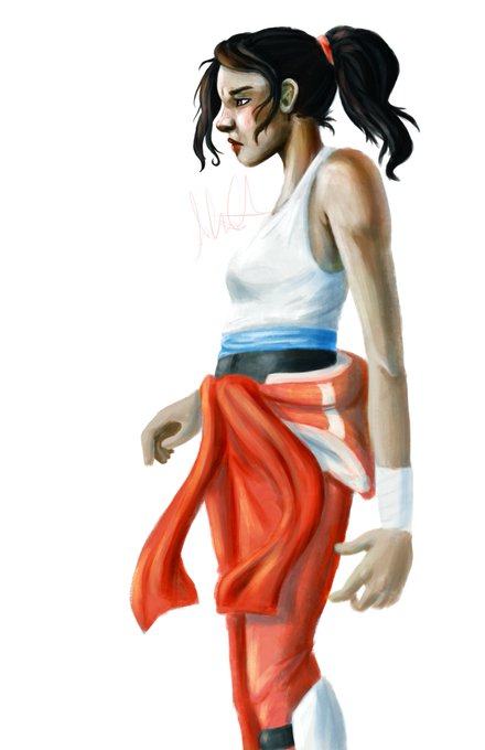
I wanted to share some of the first things I drew with my tablet back in 2013. I totally forgot how obsessed I was with Portal at the time! The last one is from this year, just for some comparison.


DOESN'T HE LOOK LIKE HER? LIKE THE EYES, HEADSHAPE... EARS ARE A DEFINITELY BECAUSE IT'S SUPPOSED TO BE BUT...WHOA. I have to draw Naki soon so I can do the comparison. : O


Here's actually something I did in 2013 for comparison. I'd like to think I'm improving


For #Comic #Writers & #Artists
Here is what one of my scripts look like, with finished page for comparison.
On my blog is a practice script for artists to draw & add to their portfolios, & writers to study off of:
https://t.co/ea34yDCavo


@jholder1224 @TheBethBarnett @HPLehkonen @NickMacari13 @Bob_Salley For #Comic #Writers & #Artists
Here is what one of my scripts look like, with finished page for comparison.
On my blog is a practice script for artists to draw & add to their portfolios, & writers to study off of:
https://t.co/ea34yDCavo


@jholder1224 @TheBethBarnett @HPLehkonen @NickMacari13 @Bob_Salley Here is what one of my scripts look like, with finished page for comparison.
On my blog is a practice script for artists to draw & add to their portfolios, & writers to study off of:
https://t.co/ea34yDCavo