visuallyのTwitterイラスト検索結果。 3,294 件中 97ページ目


We have been creating children's picture books for the last 15 years. In that time, we have developed a wide range of distinct and varied styles, which allows us to create all sorts of quirky, wacky & visually engaging children's books! #bookillustration https://t.co/BhEPypQJ9d

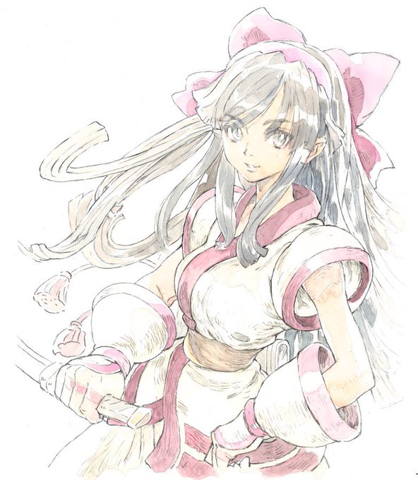
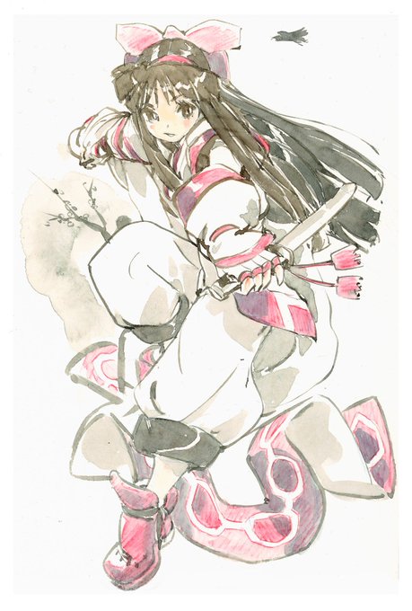


along with the last @ErinFitzgerald picture, this was conceived by Erin and her followers during one stream, I just made her come to life visually. Choco Chie


Reignited Trilogy and Dawn of the Dragon are the most visually appealing Spyro games


hud design is a huge pain both visually and technically like i was 3 hours making this and it's just one corner and it's not even done completely yet


Not sure how many people remember this, but items were very different visually in both the inventory and player card before Disney bought Club Penguin. They mainly had a lack of shadows. (2007)


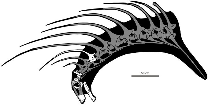
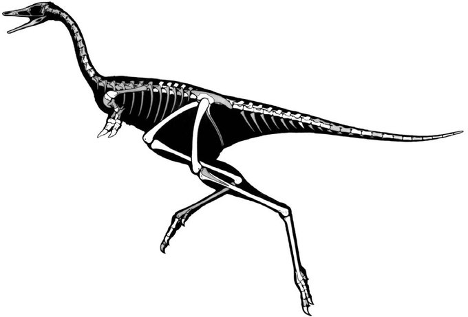
Hey paleo twitter, what are some really weird, visually striking dinos (or other prehistoric fauna) that are less widely known or represented in media?
Probably not the most obscure but I'll start: pin-head cotylorhynchus, punk hair bajadasaurus & stubby spike arm linhenykus.

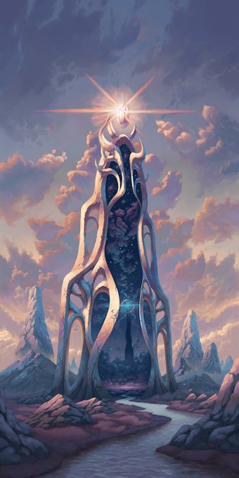

The Twilight Gate and The Waning Passage were imagined as companion pieces from the start. I wanted to contrast them both visually and conceptually: light against dark, solid against ephemeral, cosmic against terrestrial, among other dualities. What story do you imagine for them?

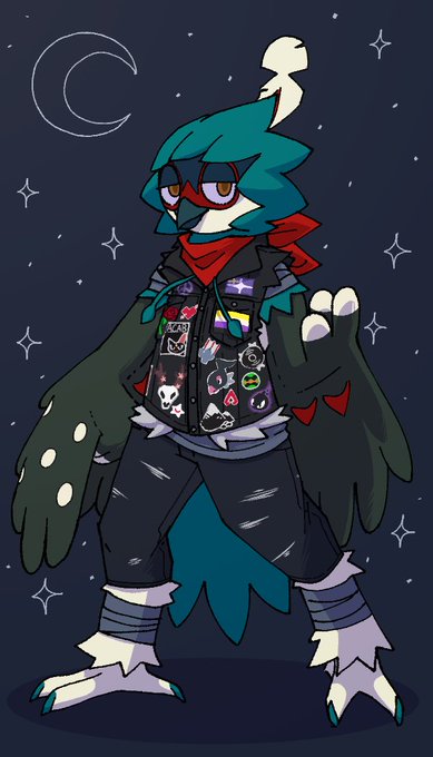
The wait is finally over (the pokesona a couple years or so stuck in the concept stage finally visually realized),
Tyras, for @DeerlyBLoved Natu make too many jokes, but you're a real Hoothoot (except not, because that's a Decidueye) 🏹🦉


Everyone should get a copy of new graphic novel Goldfinch by @the_bowen_arrow and @Punch_chinsky. Currently reading and its great both visually and narratively! While you're at it, give them a follow too! #SupportArtists #artistsontwitter
https://t.co/74d3eu3Gp8


Seax's old concept versus his new sprite art. He hasn't changed much visually, though he's gotten more visibly cagey as I've developed him as a character.


I, Voidhanger Records is not only one of the strongest underground labels of today, they're also one of the most visually appealing. Don't believe us? See for yourself.
Here's an album cover thread for you to lose yourself to:
#HeaviestofArt


Despite three houses anna being the most visually different, I don't mind them shaking up the style every once in a while. As long as anna keeps the same type of hairstyle and a close enough to red color, I'm cool with the changes.


@BlackboltLW Thenk u,,
Also to throw it back, I love the aesthetic and strong visual cohesion that you put into your art, it blends so well together visually, it's hard to pick a favourite LOL


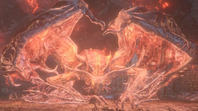

@Aggronize There are lots of visually interesting bosses out there, but these guys excel at providing good gameplay too.

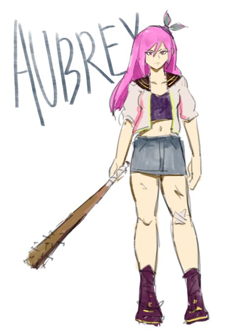

finished my first playthrough of OMORI few days ago. I really love these types of RPGMaker games and I've been waiting for this one for a LONGG while. It's really beautiful both visually and narratively. please play it.
#OMORIFANART


Edgy bun!
I tried to do a more visually complex design


while on the subject of creeps i don’t know if it’d be better to have them all be purple or to have them be multicolored like in download and die. some color variety is more visually interesting but i feel like having them all be purple fits better w them being supremacist aliens