ContrastのTwitterイラスト検索結果。 10,555 件中 98ページ目


【VOCALOID4】The vocal synth of the hour is Kobayashi Matcha.
Matcha is a calm and collected girl who tends to hide her emotions, in contrast to her best friend Masaoka Azuki.
Originally released for VOCALOID2, her voicebank wasn’t public until her V4 release.


experimenting with some colors and [head in hands] the contrast is nicer compared to the blue one i made before, and he looks so worm im !!!!!!!!! aaaaa I'LL JUST GIVE ALL COLORS AND LET THE MAN HIMSELF DECIDE


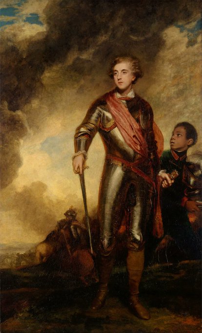
In contrast to her sister Lady Worsley (previous #ArtLovers), Jane Fleming enjoyed a happy marriage to Chas Stanhope, Earl of Harrington. They were an immensely popular couple throughout their long lives.
Lady H twice by Reynolds 1775 & 1779
Lord H “& servant” by Reynolds 1782


@beetlelunch Basically these are two drawings that already exist but I decided to make a mini montage to show the contrast of the two characters


Exploring her costume design, I inverted the spider to descend on its web. It felt more menacing, contrasting with the sporty pops of white.
Of course, drawing a spider-theme straight on is easy. Figuring out how it would wrap around her body in motion was a challenge!


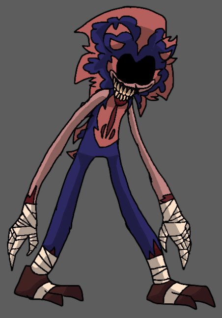
@feltyninja hei! don't take it wrong way but I genuinely had hard time seeing it. cool design - Love it
did some contrast adjustments


Art is mine, but the draw is a copy Of Yamato from onepiece someone drew! I can’t remember the artist name, please tag them if you know! But this was an intriguing study in terms of style. It pushed me to concentrate on contrasting colors. Timelapse ⬇️ #ONEPIECEFILMRED

ALRIGHTY, this the look we're happy with? maybe i'll change the orange jacket for more contrast.... https://t.co/ckAaRxjcWI

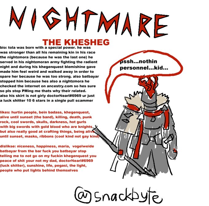


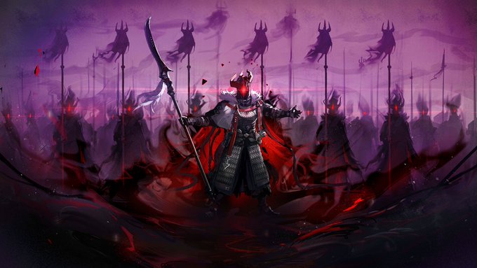
23. Nightmare Knight!
(ALSO MANIFESTING) Tola is a char. put in direct contrast with Maria. He forces himself to continue his fallen race's legacy, convinced this is the path to the end of his internal struggle. Both he and Blemishine learn from each other.
Also super cool.


Take a look at the #illustration developed as a part of the collaboration with the Tinloof agency on the EdgeTag project: it aims to reflect the nature of digital services boosting sales and marketing packed in stylish line art and bold color contrast.
https://t.co/Pngkr1btRj


Watercolor #painting of the dramatic #storm sky, titled "Sky No. 6'" (30 x 40,8 cm, 2017). I just love those contrasting colors!
You can find the original watercolor and signed art prints of it here:
https://t.co/BO4WBzUoE0
https://t.co/cSVqObweKm


@Amurr_Reha My Raen may not the darkest in this thread, but I adore the contrast betwen her darker skin and her pale scales!


The contrast to his message was damning, his physical did not deliver his heart's unspoken.
#DragonAge


It has a strong contrast.
明暗が強めの人やってみた。
#MyArt #Drawing #Procreate #FullZipHoodie #イラスト #創作 #パーカー


@Random_Blorper On the contrary I’m younger than 16 and I’m very happy with where my art’s at rn
There’s a stark contrast between my art now, and the start of the year, because there’s this neat little trick that I call ✨improvement✨
So kindly shut up and let people feel proud of themselves :)


The 8th anniversary of my weather fox species is coming up on Wednesday, so here's a WIP of Tempest and Amaryllis!
Meant to contrast my portrait of her and Ignis from 2020


