compareのTwitterイラスト検索結果。 22,416 件中 100ページ目


@TooraMakesArt no one compares the shadow part with the base skin color, and highlight area with base color . Seems like you just try to prove the artist is a whitewasher no matter how ridiculous your witness is


I drew this for a kpop secret santa art exchange~ It was hard because I drew pretty much all of it with flux on so I had to make so many adjustments 😭 but I was reminded of this other piece I did in 2017 that also featured a light between two people!! Interesting 2 compare 🧐


The First (intentional) patreon exclusive art. nothing bad about about it's just slightly...off, compared to what i usually draw but if you're interested its on my patreon
https://t.co/ZErzkeoxf0


That ain't shit compared to me making this during my whole school time https://t.co/6joDF8UbdB


Factoid Extra: Amazing what a well-applied bit of burr walnut, lighter upholstery, dash plastics & door trim did for the Rover 600’s interior compared to the Honda Accord as essentially they had the same interiors…
@neilmbriscoe @t2stu @DarraghMcKenna @TopOfTheTower @StvCr

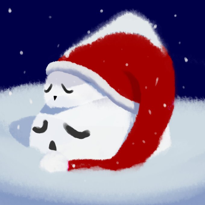

When searching my files for art to use from 2020 made me realised how little art I did that year compare to the next two (So little in fact that this was the only finished one I could find). Happy I'm doing more now and looking forward to making more in the future! https://t.co/EgWoCYIe8T


@Hiroshi_kuroo LOL Hiro ahahah yeah bro I miiight have amped up her chest just a bit much past standard Jinx regulations😅
But nah the braids I had to make 'em nice and THICC they look so much better compared to the much thinner ones we always see, so thanks brah more Jonx incoming😏👍♥️


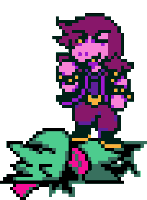
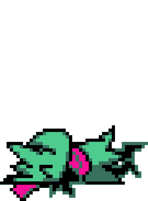

@Fl0weyTheFlower I couldn't help but compare them, and I recreated it in Sprite form
(the fourth image is the sprite at pixel size)


Fun fact: Ronnie isn't well liked in the Pokemon community compared to the poke art community lol


Only their last drawing was legit, and you can clearly see the difference on their previous works to the new ones they made, this is one of their previous drawings, compared to the new one they made, how would this "improvment" be possible in such a short time ? the styles don't-

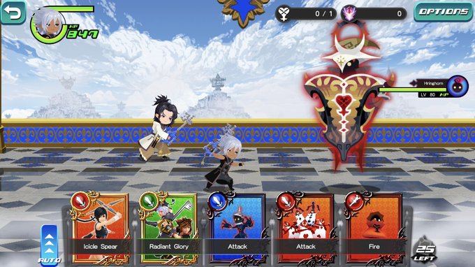


One thing that I'm excited to see in Missing Link and Kingdom Hearts 4 are the boss designs we will see bc I love the designs of the bosses in DR/UX.
Especially with how different Missing Link looks compared to Union Cross and how KH4 is basically going to be a next-gen game


To add on, the Jake from the Original Revamp was going to be the Jake I had remade a while back with his proper humanoid appearance to fit with Jake feel more "human" compared to his original design. I still even have the file for the Hellbound PNM that was made. https://t.co/hiHH24lu2p


I have definitely improved this year! Just compare one piece I did in July to the latest one!


#SkillNotTalent Wanted to compare my 2020 to 2022 Rosalina illustrations 💫


@PhilipposoleV2 they look really uninspired compared to the original sakura wars cast too 😔


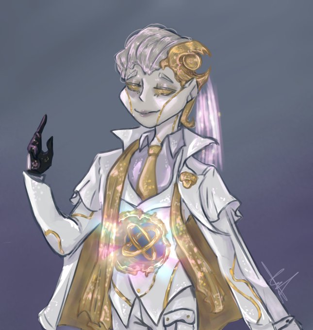


I finished him I think I forgot to post tho
Anatomy is kinda wack but I love the coloring and glowys I did on it
He's a bit different and softer compared to the harder, darker and bright colors for Melly but I like that, it fits #wuchang #IdentityV #IdentityVfanart


Yes, it's a beautiful blue planet, but plagued by terrors that every day commit atrocities that nobody cares about, because that blue planet is nothing compared to the void that surrounds it, if it disappeared today, it wouldn't matter much, I guess that's the way the universe is