ContrastのTwitterイラスト検索結果。 10,562 件中 2ページ目


My class “The Warmth Workshop: Ethereal Drawing Through Contrast & Hue” is now up for pre-order on Coloso(@colosoglobal)✨🎨
Use code [enzefu-55-sns-tw-2] for a $55 coupon too! 💸(Valid for 48 hours⏳)
👉Link: https://t.co/t8EFdMzSYp
#coloso #illustration

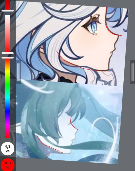
The jawline and nose for female then to be drawn soft and round in contrast to male character which is drawn bit angular. Wanderer who is supposed to be feminine is also drawn with the sharp jawline
We’ll see tho , these are our observations


#EveryonesErika
These two delicate drawings of Erika, created by artist @NEVA110M1T, capture contrasting moments in her reality—first as a carefree youth in a tank top transformed into a wartime medical volunteer in a military parka.
The war changed her life forever.


The moment I saw the whole of 🥀's new attire, 🪡's outfit immediately came to mind.
Their outfits feel like mirrors...(white foundations, each with long flowing fabrics in contrasting tones.)


@Letraartz Thank you!! Actually, I think my answer will be quite simple: it just looks that way because of the bright highlights contrasting with the relatively dark skin tones. I've attached what the picture looks like when you just remove the highlights
If you're interested in learning


I liked this curvy design too, but I wanted to create a contrast with her big brother, so I decided not to go with it.
#zootopia


よしよーし。silence_mixくんのことがちょっとずつ解ってきたぞう。
illustorious系だから古の技術が地味に通るし(ex:でょサンド)、matteとかcolor contrastも通る。おもしろい。
#AIイラスト


Just fumbled for some really old oc sketches that was from 10 years ago. Maybe I am never talented in drawing but people around always pampered me to make these evolve.😭 Last two pics are for the contrast.


I particularly like the way Louis' horns are drawn on the LouiWill wedding artwork because unlike most artworks of him, they're drawn thick, rough and rugged. It's a small element that contrasts in comparison with his very tidy and kept appearance
I love it the most


#MMOARTPG For your birthday, Pippa, I give you the dinkiest pip I could muster. Contrast with the other hooligan Pipday art. happy birthday, have a good one


Kizna (Color minor change)🐐❤️💙🖤
Inspired by the coloring of Switch2, I made a slight color change. The contrast between the blue and red colors brings out the image of "good and evil" as far as I can imagine🤔✨


@plimboner oh type shit it was a lot brighter before but i was like 'its a robot' so i made it deader lookin to contrast with sonic


812, "Night Out"
Sees Ciel by the busy lights of Misaki City, sketched in with a g-pen the painting escalates into coloring in the character in accordance to ambient light.
The long exposure traffic contrasted with the stillness of the character isolates the seemingl


Never stop drawing!~ 💖
Contrasting old and new work really helps in putting things into perspective if you ever feel like you've stagnated.
2017 -> 2025 https://t.co/1QuhfQWqKn


「BunnyBunnyBANG!」天宰星-Rebecca Ivy Harper.
Profession: Dentist
Hobby: Camping
Has a husky "smoker's voice" that contrasts with her appearance.
Nickname: Becaca
True Nickname: BeBe