InacademyFBのTwitterイラスト検索結果。 27 件中 2ページ目


hi ina-sensei, i struggle with coloring my works. i think i tend to focus too much on one main color such that everything ends up hued towards it.
#InacademyFB
how would wahn;
-know where to have vivid/muted colors
-pick what colors to use for shadows
-paint flowers prettily


Need your tako wisdom Ina-sensei!!
Im challenging myself with perspective on this piece but I struggled in making the body proportions accurate and made her look taller than her actual height. Any tips and feedback to make it look better is much appreciated! 💜
#InacademyFB


#InacademyFB
Hi Ina sensei! This is a piece I draw for Polka for her debute anniversary a month ago.
I always found the shoulder on this kind of angle challenging, specifically, I saw people doing the armpit line extremelly smoothly but for me it either dislocates the shoulder


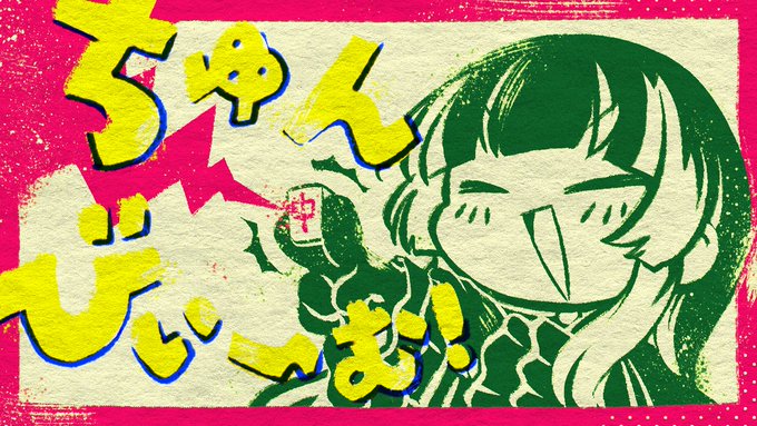
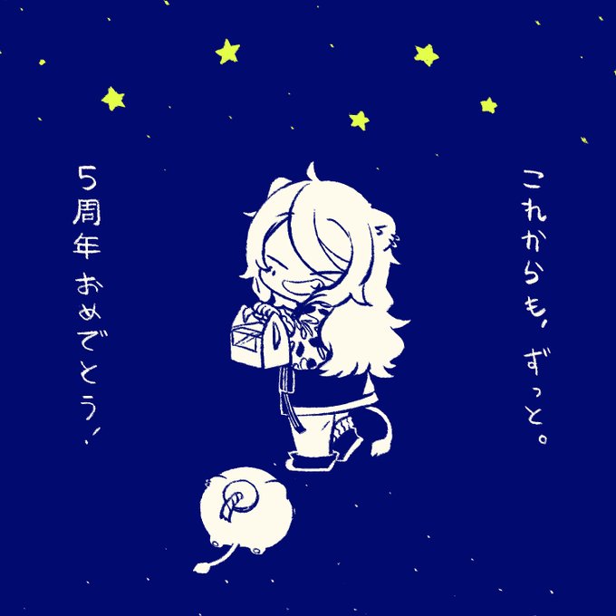
Hi Ina-sensei! Trying to develop this more design-ish approach on my art over years but it tends to be a hit or mid- tfw you NAILED one art years ago but cant grasp the vibe again 😭 Love to hear your thoughts on how do you "spice things up" to keep things fresh!!✨
#InacademyFB

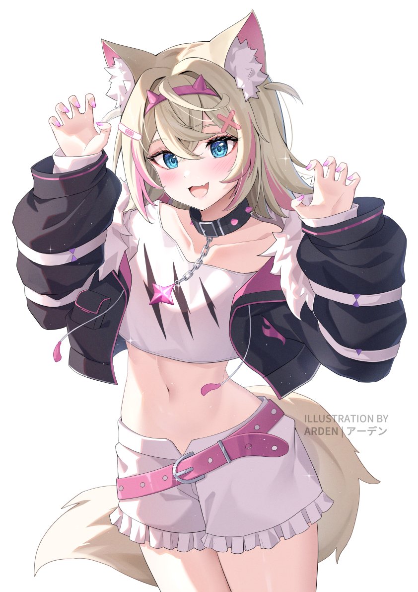
Hi Ina of the brush! For this one I mostly struggled on how to make the pose feel more dynamic. I wanted it to have more movement while still keeping it as a standing pose.
Any other feedback on how to improve it is very much appreciated! 💜💜 Thank you!!
#InacademyFB


Hi Ina! This is a piece from last year that I really enjoyed, but I struggled a lot with proportions from a low perspective and readability (feels like a lot of elements blend too much into the background) This is unfortunately a recurring thing. #InacademyFB


#InacademyFB
Hello Ina! I made this art a few years ago. I’m still proud of this one, but I think many things could be improved:
- Due to the color palette, Ina doesn’t stand out much
- I didn’t do perspective properly. I wonder how to do perspective involving reflection. (1/2)