NewsprintのTwitterイラスト検索結果。 286 件中 2ページ目
3 hour portrait from life. Charcoal on newsprint.
#portraitdrawing #lifedrawing @academicdrawing @charcoalsketch
GAME BOYZ: Welcome to the Effing Zombie Apocalypse 👾🕹️🧟♂️
https://t.co/dewcl2BV1J
#comix #comics #zombies #undead #cartoon #illustrator #illustrations #drawings #doodles #drawing #sketch #newspaper #newsprint #magazine #indiecomics #flashanimation #animation
@iminyourhouse_0 uuuhhhhh um hector asamori from Newsprints by ruxu
@RikWorth @ThoughtBubbleUK It was printed newsprint format so here it is in chunks in case it's hard to read on-screen.
In Gods And Gears, we like to have fun with our settings.
Especially in this time/dimension jumping short story for It Came Out On A Wednesday #8.
Grab a copy while they last. In fact…gab two!
1.99 on newsprint, baby!
#indiecomics #comicbooks
https://t.co/9xpub364se
Princess Serenity progress thread pt 1
We sketched out the beginning doodles of the pattern. Getting newsprint paper and test fabric this weekend to start drafting
While I take a break from drawing to properly learn 3d, here are a few drawings I've done. Charcoal on newsprint.
Cover illustration that I did for the Daily Trojan a couple of weeks ago! :) Immensely pleased & honored to have seen it in physical newsprint! <3
Just added some @ALTERNACOMICS rarities to the webstore including a few remaining (signed) copies of It Came Out... 13, 14, IFanthology: Superpowers & a Unit 44 newsprint bundle!
https://t.co/HiDVpr0uEc
"In all eras and centuries, a Russian warrior beats a Prussian" — Soviet propaganda newsprint from 1943 showing Russian and Prussian soldiers battling it out through the centuries.
This development output from Kunza makes me think of a faded, handwritten note on newsprint.
#javascript #nft
What’s up! This is Chris Rini of @BloodyElbow and publisher of The Fine Art of Violence MMA books.
The first Live Drawing Thread of 2022 starts now with #UFCVegas charcoal on newsprint
My 19 yr. old nephew died in a house fire a year ago. The tragedy filled me with emotions and images that had to come out. Not pretty but real.
We Lost David, 2020
Soft pastel on newsprint
#procreate #procreateart #ArtistOnTwitter #art #fineart #paintings
Start to end...🎈 (Yep that is old newsprint paper front 2017 or so)
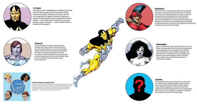
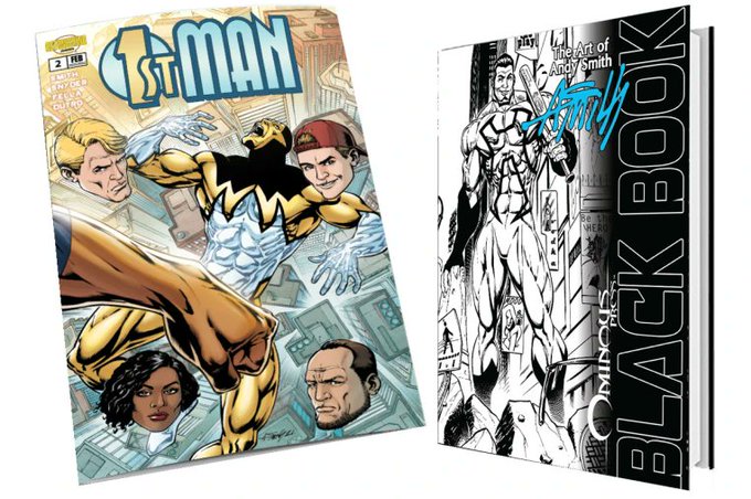
Check out @andysmithart's 1stMAN 2: Learning Curve! on @indiegogo!
1stMAN will remind you what it felt like to read a comic book printed on newsprint, chewing on a wad of bubble gum, and wondering what Penumbra looks like in a bikini! It’s that much fun!
https://t.co/qSQs1zuKXu
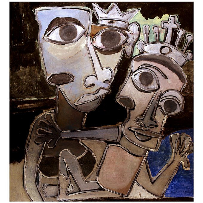
DOMINA AND CHILD
romanho
acrylic on vintage newsprint
#acrylic #newspaper #vintage
This stuff looks great. You gain basically nothing by slapping a bunch of fake newsprint filters over it or worse redoing the whole thing to look "modern"
That's not how #TheEternals looked in 1976.
Modern reprints use colors that are WAY too saturated, giving the false impression that old comics were garish. The newsprint absorbed color, creating more subtlety and appeal even with bombastic Jack Kirby art.
It read more like this https://t.co/eRDdBPozgk


