PosterizationのTwitterイラスト検索結果。 36 件中 2ページ目

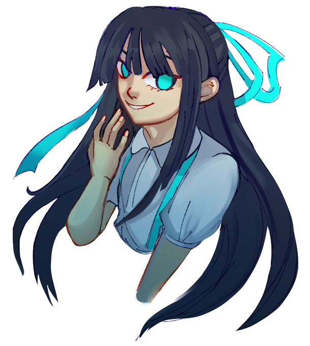
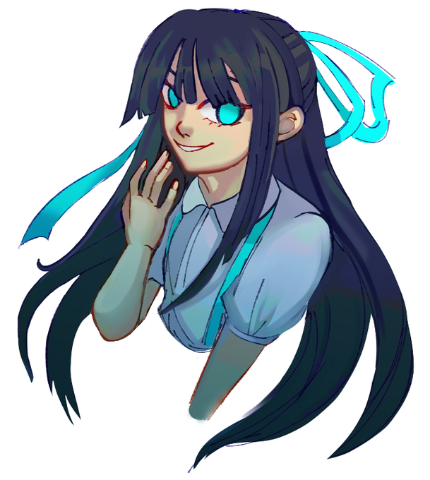
hello twitter i need advice. which of these err. looks better? experimenting with posterization


using CSP and wanna give a bit of 'oomph' to your coloring?
right click on the layer> New Correction Layer > Posterization!
you can work with it any way it fits your style!
I've been using it for a while now and loving it, look at the soft holo effect it helped me make!!


alternatively you can just apply posterization > mosaic > posterization for a similar effect
there's a way to finesse GIMP to create even sharper mosaic transitions but I can't for the life of me remember what on earth the process was
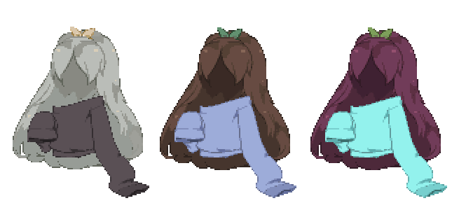
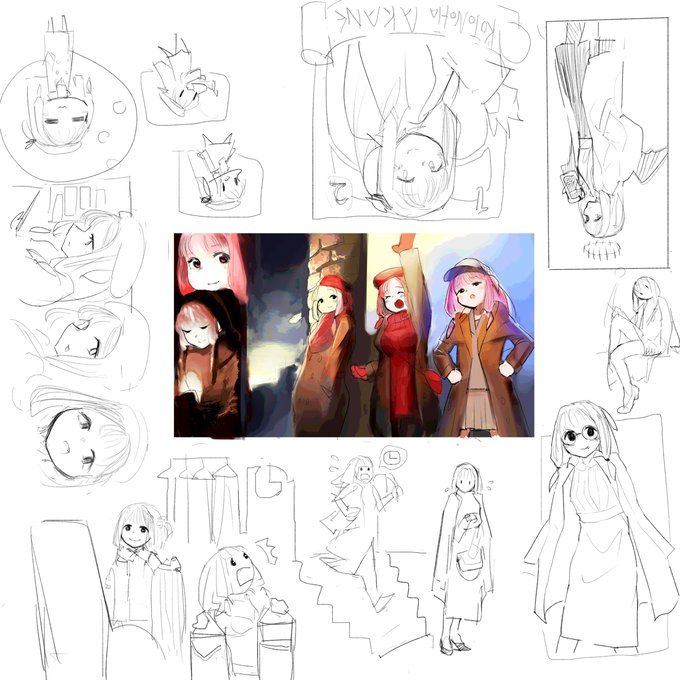
n/e way enjoy this hair I made years ago 🥲


Posterization done in Illustrator of John Mulaney for a class. It’s technically a wip, but I kinda like it like this


ของ Clip studio จะเป็น Edit>Tonal Correction>Posterization
Before. After


Messed around w the posterization thing in csp heres the og colors anyway their names are siren and tk both are homeless and unhinged and are very good at hiding it


i used a flat brush with a really rough canvas texture and a textured smoother brush! for the colour tweaking it was a posterized version on 30% opacity and a pink glow dodge layer >:) the posterization is really what gives you some sexy colours,, this is full opacity v original


Another variant. For this one, the Saturation was bumped up to 2, Brightness to -1, and Contrast to 4 (via @acornapp's Color Controls) with a Color Posterization of 4 and then using a closest color algorithm to select the closest EGA color.

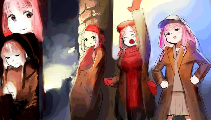
I've been practicing posterization in Photoshop, and I love this one technique which distorts the picture to its dominant colors. I just did it on a poster for a film I plan on watching soon.


idk what the posterization filter means but it looks cool so heres another version