Typography.のTwitterイラスト検索結果。 166 件中 2ページ目
I designed the hell out of the typography. Was heavily inspired by heavy metal rock band logos cause they’re just rad
It was fun to work with @DileksProject in my latest "Typoface" #NFT
I really like her style, we decided to make a collab combined with her drawing and my typography.
Here is: Michael Jackson
Listed on @withFND, reserve price: 0.5 ETH
https://t.co/rn1Zw2SL5A
@emnide hello! i would like to apply.
I have experience with using vector tools such as the pen tool and the text tool for typography.
I use Adobe products such as Photoshop, Illustrator, Lightroom, Premium and After Effects.
I also emailed you so I could send more examples.
Angela Lahs Gonzales was the 11th employee at @Fermilab. For more than 30 years, she was the aesthetic gatekeeper, influencing everything from buildings to typography.
View "A Lasting Mark" a virtual art gallery of her work at https://t.co/r9aUhuSulN
Artwork:
Bespoke illustration graphic, with typography.
Typefaces:
‘Kern’ by @pizzatypefaces.
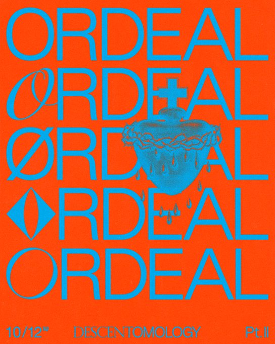
(O)’ Tenebras’ by Doménico Barreto.
@jeffbrutlag You could always make something with interesting typography. I put some samples below of what I mean. Colors, typeface, and texture to express the general vibe instead of illustrative imagery. And you could use accent icons or images as well but leave the type as the main focus.
DUDKI Brand Design
Beautiful sophisticated logo design for this restaurant brand. Suitable colors and elegant typography. The logo variations and the trumpet icon adds an extra flair to the brand. So well done! https://t.co/o4phftzz7y
@SG_Posters This poster for @flanaganfilm's #MidnightMass . It just fell together really easily and i'm really happy with the concept, composition, colour and typography. It just gels for me.
Study color.
Study layouts.
Study business.
Study discipline.
Study marketing.
Study typography.
Study copywriting.
Study communication.
Study self-awareness.
Take action and practice all of these.
Advance your career.
@GaryLoew Asterix comes from the fun world of European comics. It goes back about 60 years now, I think. I didn't know about the Asterisk and Obelisk connection in typography.
As with Tintin, I'm only passing familiar with Asterix. Something I should explore some day.
Mighty Cultured typography.
#logo #design #art #creative #typography #designstudio #font #lettering #abstractart #tuesday #tuesdayvibes
Assignment for Photoshop class. Supposed to do a hand drawn illustration on Photoshop and add a typography. Since I'm game Dev class, my assignment prompt was to create a character that could be in a video game. Join cyber girl Solera in her quest around space quadrant Gaea. 🌌
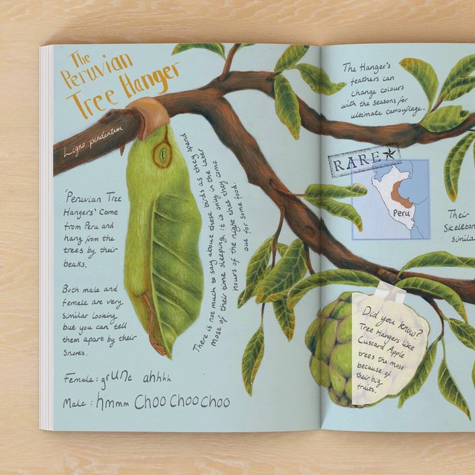
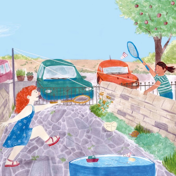
Today we're delighted to introduce you to Hannah Kenyon!
Hannah says, "I am always looking for ways to inject fun and humour into my children’s books, whether it be with quirky animal characters or expressive typography. If something makes me laugh, its going in!''
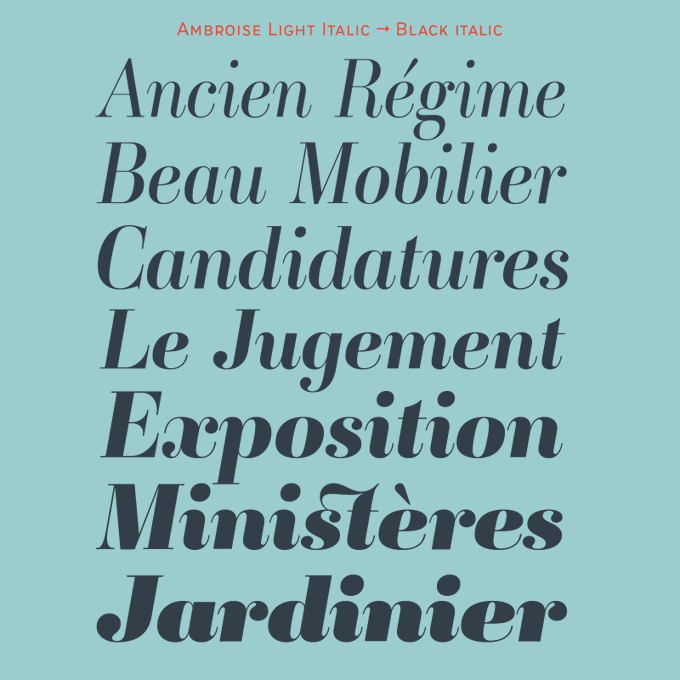
Ambroise is a classic of digital typography. It represents undeniably the Didot à la française, with a certain contrast but not too much, in order to make it usable. Three widths, multiples weights, italics, various alternates & fleurons: Read about it https://t.co/alz9CeyWgn
Their work is so much fun and they have such a knack for stunning typography. If I ever have the chance to work with them again, I’ll be so grateful.
Our Differences: Chapter 2 cover art ❤️
Thanks so much to @pixltdeggplant for the help on the title typography. He's a super talented artist and graphic designer. Show him some love and give him a follow!
High res and no text version available on Patreon!
https://t.co/8ieVEPoe5e
I have been working on and experimenting with hand rendered typography. I made these using an ink brush filled with black acrylic ink.
The titles are based off blxckie's - B4Now tape/album.
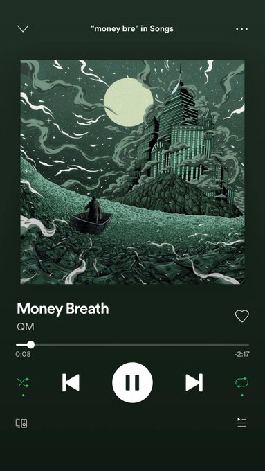
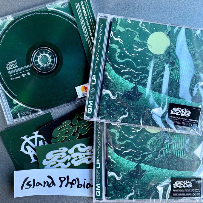
Album cover illustrated for Qm questionmark (2020)
( Physical CD )
Art dir. @Rowdee38
illustration. @JeffAphisit
Typography. gx2_h
#art #ArtistOnTwitter #design #illustration #albumcover #thaiartist
Another exploration of form and texture through typography. SacredWe is a collection of artworks exploring the beauty and stories hidden in the things we take for granted.
#NFTartist #poetry #africanart #ArtistOnTwitter


