better,のTwitterイラスト検索結果。 2ページ目


My take on this:
Red shoes are obv better, but blue shoes CAN work. If you make Tails orange instead of yellow, and have the blue shoes be of a cool tone, then it works really well https://t.co/tMNaDZg1Vf


okayyy i'm feeling a little better, coloring the next part for our sampo game :9


@AirshowD The proposed production models actually look much better, but yeah. Boeing did not really endear itself with that prototype


Adding more spamming.
Let’s meet San Diego (She is a commission so I will stop posting)
Unexpectedly to you, most of my girls are not new designs—they have been in existence since 2015 or earlier. I tried to make them better, but I NEVER redo them, since they are alive to me.

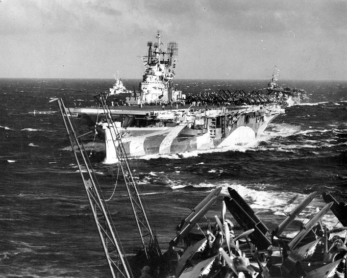
I love Ms33, but I do like Ms 32 better, since it has a greater contrast. Anyway, although it might look dull according to the paint plate, the historical pictures do show a nice contrast between colors. Let's throw the painting guide away.


Video games are my biggest stress relief! So I spent all day playing and took a break from drawing. I feel better, let's finish the story!!! :L


左の絵と右の絵、塗り方が違うのですがどちらが好みでしょうか?アンケートに答えていただけると幸いです。
Which is better, the illustration on the right or the one on the left, which is painted differently? We would appreciate it if you would fill out the survey.
⬇️

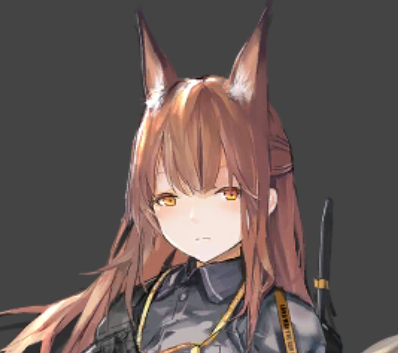
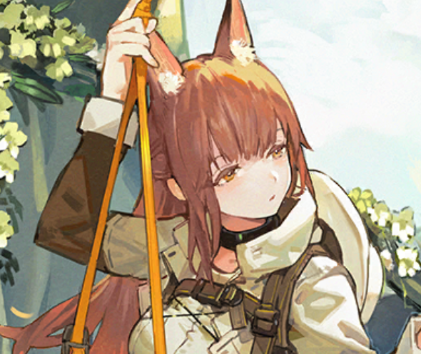


strange how the most random observations blow up
to clarify, i think the newer art is much better, but still looks nothing like savage
compare franka and liskarm old and new artist, they maintained the exact same design and vibe


Which color shading do you think is better, the left or the right?


even better, she's a floof with eyeglasses https://t.co/mc09kaYmOr


It was such a great 4 years with myth, these 5 girls really changed my life for the better, and I’ll always be grateful for the memories they’ve given me 🫶
❤️🧡💜💙💛


i think few people misunderstand, I was trying to showcase the texture work instead of the mesh/building. that part is shit LOL. I shouldve done it better, but I want to do it quick for the sake of demonstration 😭
-
anyway i'm working on my thesis project do check em out :)

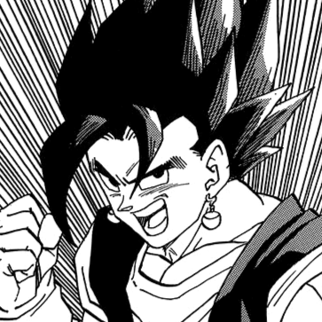


i'll give you one better, arlefuri lokal AU https://t.co/HX6P0JiZYJ

unblindfolded ver
I still don't know which one I like better, I think she looks kinder and more mischievous without the blindfold


Hey Zat, it's Zet, i'm in your twitter account, spooky innit?
Anyway, i just wanted to say that you've changed me a lot in the past year or so that i've known you, as i did see you change for the better, thank you for being a great and dear friend, and happy birthday to you, Zat.


@DenjiDreams I feel like, proportionally, the first one is better, but I'll explain why with some theorycrafting. Of course, since it's art, you can do whatever you want tbh.
I made some green meme lines. From top to bottom, they go: top of the eyes, bottom of the nose, bottom of the chin.


Since I decided to lower the stabilization on all my brushes, it made me realize that my strokes are much better, freer, looser and completely in my control. I used to have +40 stabilization on all my brushes. It opened up a new world for me to remove that. I enjoy drawing