fonts,のTwitterイラスト検索結果。 88 件中 2ページ目


Little kustard children concept,their names are random fonts, don't take em too seriously,unless...you like them I guess
#kustard #underfell #undertale #undertaleau #sansau


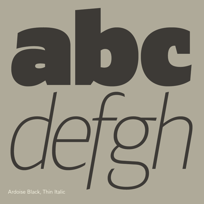
Looking at lettershapes in a mirror is probably the most revealing thing about learning to draw type, or rather to see the shapes, the regularity of counter-forms and forms.
— Ardoise https://t.co/Cie5hXC4Iw A straightforward sanserif in 45 fonts, 4 widths


men and women are completely different!
men have blue outlines on their fonts, women have pink outlines.


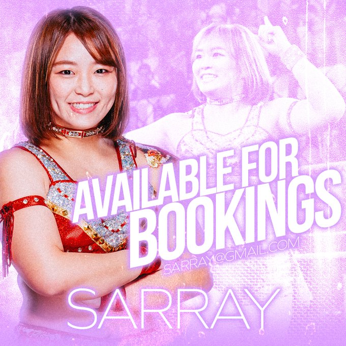
Added some free "AVAILABLE FOR BOOKINGS" PSDs editable in Photoshop and other design programs. You can customize all the fonts, images, and text
will try to add move over time
https://t.co/XmemiPvQNg

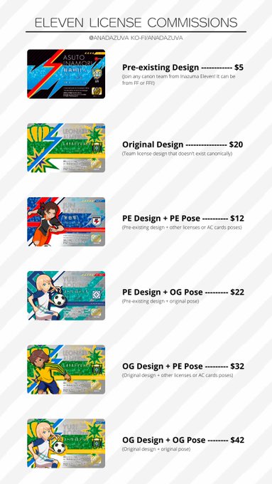


ELEVEN LICENSE COMMISSIONS ARE OPEN!
If you always wanted a personalized license, but don't want to go through the pain that is searching for assets and fonts, this is the place to get one!
Hit me up on DM or https://t.co/yZKPHLKeaQ and be even closer to Inazuma Eleven!


Typography is a hidden, often forgotten part of graphic design… which is a shame because it's just so fascinating. Checkout the ligatures in these two fonts, they’re FIRE.

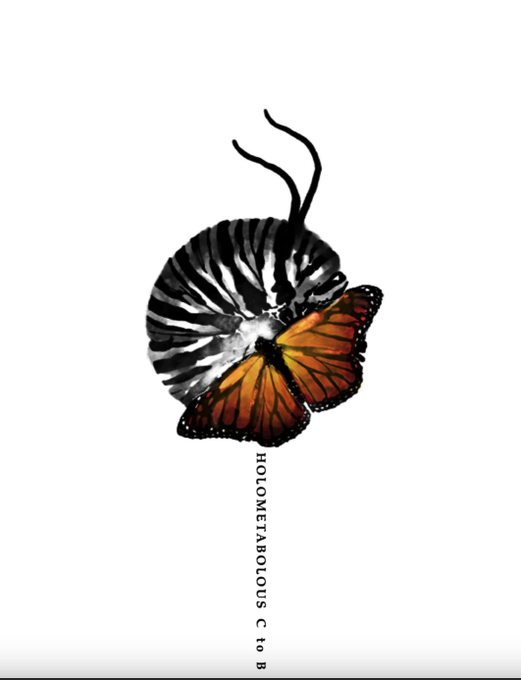
Storyteller: Binhua Chen ('22)
Story: Holometabolous
The target for this assignment was for the student, as a storyteller, to come up with a visual biography. It was for the student to show the tone of their voice translated into a grid, fonts, & images.
https://t.co/Qhn4qZK9p7


A fashion magazine mock-up. Had a lot of fun playing with the fonts, even though I don't have a lot of experience with them.
#artistsontwitter #digitalart #fashion

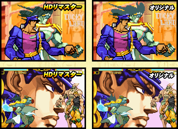
It was an HD port of JoJo's Bizarre Adventure: Heritage for the Future. It featured upscaled graphics, tweaked dialogue and fonts, and online multiplayer support.


Gradient map practice + dorky joke (get it? most sonas have at least edgy stuff on it)
ft. @Yoink5558 's akira
font used: Manrope (search it on google fonts, its free and good)


So I did JK in diff fonts, which do u guys like better? Just curious cuz I’m wondering which one I should try to develop more :>
Ver J : more anime-stylized type of style
Ver K: more semi realistic :0

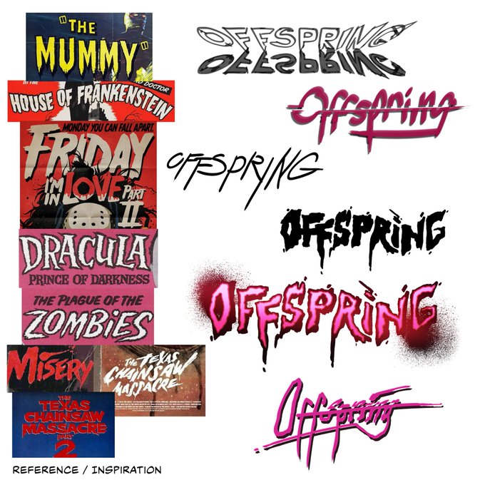
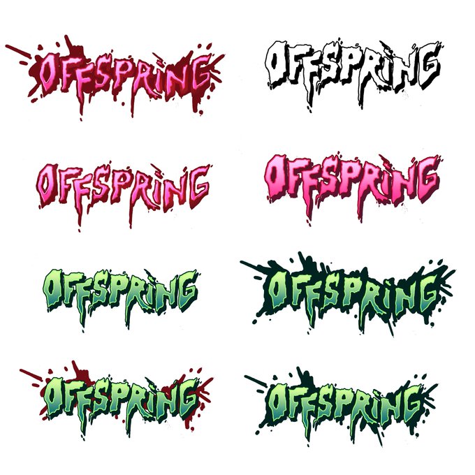
Ever think about how cool our logo is? Us too! Inspired by classic vintage horror film posters and spooky fonts, @SolValdezArt designed and perfected the logo that adorns our #pfp. Here are some references, first drafts, and color tests.
What's your favorite classic horror film?


Hello my commissions are still open, still at the same prices, DM me if you're interested ^^
(Alt text is finally here bc some may struggle to read with those colors and fonts, also there is the convertion in $)


Thursday Draw Jam TONIGHT! Tonight we're going over what else makes a comic work, and what makes a comic not work.
Think of: Fonts, emanata, borders – issues, favourites, tips, critiquing.
Join us tonight at 7PM EDT to discuss and make some comics.
https://t.co/m1lerHd9n8


okay everyone look,,, literally the same people in different fonts, this is getting ridiculous


I did this logo, well, obviously for Powerland: Huriya! Haha! Not very confident with logos but i tried. Followed specific instructions from author, including color scheme, fonts, positioning and style except for the circle thing around it.


Other things i can do: bitmap fonts, NES style title screens & menu cards, decorative elements, HUD:s.


Looking to do some commissions.
I make game art, characters, tiles, fonts, user interface, etc. DM me if you are interested.
Cheers!
#pixelart #pixel #commission #commissionsopen #gameart #art #tileset


Sanatorium of Romance - Spanish Translation Revision
Theo Wilderbeek already translated this game in 1995, but recently he decided to revise his work and it resulted in a new translation patch with more texts, better fonts, and several revisions.
More at https://t.co/wl2XY5YgYx