readableのTwitterイラスト検索結果。 912 件中 2ページ目


Like I wanna see people draw these guys so bad
Can't have that if they're not readable


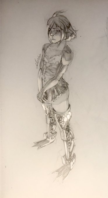
Cleaning house with art I should've posted
Cleaned up the signature because the prior writing was unreadable without my glasses!
This is Moon, its for their belated birthday


Some of the small comments I add got eradiated from being readable in the full version, so i'll Put them Here🥹


@aapur Yeah i thought that it might be unreadable but TLDR its a really down bad mod for mhr, heres the full image for you to... look at i guess


Tomorrow is the day!
"Welcome to the Grim Session" will be readable on Webtoon Canvas ID.
Since it hasn't been published, I can't share the link. I'll post the updated link tomorrow


If i see one of these again from any of you, you are giving me explicit permission to take 30 seconds and draw the most vaguely readable gremlin. This is a threat. https://t.co/usHfc7kB61


A warm surprise this morning, when I noticed I got a new Creative Agent on Patreon! Shadow Halls has now more helping hands!
You have my many thanks! @Pix1001
Your name is now added to the game Itch io page & in a special note readable from the game's menu. ❤️


pondering questions... from my comics essay "Where Is Evil?", colors by Gryphon. Readable free at Broken Frontier @brokenfrontier https://t.co/jD1VwH3PlQ #comics Inspired by the political comics essays of Nate Powell, created in the summer of 2021


Adding these as well, I love how the pose came out and I feel they're more readable that way


Senpai :']
For an upcoming valentine's one-shot on Line webtoon (ID), will be readable on 15/3 ♥️♥️♥️


One challenge: keeping the map readable while working in a dangerously decadent/ indulgent amount of detail. It's all about setting up a visual hierarchy. Big shapes and thick lines for the major elements, variations within these shapes and thinner lines for patterns and motifs.


otay twitter... I tried making some changes that were suggested in the comments.... I have been staring at this shit for like a week and idk how i even feel anymore. Is it more readable? does it look ok??? (i might scrap the idea cuz its just pissin me off now) https://t.co/K33SM8uFiy


Pi is a stern, blunt character whose unreadable nature causes him to be avoided by many. He is the most mature one out of those that he spends time with, though they do have a chaotic and sadistic side to them. He and Square Root are inseparable friends. (3/10)


UI Palette - Primarily used for icons
bunch of grays & browns to depict weapons, items, glass bottles, etc.
high contrast accent colors to give each icon it's own distinct, immediately readable flair
many shades of almost black for UI panels


THE JAPANESE LOGO LOOKS ACTUALLY COOL AND MORE READABLE 😭😭😭
I would just make the background smaller to increase readability even more, but other than that...damn that actually looks good


@Monster31206678 what kind of dumb ass uses white text? that shit ain't readable

kira kira ✨✨✨ My one-shot valentine for webtoon ID will be readable on 15/3 :'D

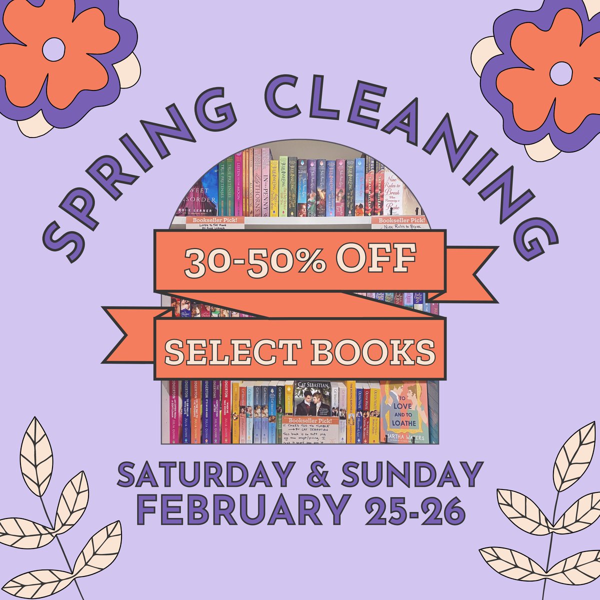
We did some spring cleaning, & now we're having a sale! This coming Saturday & Sunday, February 25th & 26th!
30% off overstock books and 50% off "shopworn" books (they fell off a shelf & are a little banged up, but perfectly readable!)
In store only, sorry internet friends!


Checked out the new SUPERMAN #1 on a whim and not gonna lie, I loved it. The premise and writing are solid, but Jamal Campbell's art is absolutely the star here. Super expressive, super readable, just super. One page in particular made me smile like a doofus.
10/10 Mercy too.


#PeckShieldAlert Fake_Phishing11667-labeled address has grabbed 4 #NFTs, including 2 #Otherdeed & 2 #Azuki
Scammers likely use phishing websites to trick users into signing unreadable messages, thus selling their #NFTs to the scammers for 0 $ETH @opensea https://t.co/OuRMc5CrIE