wordmarkのTwitterイラスト検索結果。 41 件中 2ページ目


Rate this creative work out of 10.
Follow: @logomakers_hq
by : joeyguidone
#procreate #book #logoprocess #logodesigner #wordmark #graphicdesigner #designer #illustration #brandidentity #creative #graphicdesign #design #logomakers_hq #swan #branding #minimal #erart #logomaker
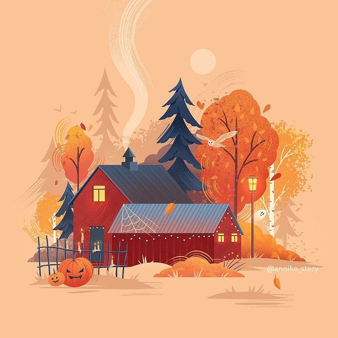
illustration
Follow @logomakers_hq
by anniko_story
#procreate #logoprocess #negativespacelogo #logotype #creativity #gradient #brandidentity #branding #design #adobeillustrator #graphicdesigner #home #minimal #wordmark #logomakers_hq #logomaker #illustrator #illustration

Eagle illustration
Follow @logomakers_hq
by : rahul_khobragade13
#logoprocess #graphicdesigner #negativespacelogo #typography #gradient #designer #design #illustrator #wordmark #creativity #procreate #adobeillustrator #logomaker #logomakers_hq #minimal #logodesigner



#redskinsnamechange
#washingtonfootballteam
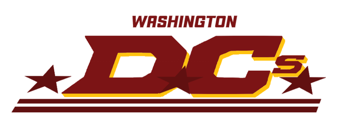
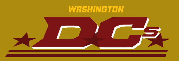
More work on the wordmark for my team name idea
The "Washington DCs"

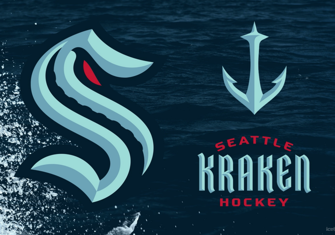
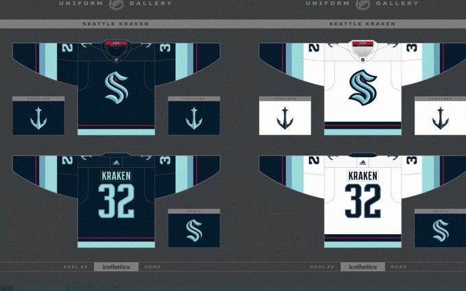
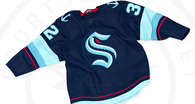
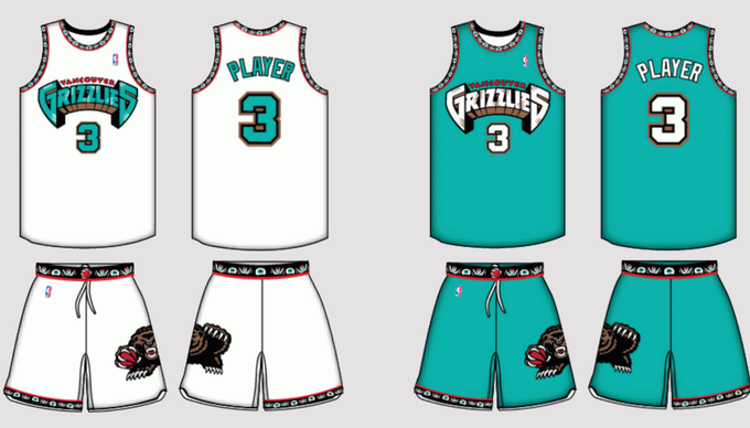
#GameplanChicago @NHLkraken review.
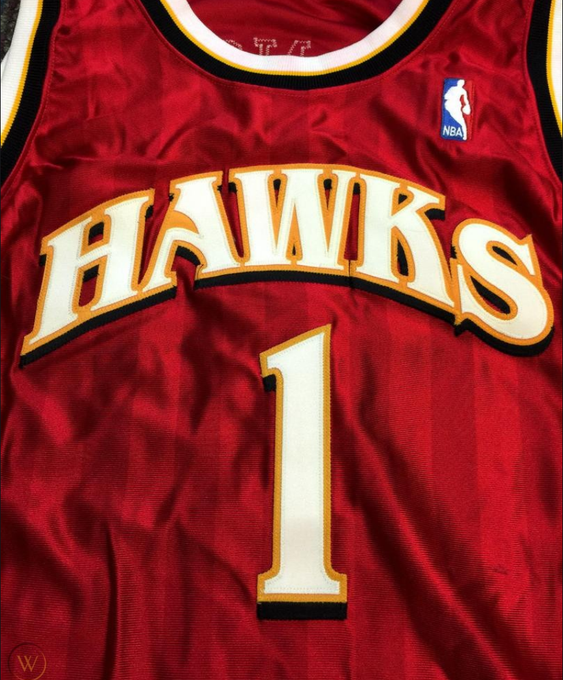
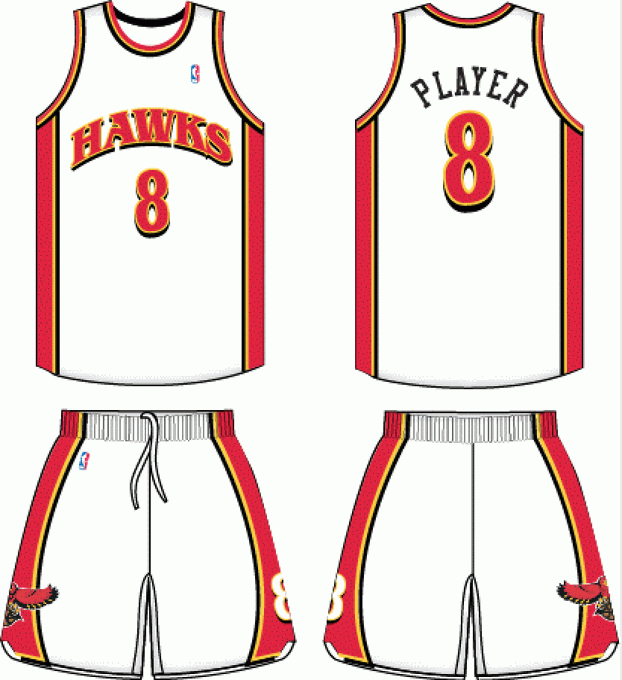
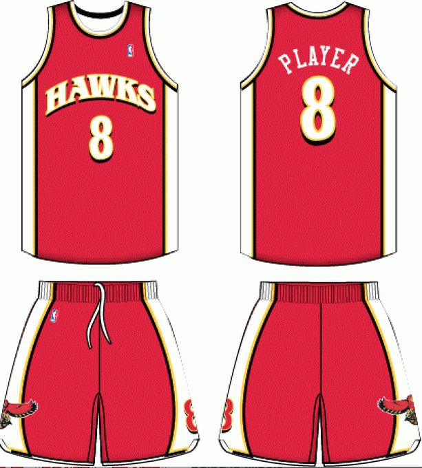
Name = catchy👍 aka @Raptors
Colors = fits region👍aka @memgrizz
Primary = clever, but forced🤷♂️
2ndary = outstanding regional tie-in 👏
Wordmark = a bit forced🤷♂️
Back nos. = not rated need 0-9
Stripping = good, thin red line why?.
Grade = C+

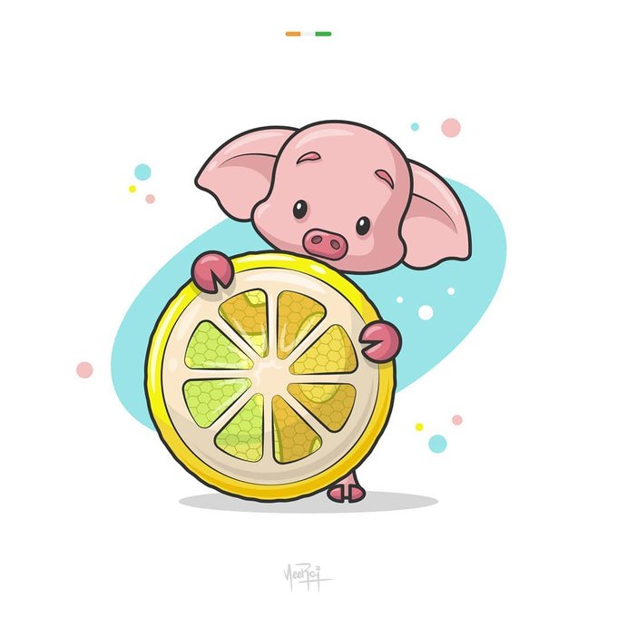
Cute Little Piggy🐖🐷
.
Follow : @logomakers_hq
by vectordiaries
#adobeillustrator #pig #illustration #lemon #dribbble #businesslogo #logomakers_hq #designinspiration #professionallogo #grid #logodesigns #wordmark #piggy #minimalist #branding #graphicdesign #logodesigner


Sheffa (Sheffa Communication Ltd)
-
One of the recent identities I curated in the first quarter of this year.
•
_______
Font: MADE SAONARA
______
•
#brand #branding #brandidentity #logo #logomark #wordmark #graphicdesign #logodesigner #illustrator #photoshop #communication

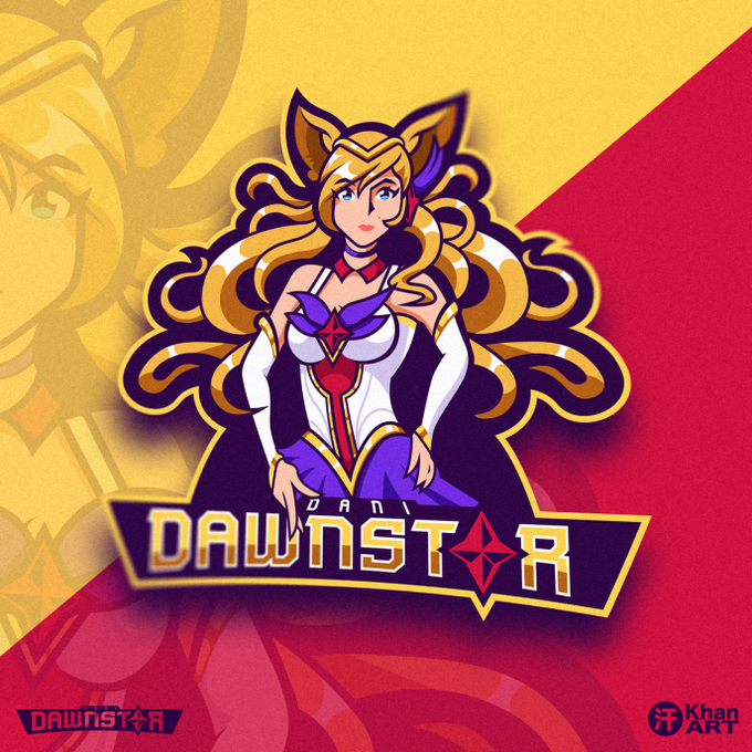
Latest Mascot Design for @DaniDawnstar
Was a ton of fun developing the wordmark.


😂 Caption this Picture, LOL , tag your friends, follow 👉@logobucket_co
follow 👉@logobucket_co
Work by @burnttoastcreative
#branding #visualidentity #brandidentity #logosai #monogram #logodesigner #customlogo #wordmark #logodesigns #logomark #adobeillustrator #logogrid #design

😂 Caption this Picture, LOL , tag your friends, follow 👉@logobucket_co
follow 👉@logobucket_co
Work by @burnttoastcreative
#branding #visualidentity #brandidentity #logosai #monogram #logodesigner #customlogo #wordmark #logodesigns #logomark #adobeillustrator #logogrid #design


@heydaysoslo
Whereby is on a mission to give people the freedom to work and live where they thrive. We helped them with brand strategy, visual identity and digital product design. More to come!
@wherebymeetings
Wordmark:…
📸 https://t.co/biYBH40k7p via https://t.co/qMG785Miys

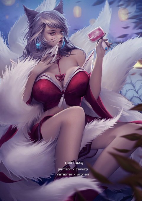

Happy Shedding Season !
League of Legends Ahri Fanart.
#LeagueOfLegends #英雄联盟 #Ahri #ahri #阿狸 #shedding
High quality without wordmarks, NSFW versions and PSDs available at my Patreon:
https://t.co/UKWGwmC1gs


#StreetFighter #ChunLi #fanart
High quality without wordmarks, NSFW versions and PSDs available at my Patreon:
https://t.co/Zl1W3f5pKN

Rate this design out of 10, share your opinions, follow @logobucket_co
Follow @logobucket_co
Work by @kuvaldin
#logo #designprocess #logodesigner #lettermark #wordmark #grid #logo #design #illustrator #logoinspirations #corporatelogo #brand #brandidentity #visualidentity #logos

Mind full art design Got it? Contact @logobucket_co if you need an awesome logo Follow @logobucket_co
Work by @gebelia
Follow @logobucket_co
Follow @logobucket_co
#logoinspiration #brandinginspiration #graphicdesign #logomaker #vector #typography #logotipo #wordmark #typetopia

Got it? Contact @logobucket_co if you need an awesome logo Follow @logobucket_co
Work by @Naolito
Folow @logobucket_co
Follow @logobucket_co
#wordmark #indologram #logocore #logoinspirations #logosai #typism #logos #logoinspiration #logobrand #brandingdesign #branddesigner #brand

Contact @logobucket_co if you need an awesome logo Follow @logobucket_co
Design by @gebelia
Follow @logobucket_co
Follow @logobucket_co
#wordmark #indologram #logocore #logoinspirations #logosai #typism #logos #logoinspiration #logobrand #brandingdesign #branddesigner #branding


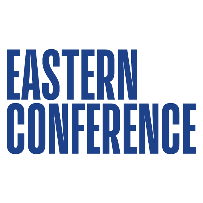
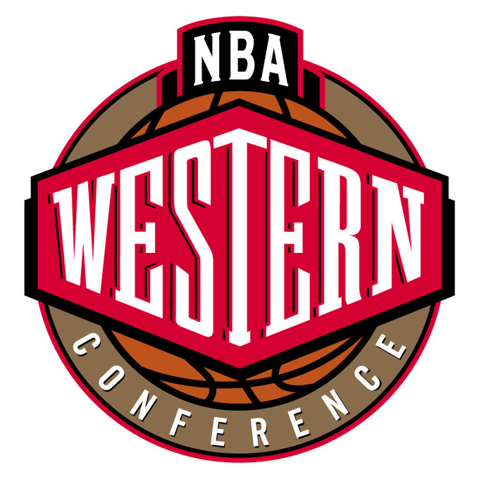

Not sure if already covered, but apparently the #NBA has altered their Conference logos to wordmarks (to reflect the current overall branding):
(cc: @sportslogosnet @UniWatch @PhilHecken @conradburry)