desaturateのTwitterイラスト検索結果。 1,021 件中 11ページ目


i am thinking of deflating stella's hair cause its easier to draw consistently and fits the stoner vibe more... also making it a warmer more desaturated color


Tweaking and redesigning palettes - would appreciate your thoughts!
First one is specifically designed to bring out pinks and purples of an otherwise desaturated palette for a gloomy magical feel.
Second one is sampled from a photo of a lavender field.

Twt can you not desaturate my art
Also gentle reminder that my c0mms open<3


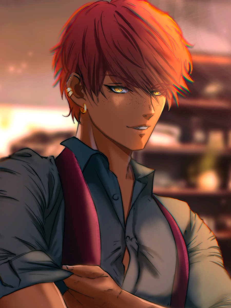
@FungiKy my phone desaturated the hell out of this im so sorrryy 😭 they are so cute i love them tho


Nico di Angelo side profile!
I struggled picking a color for the crown so in the end I went with a desaturated tone oops #pjotwt #PercyJackson
Thread off all the art below ❤️


Behind the scenes~
I use really desaturated colors normally
Most of the time what you all see is different from my original file~


If her skin tone is more desaturated than I want, I will fucking scream. My tablet is so saturated it's so hard to tell. Anyways-- my oc lol


Playing around with editing photos mostly because the original looked too desaturated


@mdashow Thank you so much! At the very start, I wanted that piece to have a bright yellow sky.
Unfortunately the original post looks desaturated on mobile despite looking good on my laptop. So I had to adjust some levels.


Trying new style to paint this, wanted abit more desaturated style but i always saturate it but anyway this style seems to suit me so loving it alr~~
#nicole #Nicoledemara #ZenlessZoneZero #绝区零 #zzzero


@comfortblues_ Second is desaturated cause she’s the grim reaper but >:)


@Kantoristan Dark is fine. It's that Toyotaro chooses very muddly and desaturated tones, particularly on the clothing. He's going for this modern look seen on the Kanz covers but it's all a bit lacking in vibrancy.


despite what "color shading tutorials" always warns you, I don't think desaturated color shading should be demonized tbh.
Not everything should be 🌈sailorm00n pastel/neon aesthetic✨. Sometimes grimy muddy dull color works best bringing the "dark edgy feel" of a work


practical ex: i can use this method to desaturate colors and get their accurate optical values, and more importantly their value relationships. theyre the same values as using dot gain 20, but with actual numbers [that can be translated onto something else]