saturatedのTwitterイラスト検索結果。 11ページ目


6/
Complementary Colors: They are opposite each other on the wheel.
For example blue and orange, or the classic red and green.
To avoid the palette being too simple, you can add lighter, darker, or less saturated tones.


terakhir, di layer baru (6), u pakein mode multiply tuh layer. abis tu u tumpuk semua nya pake warna saturated biar makin nyatu dah tu gambar, kaga acak adut kaya idup gue.
inget-inget kalo sumber cahaya utamanya bukan warna warm, lu jan ikut2an pake oren kek gue.


The colors are lil too desaturated for my liking (except thw skintones), but I really like the artstyle! :3 https://t.co/3EcS1nkIT8

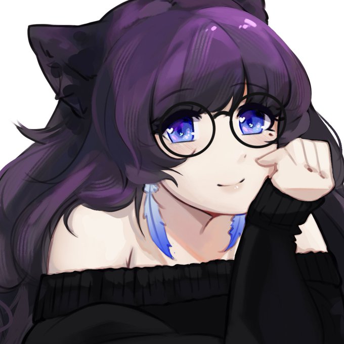

One thing that arknights art has taught me and that amazes me so much is how well artists make colours pop
I love it
So I’ve been trying to do that on my own
I’ve noticed its mostly the whole piece is sort of desaturated except specific things like eyes or hair or other details


Strawberries are really sweet and delicious, yet sometimes one can get saturated with that sweetness. So, adding mint makes a really refreshing mix!
Say hi to @MintStrawbyMoo! This cute cow is the best source of sweetness and freshness for your heart ♥️


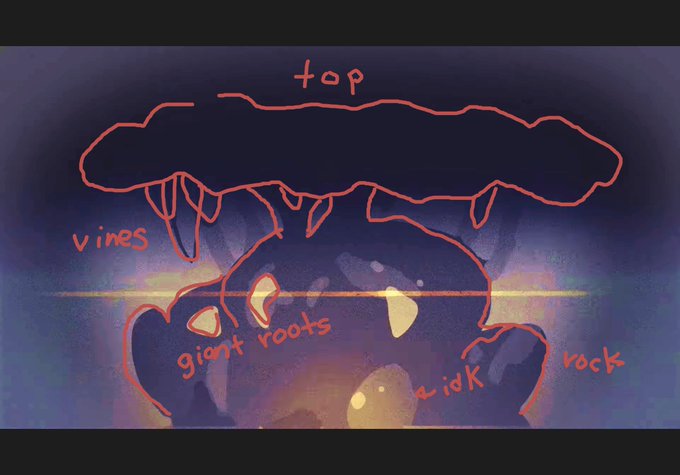
saturated this sc from the splat 3 dlc announcement but i still dunno whats going on. a tree ?? #splatoon3

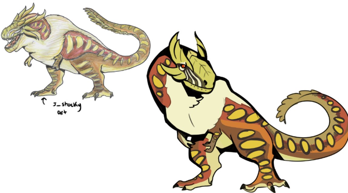


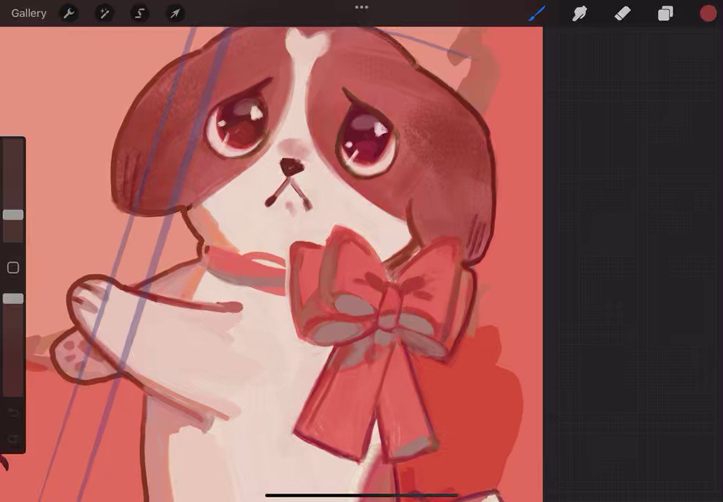


oh ye forgot to include this!
saturated ver. 😤 #ArtXel https://t.co/NIlhCIsxXR


“Gondor the beautiful city, puffy clouds, sunset, hyperdetailed, Ciruelo cabral style, cinematic lighting, long shadows, saturated contrast”
~ Prompt by Ludovicov #MidJourney #AiArtwork


Goblin girl is here 👀
I tried to change the usual paper texture that I use + I used more saturated colours. Let me know what you think and what I can improve!
Despite the fact that I have zero idea on how to make backgrounds lol
#ArtistOnTwitter #illustration #DigitalArt


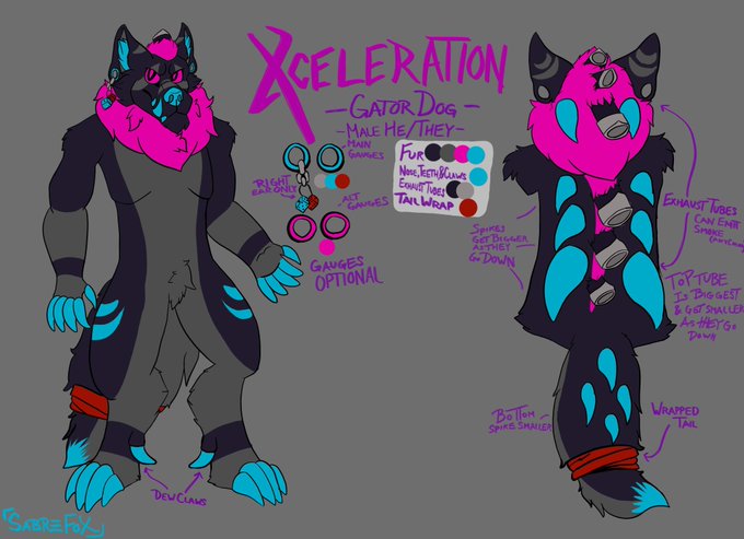

@Setrael I say when making colorful characters to choose 2-3 give or take. Colorful outfits also help! Choosing complementary colors and the magic that is color theory is great.
Offsetting with a "natural" color is helpful too or a darker & more saturated hue of another color on them


I am not redesigning my first sona ever for sentimental reasons but if I ever would, what would make her design better? Make the underbelly color less saturated alongside the hair, maybe?


Lol just realized the thumb was off when I got back to work on this.
Flat colors are applied and will be working on shading now! I'm going to be using a desaturated brown for Bedi's hair again.


In between v0.02 and 510, before the background was changed to the final one, the palette was slightly altered to make the sky a little less saturated. This palette data can be found leftover in the final game.
(Left = v0.02, Right = Alteration before 510)


@azraelmint i also like to make a new layer set to overlay at the very end and gently airbrush areas i want more saturated with bright colors such as the neck/face.
i forget what it's called but i really like to use it for adding saturated edges to shadows


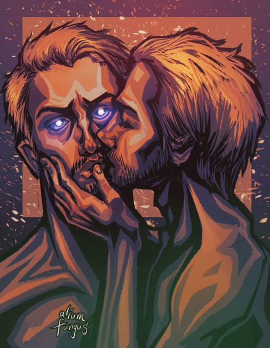


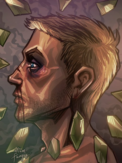
@MonicaM_art I'm aliumfungus and I love D&D, OCs, military stuff, smut and over saturated colours! 🤠🥳