appealingのTwitterイラスト検索結果。 2,733 件中 102ページ目


A sly liccy kitty for @BaraJustinAD Really enjoyed this character and making his grin so appealing! 💦

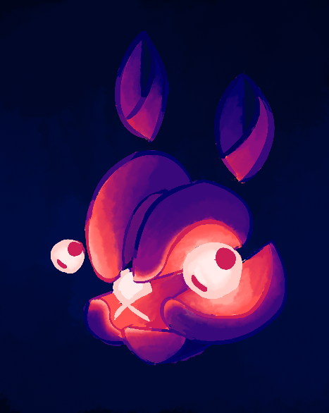
Update on glow bunny! @billiamboy1 struck gold with this design. It's so appealing...


4. Slo'mo is my favorite OC by design. Character structure is simple, color design is a challenge but, appealing to the eye and fits my aesthetic of vaporwave and aliens!

My DM got submitted.
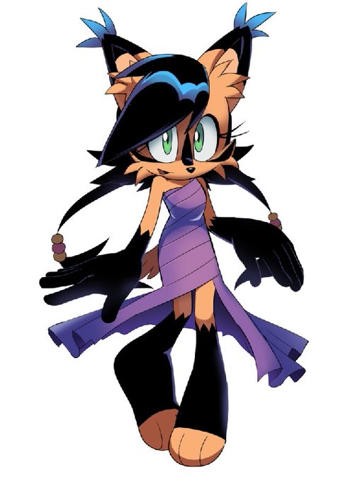
Nicole is my all time favorite Sonic character. Her story is simple but appealing, an AI learning to feel emotions and become lifelike. Her designs were cool, I prefer the classic purple toga outfit but her games-style design shown in OP post is great too. https://t.co/geaLJvrU09


@webcomicchat #WebComicChat Q3 I agree with everyone about the text being legible, not crowded, etc but another thing you want to consider is how visually appealing the text layout is. Here's some of my older comic pages as examples of what NOT to do with speech balloons.




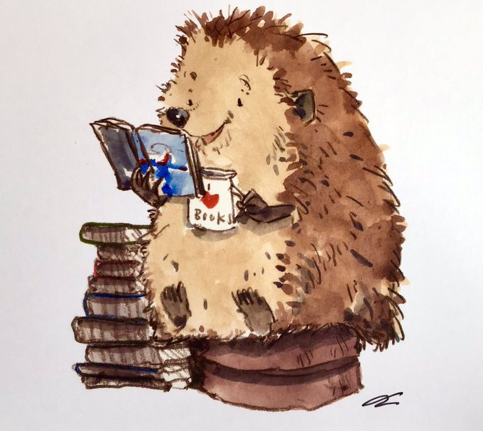

Happy birthday! Your #bookshop looks so inviting and appealing and do hope that it - and other bookshops - can open again soon
There’s no substitute for browsing and handling books
Here some wonderful #illustrations from @iaindwelch capturing the #joy of #books & #reading.. https://t.co/mFzalXiyrW

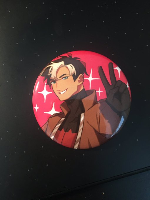

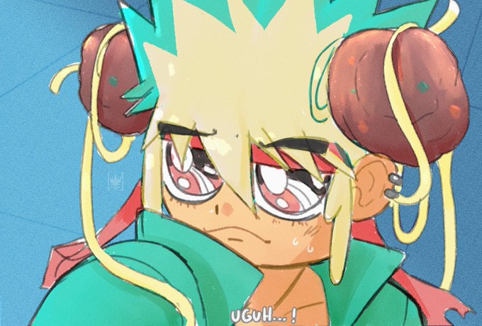

I confess that I didn't want to join into the sailor moon redraw cuz I didn't find it appealing but I just have a random idea and..ehh..Garui the BISHONEN is now a reality.
I should be working actually.
@Dibujnautas @ArtistRTweeters @TheArtistHelp
#sailormoonredrawchallenge


I don't have much art from @SorcererLance, but what I do have is one of my favorite commissions! These also seem to be a favorite among my followers. His smooth and rounded approach to paws is also iconic and appealing on several kinds of characters.


Here's said picture. Never got around to shading or anything. But the pinched thighs and puffing pockets are kind of appealing. Maybe I'll redo this one with her current design.


There's something strangely appealing about characters with suspicious auras that you can't trust


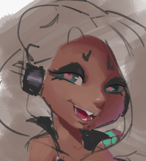
Faces still give me some trouble, but hopefully they're getting a bit more appealing.
Left is from August last year and the right is now. The current one is less detailed but I think I like it more.
I'll probably keep working on the current one but the tentacles suck to work on


Do people think the classic Mega Man art style is unappealing or something?? Why does almost every Mega Man adaptation go with a weird different art style


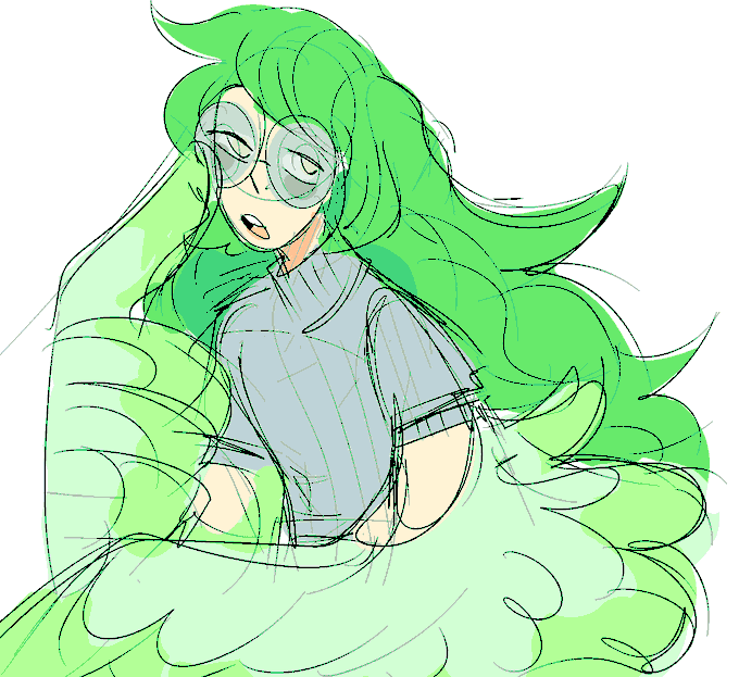
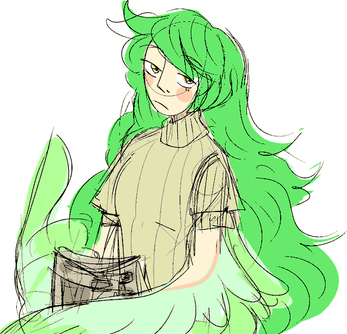

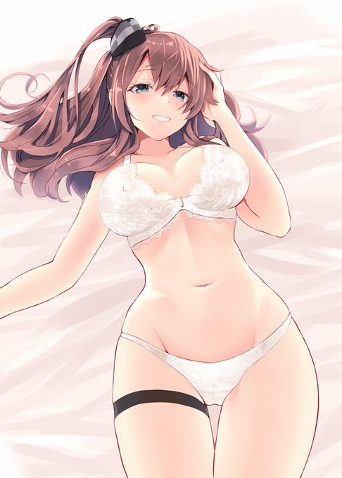

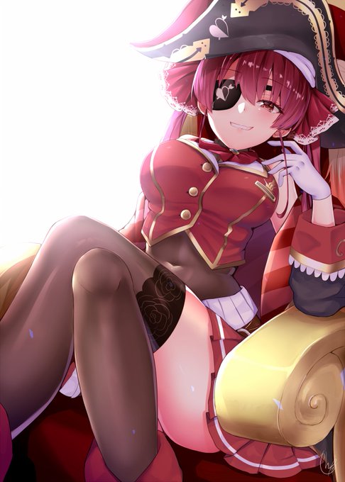
@Rongmario I agree.Her illustration is beautiful enough,but ,for me personally,not enough sexually appealing picture.

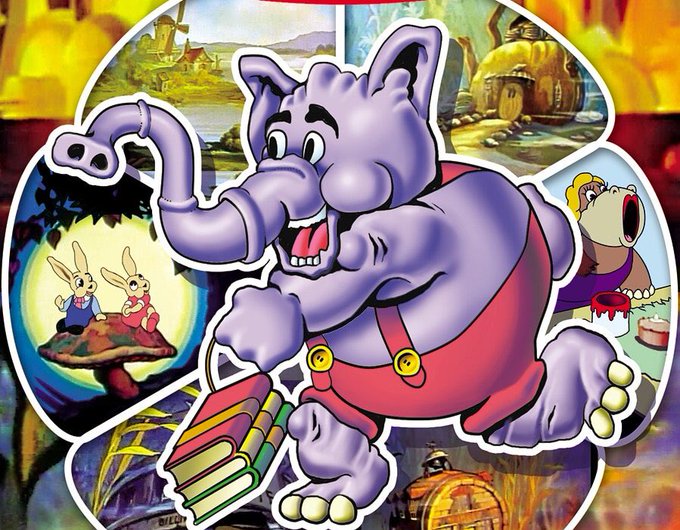
Them: “Can you keep your drawings appealing and clear while also maintaining a classical sensibility?”
Me: “Huh? No, yeah. Totally.”

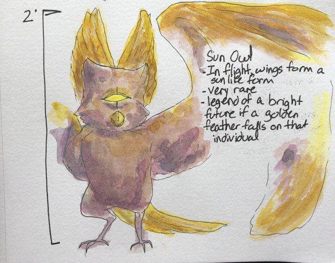
Here’s another #monster owl, just a lot more appealing to the eye! #watercolor #art

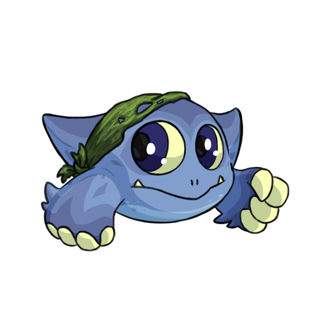
realized that there isn’t a tyrannian kiko yet and was like. oh god would it even be possible to make one that’s appealing
so here’s my attempt. vaguely diplocaulus inspired, with a seaweed wrap instead of a bandage because those weren’t invented yet