JustMeのTwitterイラスト検索結果。 5,243 件中 103ページ目



GM
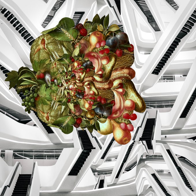
made a new front layer yday night
note to self:
collaging in the dark is hard on the eyes and gets you some weird colors… usually too green/yellowish like 👇
(color adjustment tips anyone?
me struggling here)

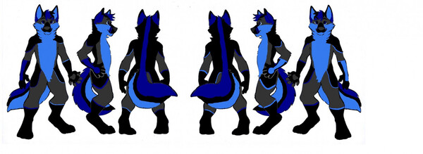
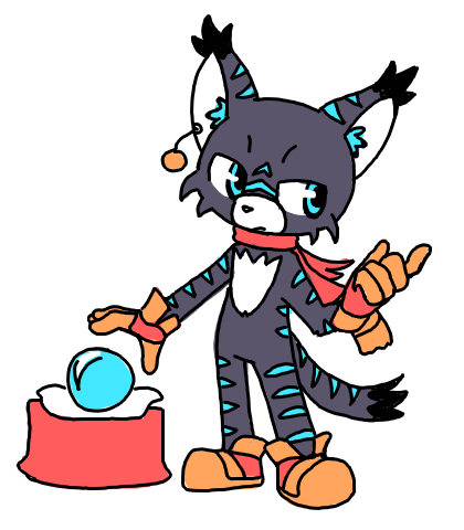
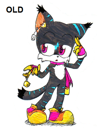
Here is Fenry Wolf v.2.
I added some stripes to the arms and legs compared to the Fenry Wolf v.1. and made a few visual adjustments.


🎄!!!HOLIDAY YCH!!❄️
∙ 4/5 slots left
∙ $20 flat, $25 shaded, USD / paypal only
adjustments will be made to better fit species/genders/body types
DM to claim!


Why measure Key Performance Indicators (KPI’s)?
To Understand the performance & health of your business so that you can make critical adjustments in your execution to achieve your strategic goals.
They should be specific, measurable, attainable, relevant, and timely.
-🍌🐀.


All designs I got from @sunnyvalerian
Pretty poke girl line up!
Some got very small adjustments
Left to right:
Castello https://t.co/2abDQIYFMA
Lele https://t.co/kFPxshpqra
Mei https://t.co/HxcOCuMT2E
Rosalie https://t.co/MX00QJgVZ4
Sweets https://t.co/CIBGs8ba3q


It's quicker and gives you more accurate values than turning saturation to 0%.
Using a B&W adjustment Layer can also work, but I tried it on different images and the accuracy fluctuates.
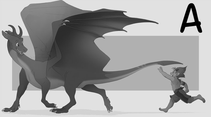
A: Turning saturation to 0% (incorrect value)
B: CTRL + Y (more accurate value)


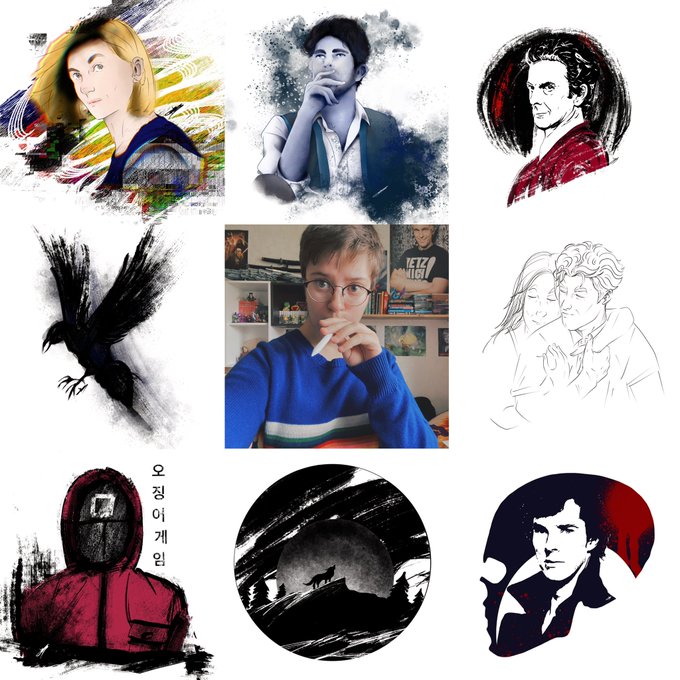
#artvsartist21 I think it was a good year for me 😊 I could keep my job and have fulfilled my wish to draw more in this year and here we are ✍🏻
Thank you 💙
#artist #artvsartist #procreate #justme #drawing #art


@Koinkopup depends on what i'm going for but it never passes double digits in layers
the characters are only on 1 and the rest are adjustment layers and effects stuff that i'm too nervous to merge down haha


this'll be the next screenshot I redraw but I'm... making some minor adjustments 🥲


Finally, Paper Jam had even more body angle adjustments. This is the most forward the bros have been angled. They also returned to their traditional black. It remained like this in the 3DS remakes of Superstar Saga and Bowser’s Inside Story. (6/6).


In Dream Team Luigi’s high waters were ditched in favor of fitted overalls like Mario. Also, more body angle adjustments (it’s a little harder to see but if you tilt your head you’ll see the Bros are angled forward a bit more.), and of course a blue hue. (5/6)
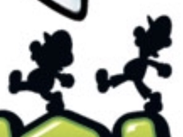
This was a staple of a lot of promotional artwork for the series all the way up until Dream Team. In Bowser’s Inside Story the silhouettes returned to their traditional black color, as well as had slight body angle adjustments (The Bros are more forward rather than upward). (4/6)


Take a look at those minor adjustments yet major progress. thank you 2021 me, u did well. #artvsartist2021