SaturationのTwitterイラスト検索結果。 103ページ目


Another example: Kyriena's rainbow wings look pretty bright and colorful, right? Guess what- the greens and blues are pretty desaturated here too. Here's her actual wing colors, and then her wings at full saturation for comparison.


-- UPDATE --
100DaysDrawing
Day 023/100
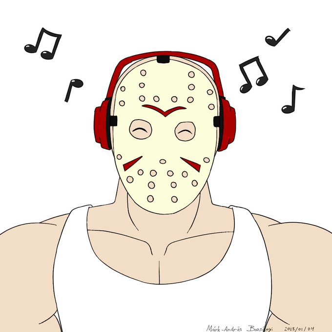
Jason Voorhees listening music with his red headphones and showing off his huge muscles. I didn't quite like the outcome, the colors. It was due to the luminosity and saturation of my screen.
Here we go again.


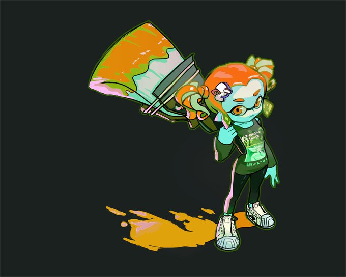


More practice painting and some parts I'm happy with some parts not and sunlight on brown skin adds too much saturation but WOOOOOOO


オッド・フューチャーらとも比較される西海岸のヒップホップ~R&B集団で、今年8月に発表した『SATURATION II』が様々なメディアの年間ベストに挙げられているブロックハンプトンが、新作『SATURATION III』を発表、全曲フル試聴可! [album stream] https://t.co/k79osDllF4


The new Brockhampton album (saturation III) came out this friday together with a short film by Kevin Abstract, Billy Star, it inspired me a lot, here’s the result of that inspiration. @kevinabstract @brckhmptn @nicksholiday
#brockhampton #billystar #saturationIII


Today's warm-up was some color practice inspired by one of @TaylorNPrice 's recent posts. I always saturate my colors entirely, so I'm working on scaling back and using saturation intentionally! 🐛

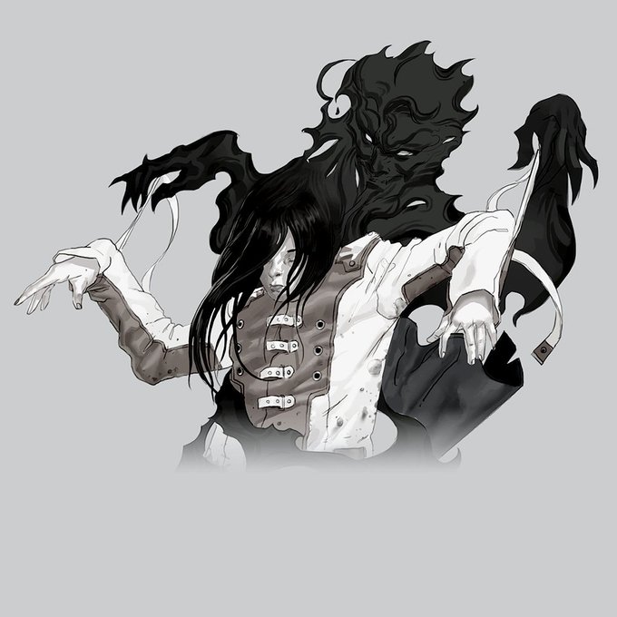
Alice art from Silviu Sadoschi with a bit of saturation tinkering to spook her up a bit! #conceptart #horror #artoftheday #sketchbook #digitalart #illustration #digitalillustration


There, tweaked the saturation down a smidge. Sky is still really bright but w/e.




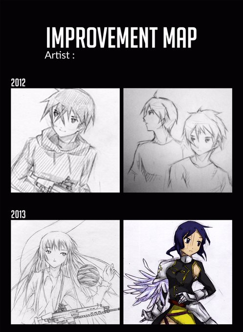
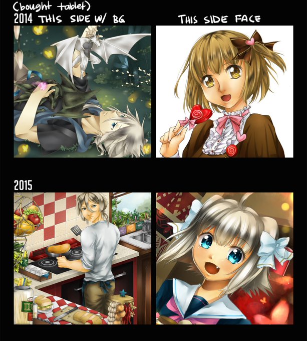
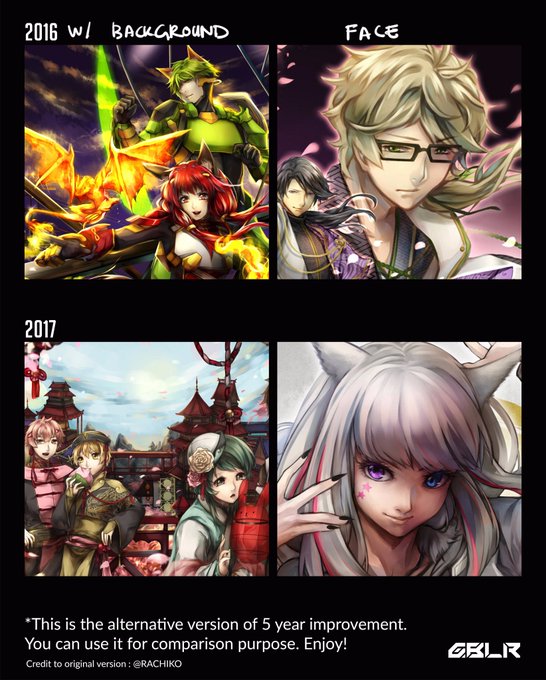
tldr
1. goodbye lineart i never liked you
2. more dark/low saturation pics where is the light in my life www

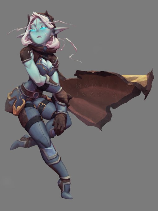
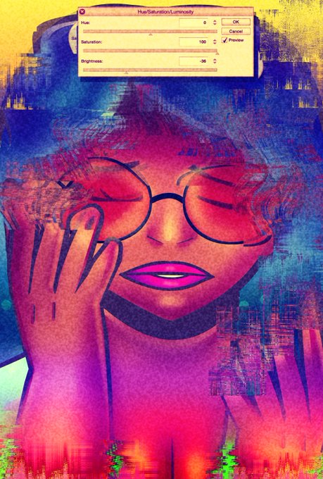
10a: Go back to my Mid layer and use Ctrl+U to change hue/saturation. Click colorize and use sliders to find a tone you like. Do the same for Black and White layers. Made a new layer on top set to overlay with low opacity, using a soft brush with black and white to enhance form.

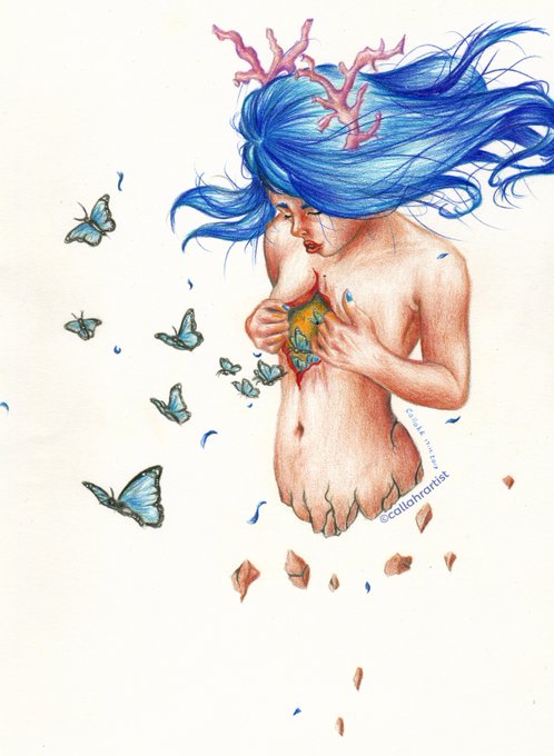
New #drawing :)
I really, really like how it turned out. I am more used to work with #graphitepencils, so it's way easier for me to shade because i don't have to think about color values, saturation and #color mixing xD
#illustration #ArtistOnTwitter #surreal #traditionalart


#6 DECIDUEYE
This is how to do adding saturation right. The turquoise, against the white & red, pops so nicely.


Finally took some time to work more on this. Fiddled with exact hue/saturation and came up with a solid set palette finally n.n;;
I LOVE RUBY

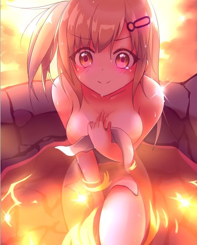


Playing around with portra!! I had to turn down the saturation for all of these on my own after tho. 💦💦💦

