CONTRASTのTwitterイラスト検索結果。 10,494 件中 104ページ目


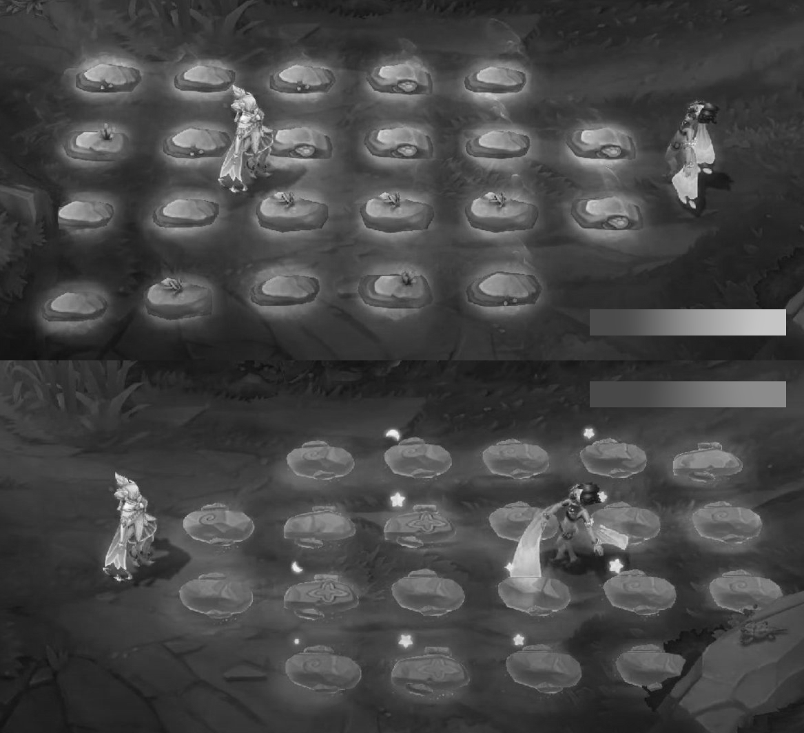
@notallwitches oohh actually i was wondering why no one on the feedback thread mentioned how low contrast the values of he rocks looked in comparison to PP, I guess they where using base taliyah as a base for clarity maybe


Also trying to be more bold with the shadows but seems like it's still not contrast enough. Will improve next time!


Holly, Ella’s daughter now joins her on the paper! They make such a sweet pair and as an artist I love having contrasting fur colours to work with 😍 #spaniel #dogdrawing #petportrait #animalart #spanieldrawing #springerspaniel


@_Sonia_Perez_ @rmtrl1 @slow_trees @Elizabedsh1 @photo_gurapher @SaysJey @nm_arte_ @no_faith_left @reyhanmente @kianataiyo5 @ilknuryavasci @Maria_nkfrv @cryptogrl_ @Labelsonhumans Hi my friend! I love this painting precisely because of that minimal contrast and the mystery it conveys.
Here is my recent nft "EN ESTADO SALVAJE"
https://t.co/saWrlSEbxR
@sanga @lucianaguerraok @AntonioWerli


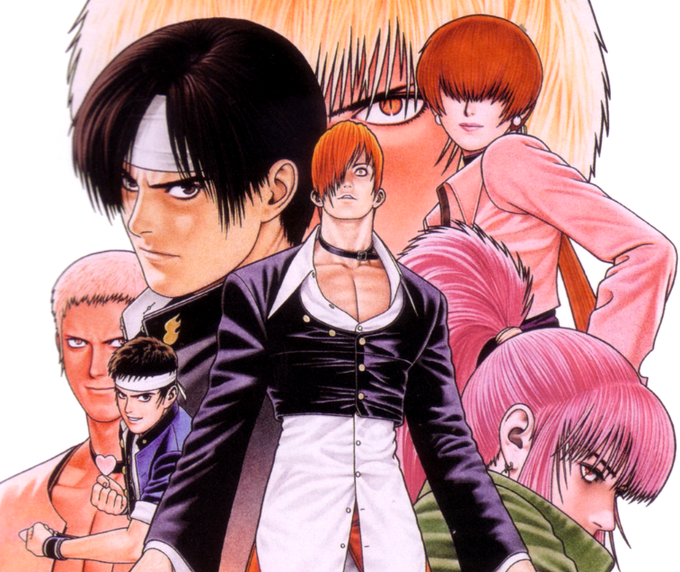

@ducapb Jogos de Luta e seus designs, os de KOF e da SNK em geral, tbm me inspiro bastante em animes dos anos 90 mas jogos de luta meu...sempre achei incrivel o estilo "anime com o realista" tendo contraste que só o Shinkiro dava nas suas artes quando adaptava os personagens


New vibes for summer contrast, high strong colors with old engraving . #tondo #design #homedecor #gold #marble #pattern #interiordesign #graphicdesign #art #creativity #luxury #fork #spoon #horse #geometry #italian #madeinitaly #architect #zodiac #white #zebra #sky #stars


“Yaaum. The Whimsical" ❄️
25th OC, and funnily my only ice one. The contrast in design was my focus here; big sharp hammer, with soft round fluffy character. More content in replies.
#ArtistOnTwitter #characterdesign #art #illustration #Art #Artist #characterart #Animeart #OC

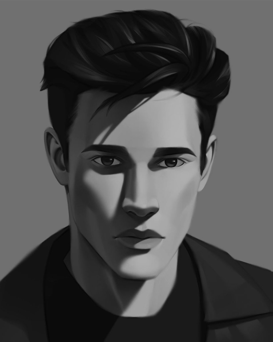
I think I got some problems with contrast here but I still quite like it. Well... kinda😐
.
.
.
#digitalart #digitalsketch #digitaldrawing #artistsoninstagram #artoftheday #digitalartwork #digitalpainting #drawing #draw #drawingoftheday #drawings #drawingsketch #doodlewarriors


Another little messy doodle, because I'm working on a bigger piece and I need a lot more time to finish it
I decided to try to design some better clothes for Berith and Miekke and I'm kinda like them
I probably play with the colors to make sure the contrast is there but-


Watercolor #painting of the dramatic #storm sky, titled "Sky No. 6'" (30 x 40,8 cm, 2017). I just love those contrasting colors!
You can find the original watercolor and signed art prints of it here:
https://t.co/BO4WBzUoE0
https://t.co/cSVqObweKm


@Lithmariel IDK when we went from contrasting colors, to dirty and dull, but I'm not happy about it


Earth lines is inspired by ploughed fields but when I'm working on the foreground area, it becomes more about colour and texture interactions and abstract mark-making. The trees give focus, contrast and a sense of scale. Print sold out but cards available https://t.co/FDtE8nF9AR


I did a funni while experimenting with changes for The Furbag's Sonic form. I like the contrast between these two.
Curse just wants to know where he is.
Curse by @x_guttedangel
(#sonicexeoc #sonicexe #curseofx )


Been trying to develop a lazy way of getting realistic lighting lately, I think the trick is to go to the extremes of dark and light within one piece, that way you can get contrast. If there’s a larger range of light in the piece, the lights look lighter and the darks look darker


Venom Swimsuit
I just finished the single color now...
I want to add a final shade to her, but I'm too tired. 😫
Can someone color the contrast,shade for me??


“As it’s form defined itself, a flood of Dread washed over me, it spoke to my mind directly in a language that has never existed, yet I understood it. It’s crooked smile never wavered contrasted to its endless reshaping of its liquid mass.”
“It…hates.”