DifferencesのTwitterイラスト検索結果。 5,416 件中 107ページ目


Drawing Once a Day in 2021, Pokémon 317: Swalot
((Shiny, gender differences))
#swalot #PokemonGo #Pokemon #shinypokemon #pokemon #Dailydrawing #DrawDaily #DailyDrawingChallenge


I love @sarvbies version of Huggy ;D; I've had this fanart just lying around and finally wanted to get it wrapped up and posted!! Huggy differences between Charlie and Rini XD <3 #PoppyPlaytime #huggywuggyoc #huggywuggyfanart


I've been making re-designs for these characters since 2014, and it’s always fun to see the differences
The old one makes me cringe somewhat >:/// i don’t like it,


When characters in a franchise decide its time to set aside their differences for a family photo 😭


Not gonna go TOO in depth with the differences between MCU vs 616 Clint but I will tell you this: One Clint lost their family dressed up as a sad ninja boy and went off to kill people and the other Clint knew he was about to die and delivered the dopest final panel ever


European animals drawn for awooden's event 🐺I love drawing subspecies(like this scottish red deer) so I can try and figure out the subtle differences between them all


There are two sides to every story. A little girl finds a strange beast in the woods and takes it home as a pet. But that night it escapes. Then the beast tells the story of being kidnapped by the girl! Can the two beasts resolve their differences?: https://t.co/XdP2HXuKAe


I may as well post the differences between Khato's first design and his latest. I, uh, kept the blonde hair, that's about it.


A new comic was released for ShinyColors featuring Chiyoko, Juri and Natsuha! Enjoy the translation~
At least Juri and Natsu can settle their differences rather quickly these days~
#シャニマス #idolmaster

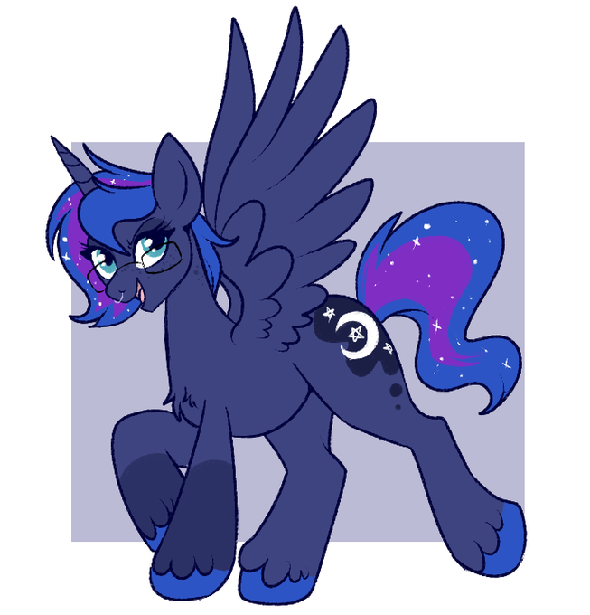
differences between kin!luna and regular luna: short hair, glasses, somewhere between s1 and s2 luna height, lil sockies in the front #mylittlepony


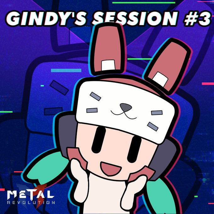
#GindysSession
Hey Revolutionaries, did you notice the differences in the interface between Metal Revolution and traditional fighting games? Join Gindy's session and learn more about it:
EN: https://t.co/K6i1VtPcqv
ES: https://t.co/8Wu4dJGc4Q
PT: https://t.co/Q1JdIjOpiX


There are two sides to every story. A little girl finds a strange beast in the woods and takes it home as a pet. But that night it escapes. Then the beast tells the story of being kidnapped by the girl! Can the two beasts resolve their differences?: https://t.co/XdP2HXuKAe

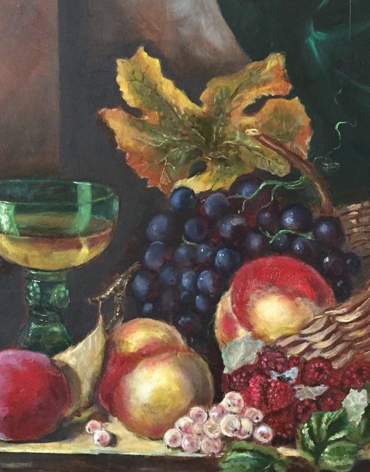
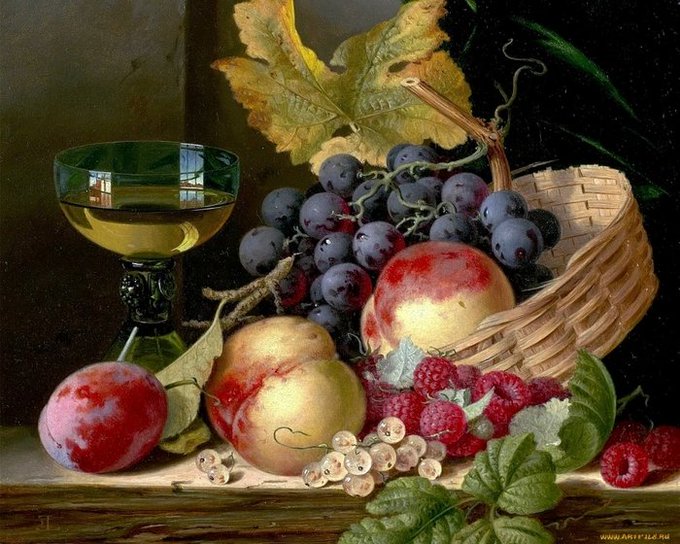
@NadinFrog Oh, I'm really proud of myself, it's a lot of progress for me.
But if you compare my copy and the original, you can notice a lot of differences.
I paid attention because I know that you are also passionate about drawing (and painting, perhaps?)


“United? Unity isn’t about being the same. It’s about working together. What you can’t calculate, Ultron, is that our differences are our greatest strength.” - Tony Stark
You have superpowers because of your unique experiences, skills, and ideas that you've connected from those.


@sultrymistress Posting before I forget about the time differences — really, happy birthday again dear Eiko! Thank you for being the kindest and most encouraging soul 🥰💞🖤