visuallyのTwitterイラスト検索結果。 3,311 件中 107ページ目


I dunno how obvious the improvement is visually, but I know I've improved like, astronomically, I feel so much more confident in my art now 😤✨

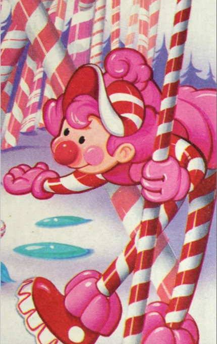
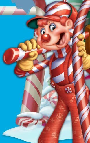
There's something so visually cute and charming about the original Mr. Mint design that it sucks he ended up suffering the generic Disney-fied curse that'd always happen with mascots in the 2000's


Another page revision down! I just changed the last panel so it was more visually clear and the coloring would be less harsh.


Tbh I can’t really see that distinct of an improvement, though from what I can see is that it’s my anatomy and use of colours. Really wanna try to break out of my defaults in art and do more visually interesting stuff. Also should draw more in general lmao


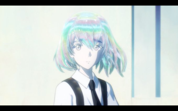
here we can all look at the [hidden lineart layer] version of the pt fanart i finished the other night. still visually intelligible so that's a win i think


Starting the holiday festivities early by watching one of the most visually disgusting films ever made:
Ron Howard’s How The Grinch Stole Christmas


Sometimes doing nice practice with storyboarding and coloring. Basically using #Destiny2 Universe, bec it is really unique and sadly can be untold visually for fans. So I always drawing my ocs in different locations. For the practice im usually using pinterest #DestinyArt


@MissBicepslol I just think the opinion shirks creativity. Some of the BEST skins have come from male designers for female champs visually in League. Pretty damn sure a dude made this:

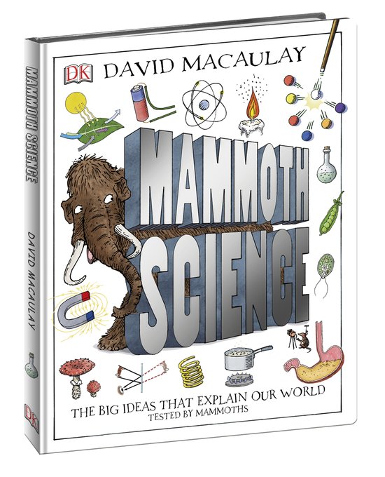
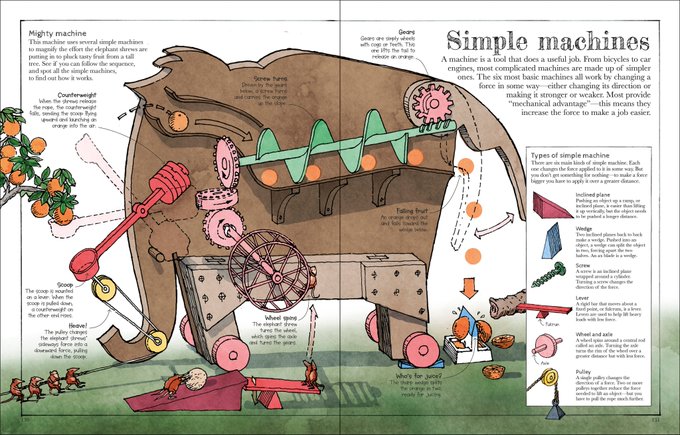
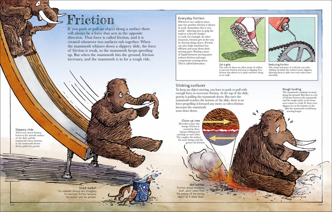
"A visually appealing science book that takes kids on an adventure through basics of biology, chemistry & physics...uses humor woolly mammoths & elephant shrews…sprinkled with humor…to explain & demonstrate each science concept" @pausitiveliving https://t.co/5lWi60PLOz #STEM


is there a reason why we never talk about this version of dick, visually speaking??? LOOK AT HIM


- appeared in second season and instantly made it better
- willingly abandoned lavish lifestyle for squalor
- locked away from society for large part of childhood
- continue to support the gang with wealth and connections
- horrible manners
- pro wrestlers
- visually impaired


sup, I'm leo and I like to draw an animate furries and anything else I find visually appealing!
#transmascartists


Toriyama's Character Design of the "Devil" shadow in Blue Dragon Grand Beasts of Another World (2009/10/08) — He also had creative control designing main characters & the packaging.
Visually, he looks sorta like your fatso uncle. Mechanically, he's good at disturbing enemies.


This comes to mind because I was thinking of parodying the Daywalker speech with Penne as a comic comm. "Half in one world, half in the other, I am the Gaywalker! I have all of their strengths, none of their weaknesses, except the thirst." But turns out that scene's visually dull

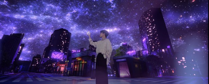
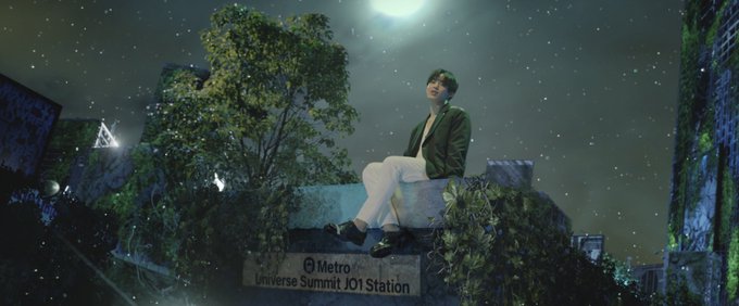


seriously, the MV is visually pleasing even in 2K 😍
#JO1_ShineALight_MV公開
#TheSTAR_1125
#ShineALight
#拓実くんセンターおめでとう
JO1 / Shine A Light / Starlight / Safety Zone / MONSTAR / Be With You (足跡) / OH-EH-OH / 無限大


Sponge on the Run might not be the best of all three spongebob movies (still think the first one is the best), but it definitely is my favorite visually.
Just look how stunning Atlantic City looks. 🤩
#SpongeOnTheRun #SpongeBobMovie #SpongeBob

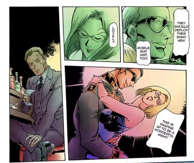
Not only is it visually just beautiful but The Origin is just so damb sexy.


I had help with the text-placement and fonts etc from Rozen (I'm really not a visually-minded person), and additional visual help from @GhostTownGoldie, who suggested @JenAReuter to do the final artwork. Here's it without the text on: