visuallyのTwitterイラスト検索結果。 3,294 件中 108ページ目


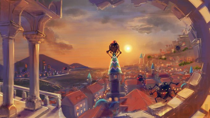
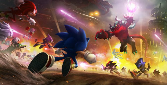

I think Sonic Forces 100% had the right ideas in the conceptual stage. They had the visually creative levels, high stake Unleashed inspired story, ambitious ideas, no pandering, etc. You can tell they wanted this to feel like a 2000s Sonic game.
Too bad execution sucked...


I'm adding Tatsuya Nagamine to my list of favorite directors! Between Happiness Charge Precure, Heartcatch Precure, and the Yes! Precure 5 film, this man is a legend when it comes to pumping out visually expressive, personality-filled, wild Precure rides that are nonstop fun!

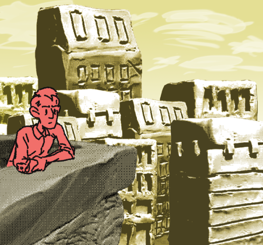


Changed the citadel a little bit, just by adding a little more greenery. Another version had lots of hanging moss but I thought it looked too visually busy.


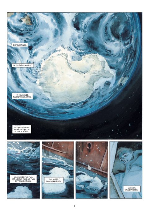

Currently reading The Moon is White by Emmanuel and François Lepage and I love it - which I can say for pretty much everything by Lepage. It is a visually beautiful documentary in the comics form.


@Doomlord115 @abstractslug I think I preferred the allied assault destroyer in ra3 in terms of utility but visually Cybran have them beat

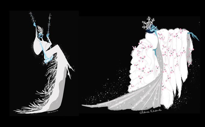


Sometimes I think about the much more visually interesting designs they pitched for Elsa when she was a villain
Instead they were like “yah u can tell she hs ice powers bc she’s blonde :)”


Here's some Scooby Doo Mystery Incorporated backgrounds. Way more contemporary but so nice looking. That show is a bit of a hidden gem visually. The style was very cool!

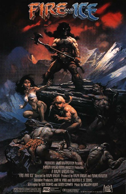
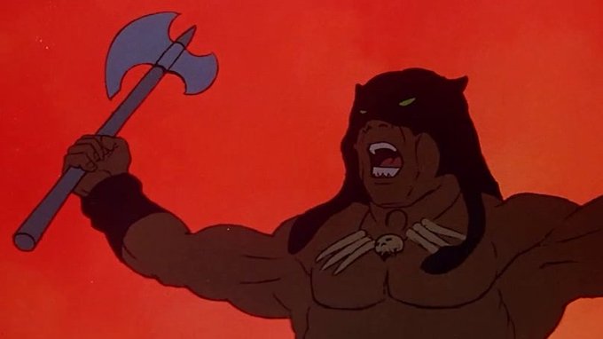

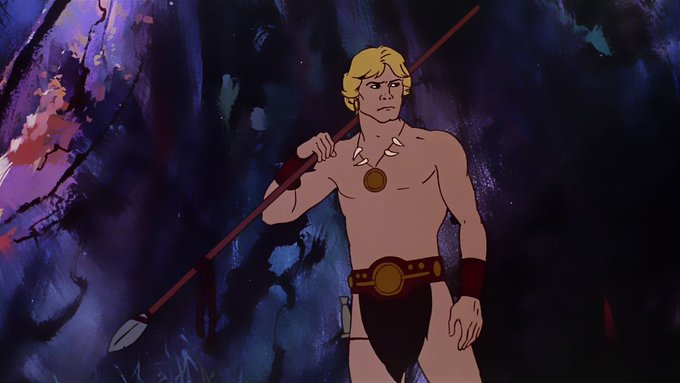
Fire and Ice (Ralph Bakshi, 1983). Ngl it's aged badly, with a lot of problematic elements, but I still adore this movie. Vintage swords and sorcery will always be a love of mine, & Bakshi's style added with Frank Frazetta's legendary touch makes it visually striking.


before knowing i was lgbtq vs now
tho i don't think much changed visually, my lifestyle/happiness for sure has changed. i don't think i realized how depressed i was as a teen before i got to college & realized i was bi.
independence works wonders, man https://t.co/8HKFJd4D8c


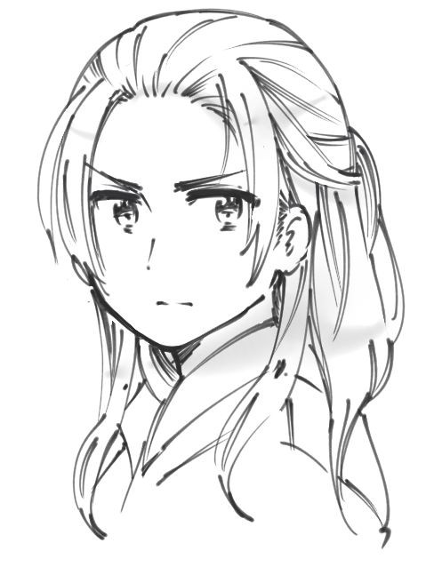
still trying to find the words that can explain the difference between hima's art and cioccolatodorima's art for a thread i'm going to make shsgshs like if you can see here they're visually different but i can't find the right words to point them out the right way

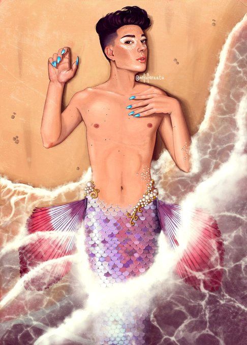

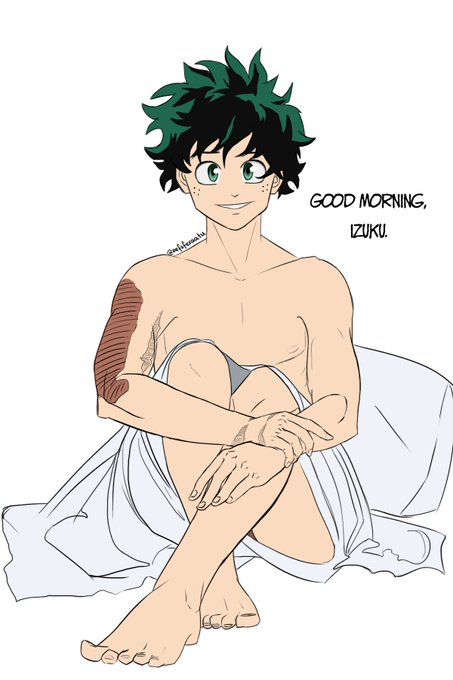
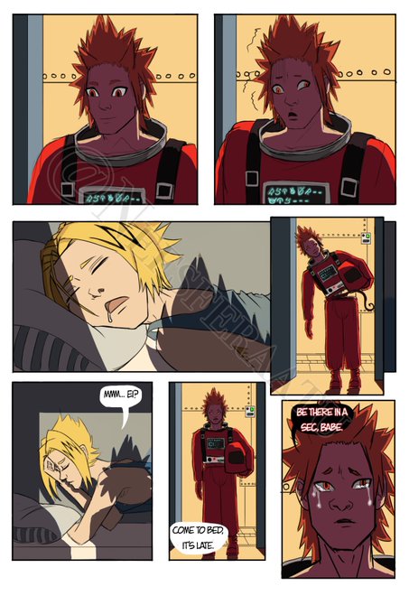
@Saxypenguin @kuuroramen omg, thank you for thinking of me! you're awesome 💖💖💖
I make nsfw fanart & original stuff, much of it problematic, so please BE AWARE OF THAT before you check me out.
Also, I'm still finding my style, so it's a bit of a mixed bag visually for now. And I take comms!


This flower has petals that aren’t seamlessly connected to each other. Because I still want them visually connected I cover all the front petals with one red, leaving out the highlights. Not painted them on, like you do with gouache or acrylics etc. /Left it out. /


So dongju watched Miss Peregrine's Home for Peculiar Children too?? Wow i didn't expect this. The movie and the story is good but visually it's kinda creepy. His movie preference is so diverse....


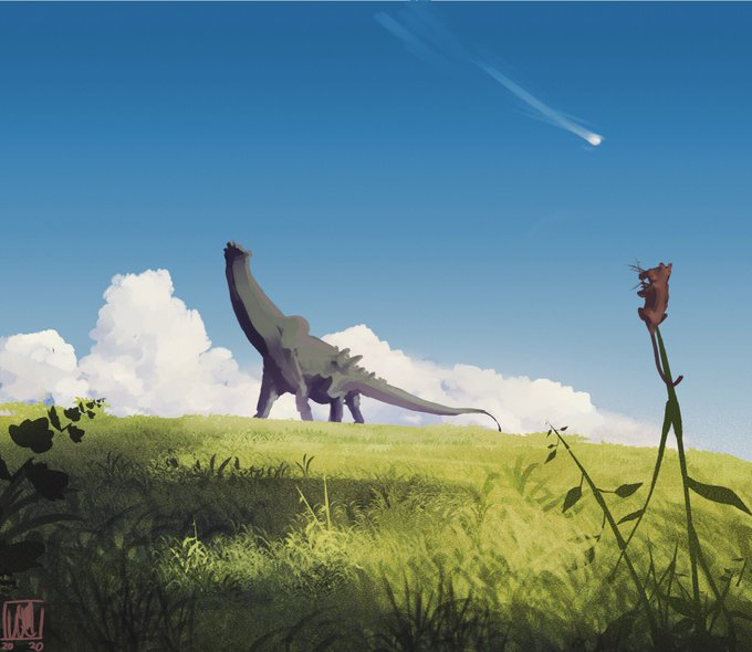
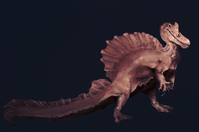

Idk why I like giving my large dinos such uniform colors. I think they just look more natural that way and make images less visually busy https://t.co/3udZzyB6sb


Didn't document rigging as it's not the most visually interesting to capture! But here was a mini animation I did to test the blink and pupil! Pupil just rigged with a separate bone so if you scale the bone it expands/ contracts (9/?)


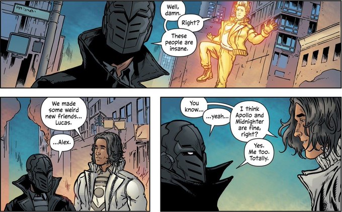


OCtober #6: an unnamed character still in development. i've been calling him "the wizard".
i've been approaching him visually like some kind of spaghetti western hero. like a cowboy wizard. thus the poncho.


i think what i like most about this one is the size of hong. he was around ten when he was caught and this size just feels more realistic for me visually