appealingのTwitterイラスト検索結果。 2,756 件中 12ページ目

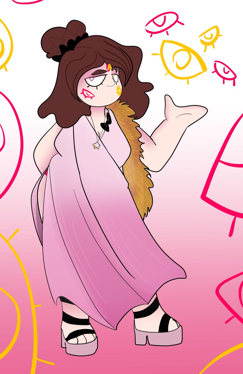
since i dont rlly consider A a persona that much anymore an rather jus the "writer" of the shit going on like some goddess i redesigned her for the better
and this is not her full form it's just the appealing one for the human eye to not get their eyeballs exploded


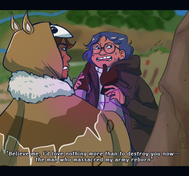
Villain Ocs?: I prefer to say antagonists, bc a lot of my villains are not evil per se just rude or often oppose the protag. Some are but I don't like getting into the proper villain mindset it scares me. But I strive to make many of my antags visually appealing, if only to me.


Back in 2020 I dont really like how I do eyes bcs it feels so empty
I started experimenting on how to make eyes looks appealing when I start working on Vtuber model
This is an example of 2020 eyes


Yes another updated commission sheet 🤦♀️I felt like the previous one was not appealing enough hek. This one displays my art alot hehe Feel free to DM me if you're interested! Thank youu!


I always draw hands and feet appealing, I think there's subtleness play with when drawing them.... Also I like sleeves that cover part of the hand lol

Shueisha gets a lot of flack for their colour choices, pretty fairly so, but sometimes they actually make some really appealing design choices that just get scrubbed in the anime pff
Perla’s hair is one example, I think the dyed streaks just made her really stand out


@JamesTurner_42 Very cute!
Btw, have you ever hear of this game, Bomberman?
It’s an underrated but very fun NES classic created by the Mario Party company, Hudson Soft!
I thought this would make an appealing game for you and would love to see this cute robotic alien in your style!
💣💕


Artist: Alan Stewart
Source: https://t.co/EkLw0fI3HP
Stewart creates a dynamic pose within the character design that pushes the body in such a way that's appealing
#agorastudio #framebyframe #characteranimation #animation #conceptart #characterdesign #lifedrawing #figuredrawing


I also finally drew @Shnikkles's Beetlejuice because it's the most appealing version of the character I've ever seen and I've been to intimidated to draw her design for so long.


“The struggle was really in that I settled too early. Luckily I had help with coming up with a much better, more interesting and visually appealing idea and I learned to try and think a lot more before settling…” - @ethanscharleart Concept Artist


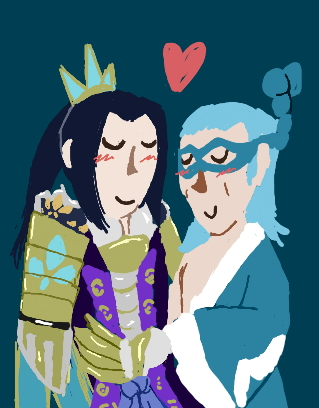
@NigelGraz Here is Filipa, my most beloved dnd character! Absolutely disgusting in the most appealing way, she is a bard who picked up necromancy in her quest to find somebody who could accept her as she is... playlist: https://t.co/1UtnAE8AGz


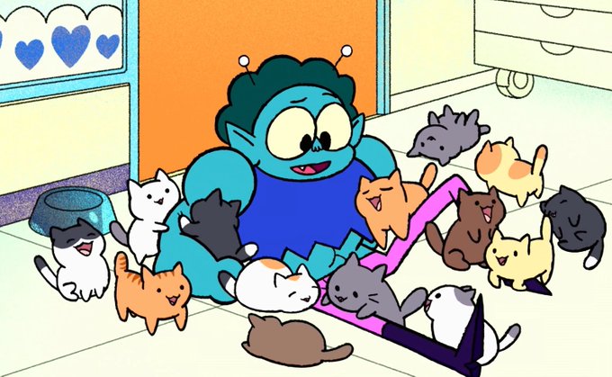
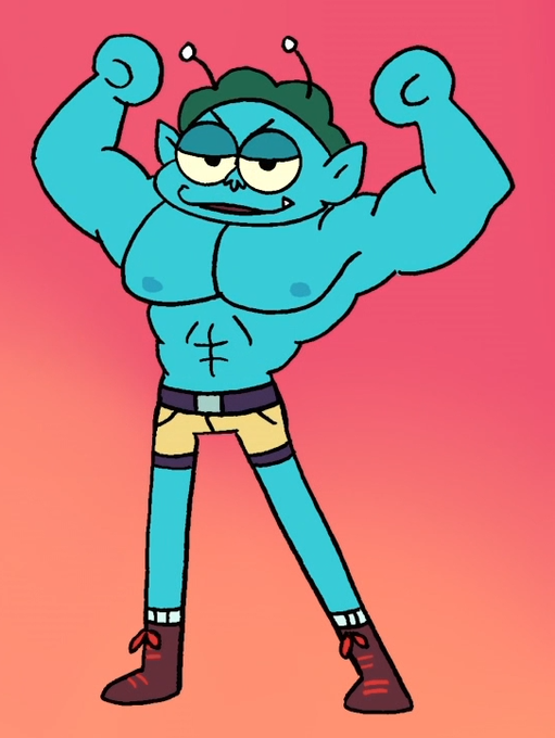
It's so weird that Rad pretty much was appealing in exactly the same way Lance was to me before I discovered SBT. They're both big buff alien dudes, but ultimately it was their growth as people and caring sides that won me over and made them some of my faves.


i just think there are way more appealing AND narratively connected visual design choices, you know? even if Menphina looks youthful-- that's not really what bothers me-- she doesn't have to be a miqo'te or anything but maybe silhouette? alluding to the Keeper sacred face paint?


ANOTHER long break -> the caligula 2 and PLA OC art that we're at right now in 2022. At this point ive definitely gotten better at using digital art programs and figuring out how to draw in a way thats appealing to me. come on 2023!


my art before then really was so....well i dont like it much. back then i (tried) emulating a bunch of different shit to make my stuff look appealing but i dont think i had much direction as a result (all of these were within the same year or two i think)


So I mentioned before how I wanted to change my style abit starting with my eyes, I think I finally picked one thats looks way better and is more appealing. so heres the new eye style followed by the old for comparison.

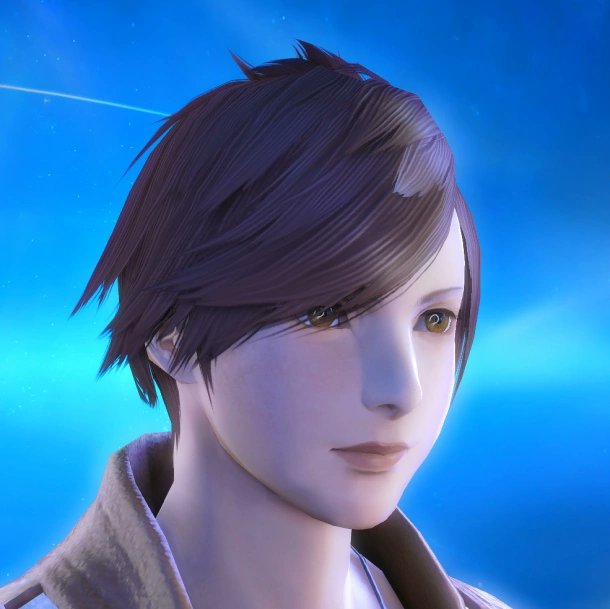


Oddly enough this is the closest I can get to irl look in the redactor. Though to be fair I'd prefer to be a miqo'te, ears and tail are just too appealing. Not sure which deity I'd pick... So far it's a tie between Menphina, Azeyma,Llymlaen and Halone. https://t.co/bLMaF6cOYc