comparison.のTwitterイラスト検索結果。 2,015 件中 12ページ目


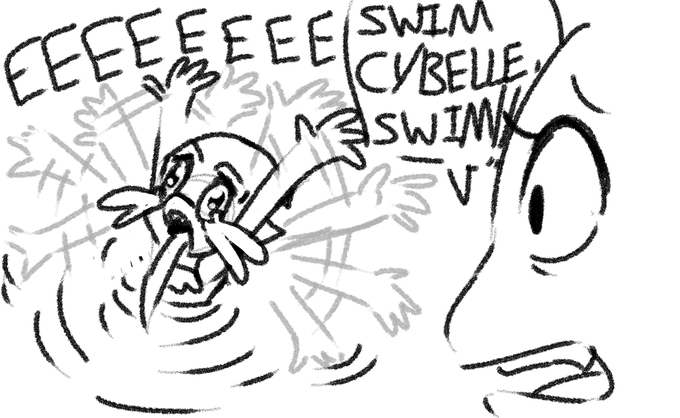
OOPS SURPRISE THERE'S TWO OF THEM.
Lashelle is a herpetologist turned mutant in a freak accident while holding a chameleon. That chameleon was Cybelle!
I wanted to do a 'born animal first' vs 'born human first' mutant comparison.


Rework of Jedah and the Fetus of God from last week, old version shown for comparison.
#darkstalkers #capcom #vampiresavior

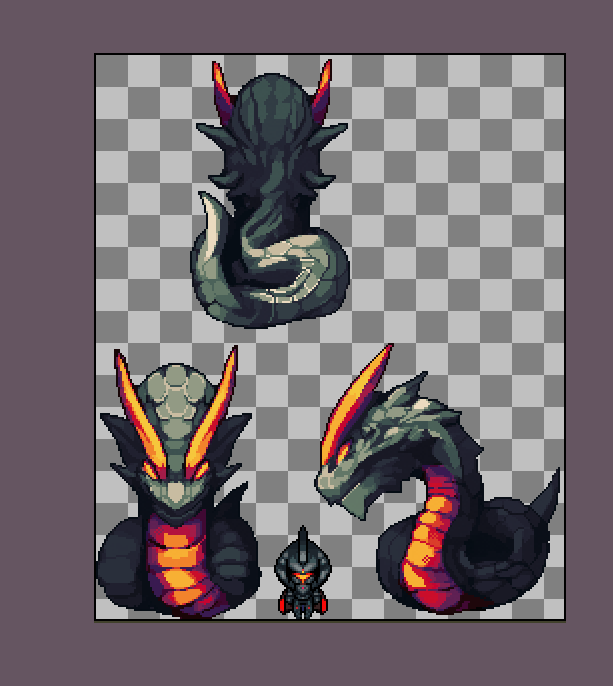
August 2022 Librarium 4dir map sprites are big creature after big creature!
A Legendary Knight Serat for scale comparison. #pixelart #pixelartist #gamedev #indiegame #indie #unity2d #rpgmaker #RPGツクールMV


Loewy’s simplified design for comparison. Two kids down, three to go! And then Arty and his hair. Oh God help :(


2020 - 2022
Not a lot of art from 2020 that's a fully finished illustration because I was deep in drawing Webtoon comic art but I have two Yuna & Kawachan drawings for comparison. Trying more with different backgrounds and layouts these days https://t.co/SS6euoxYxQ

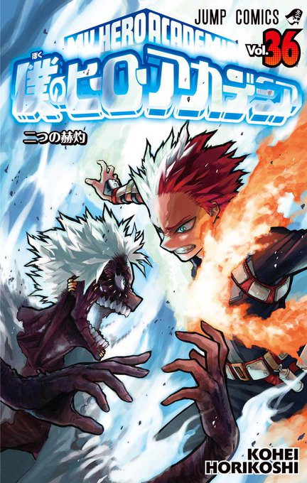
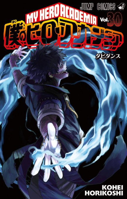
I'm in pain just looking at Dabi. Makes his previous state look healthy in comparison. 💀 And as a fan I want to see him deteriorate further.. 😅 I want to see how far Horikoshi can push this visually and how much he can hurt the Todorokis with it..
#MHA #ShadzMHA #MyHeroAcademia






It’s crazy how much my art has improved here is a 7 year comparison. Like dang I remember thinking this drawing was AMAZING when I did it lol
2015/2014 ish. This month


Here's the old art from 2020, plus a comparison. Gore version of the piece is on my Patreon. Link in bio-


Rework of Felicia from last week for Patreon, old version shown for comparison. #capcom #darkstalkers #vampiresavior


@NoHornyOnMain6 Even in Dreamland 3 and 64 he didn't look this weird. His head is just way too small and pointy, and his coat getting larger only makes his head look smaller in comparison.


seulgi art comparison..
that was ths first time i made kpop art too I think



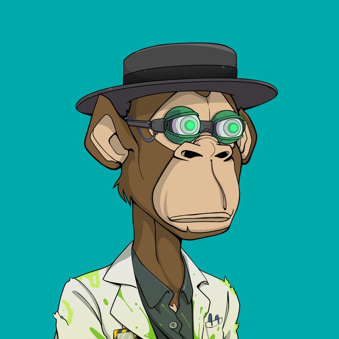
The #0xape #Tribe #Heisenberg comparison. 🟨🟥 @tribeodyssey 🔥
Love them both! Thankful to the seller for allowing me to get the matching #yellowarmy ape. 🙏
#nft #nfts #nftart #nftcommunity #breakingbad #walterwhite


A few comparisons of the @kinekovideo scan of DBZ Movie 9's 3rd reel, vs the official Toei Blu-ray. Cropped the 35mm scan to 1.85:1. for a clearer A/B comparison. These are off-TV photos for the BD so not a perfect comparison especially re:color but still illuminating.


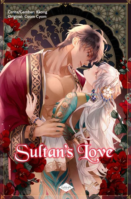
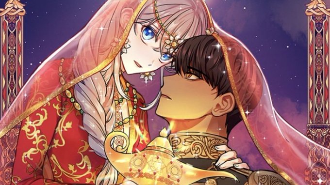
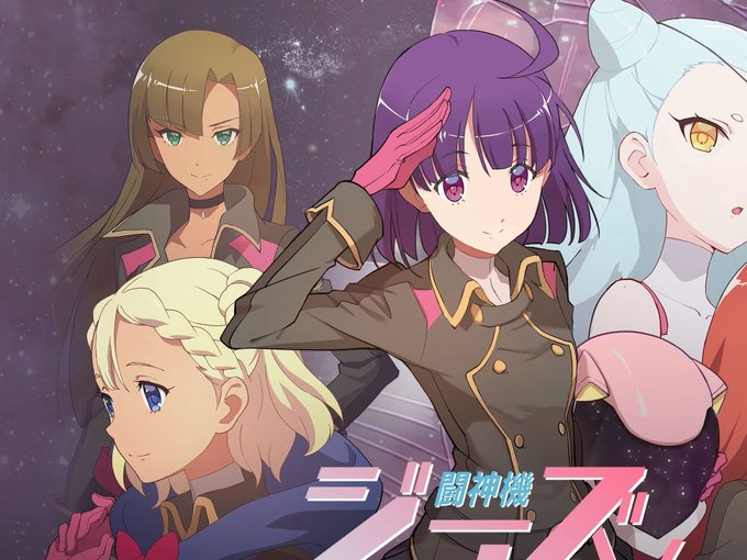
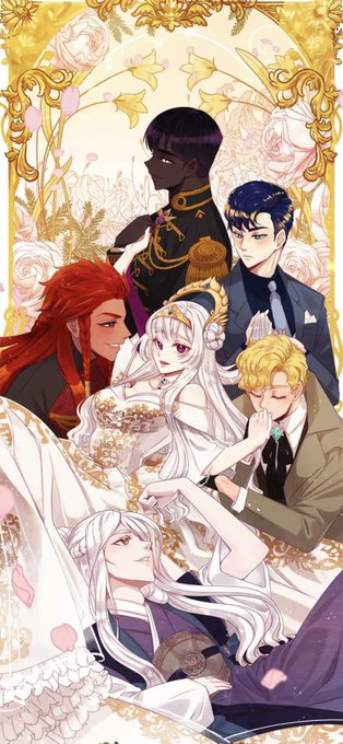
Below R Anime-style works with diversity & representation.
RWBY's 4 Main Cast characters are all pale, in comparison. But it's OK because not all works need to have variety of skin colors in the MCs.
But for Sumeru it should have more brown instead of majority being pale...


yea i don't draw full art much this year 🤠🤠 but in case you wanna see a proper comparison...


Lmao, because I should've explained... The base art is mine. I'm just playing around with https://t.co/vsG93TNfqE to get a different lighting mood and colors! This here's my original art, for comparison.