jarringのTwitterイラスト検索結果。 595 件中 12ページ目


The initial change can be quite jarring, even for a shadow!
@Lulunamo :3c


Finished the first 12 episodes of Stone Ocean. I quite liked what I’ve seen so far. It’s still clear production suffered, the inconsistent character art first and foremost, but still feels in the same vein as the previous parts and not super jarring. I like Jolyne a lot too!


@diodaily I get that they wanted to combine the Part 6 hair with his Part 3 outfit, but it feels so jarring. Especially since he doesn’t have his heart headband.


2018 vs 2021!
did a quick study the other night to do a little improvement comparison
its. jarring, same character 3 years later!


Changing my pfp to the otter yeen pic since MFF is next week and they look more like me irl UwU I know it can be a lil jarring when you see people irl and you only know them as their sona. I gotta com art of them theyre so nice


IM FINE BTW this song is just very good
https://t.co/sAHtP2Qz3z
plus a bonus two that didnt get in the gif because i think theyre a bit too jarringly large
@atari_st_fan Which is funny because, after having played the sequel for so long, I find it hard to go back to the original Lemmings. It's roughness around the edges, as they were trying to find out good level designs.. It's a big part of its charm, but I find it a little jarring. 🤔


Grown adults (mostly men for some reason) with really stiff but trying-to-be cartoony art styles and literally only ever draw women looking something like this, bonus if they only use jarring neon colors for everything and if they've drawn that way for 10+ years with 0 change https://t.co/hPqSvahzSz


@L3THONFTs @mrflosunday @BrightDreams_io @delta_sauce @SkullKid_Art17 @EmporiumLoris @dzmitrylysh @Benny_NFT @kevvvinsmith @PabloStuartStu Looks great!
Hot off the press, I've got more jarring stylistic changes to share.
Tagging @Trippingonpixel


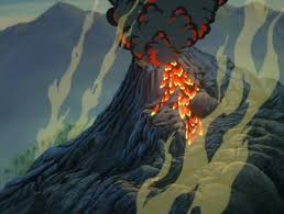

feature from that film: that volcano. We go from the jubilant “We’re a Family and You’re One of Us Now” to this scary volcanic eruption in just a few minutes time, I think its that jarring contrast that makes it my favorite volcanic blow up in the series.


Never been more satisfied with a character upgrade in my years drawing and creating.
It's quite jarring when I look at it now. Different, but also eerily not so much.
2018 Needles - 2021 Tenebris https://t.co/261Hxxw4n3


I wasn't sure how to properly convey how JARRING it is that the MC's 2nd thought when interacting with their possessions is "Break it"
This was the best I could come up with
...the baby is not Vishnal & Toast's :x It is rando baby
#RuneFactory4


I know Araki’s drawing style changed over time but i feel like the difference between each season of the jojo anime is so jarring 😭

Why did Jaldabaoth bellydancing feel almost uncomfortably jarring

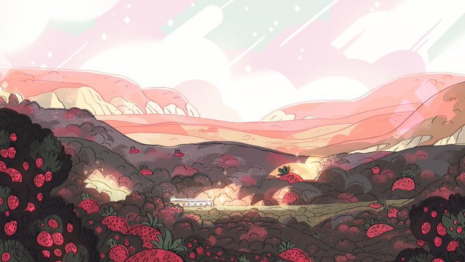
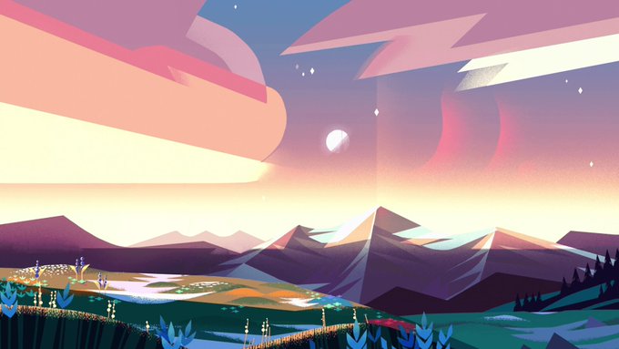

Steven Universe is 8 years old now. I remember being excited to see it when I was 11! Many things happened and I experienced a lot of things that were jarring and different, it felt nice to have the Crystal Gems as an anchor to normalcy. Hoping for more SU in the future 🤍💛💙💖


went nuts and bought myself a new tablet for my birthday and by far the most jarring thing is how different the colors look but it lets me draw handsome men, so that’s a plus. Anyway makes some noise for Serizawa #mp100


screwed around a bit more, i think this looks a bit less jarring? https://t.co/jmGXruQQmA