ContrastのTwitterイラスト検索結果。 10,554 件中 113ページ目


the contrast between these two attacks dslkjdfjlkafds
Characters: @/mintomillk | @/ivyking2140


Green name version for better contrast.
Shimmy sham and skedaddle onwards.


Day #133
'The Conjured' by @OriginalGoldCat
These ghostly, painterly portraits in goldcat's signature gloomy style remain one of @fx_hash_'s most exclusive projects (60 ed). Mostly monochrome, the eerie faces pop with a contrast of color.
Floor: 1k tz
https://t.co/N7zTa1HfIi


This piece is for a 'draw this in your style' contest hosted by Camilla d' Errico. I am happy enough with it, it is a lot softer contrast than what I usually do.
Unfortunately, I got the date mixed up and didn't submit it in time.
#dtiys #drawthisinyourstyle #DigitalArtist


@gothmiko this is kind of hard to follow because i didnt record it, but i usually start from a base sketch, add flat colors underneath, and take a harsh brush to add texture/harsh edges in areas where contrast is needed (some palettes dont need them) you can erase the sketch as you render


To give a further idea of what to expect, here are some samples for the various tiers in order of appearance:
1. sketch
2. hatched/contrasts
3. sketch shade
4. full colour


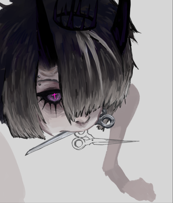
2 revenges in a high contrast style! Never attempted this before but I like em!


Holiday review of Action Comics #1044:
https://t.co/Hmmi7xmTrj
Another great chapter in Warworld, again contrasting Mongul and Superman. Continued plot progression with decent horror!
And some wonderful Supergirl moments!
Thanks @PhillipKJohnson @RicFederici @DavidALapham


Prizes for raffle winners @Spookiphoria and @Pokemini4 🎊 I love how both characters have contrasting vibes and I was able to create different themes. I absolutely enjoyed drawing both of them! Thanks again for participating!


Born #onthisday1914 Fernand Leduc Canadian #abstractexpressionist #painter & major figure in 1940s & 1950s Quebec contemporary art scene co-founded Les Automatists later experimented with spontaneous & gestural nonfigurative painting with colour contrasts & interactions


@queercryptidRey @gaybunnypunk @Flailmorpho_ Yes! It was a vision accessibility feature. Thank you for noticing.
Even now when we do lesbian flag pins based more on the others’ flag designs rather than my proposal, I mess with the colors to have readability thru value contrast, but not too much jarring saturation.


#ObeyMeUnits If i were to reccomend any dream unit together then it would have to be simeon and satan. There relationship is honestly really interesting to think about both ingame and how the expectation of there solo songs contrast how someone might perceive them


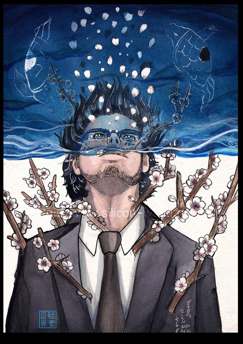
@AmalasRosa I like also to use fire, contrast and blue in my art.


Megatron's movie design has been the subject of much ire, but again, I'll defend it
they needed a design that would contrast sharply against Optimus and all the other robots- and making him literally sharp all over makes him feel evil as fuck, again fitting for the big bad


@spooky_loli @MOLENAIDE what an awful take. just say you’re racist and go literally i find bright, pastel, or bold colors to contrast most beautifully with darker skin tones you’re just a coward who’s not willing to learn


✨Look into my eyes!✨Wow! So happy to pick up this stunning Chimera by @sofyaiva last night! Just unreal detail, shading, expression, and contrast in this Sphinx Priestess. Totally blown away! 🤩❤️🔥🙏