ContrastのTwitterイラスト検索結果。 10,510 件中 120ページ目


WAAAA
I'VE BEEN WORKING ALL DAY AND BINGING THE HECK OUT OF KATEKYO HITMAN REBOTN AGAIN KJHASKDJ,,
BUT!!! Check out the nice contrast between Evan's two faces, don! Which do you like more?
I may edit the eyes of the right to make them feel more mature like the left!


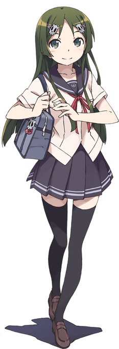

【VOCALOID4】The vocal synth of the hour is Kobayashi Matcha.
Matcha is a calm and collected girl who tends to hide her emotions, in contrast to her best friend Masaoka Azuki.
Originally released for VOCALOID2, her voicebank wasn’t public until her V4 release.


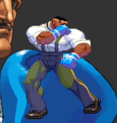
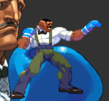
I just hope that in Street Fighter 6, the blocking animations still remain very defensive (you're still taking chip damage from specials). They need to contrast against the parrying animations, which should feel much more active and deflective (no chip damage).

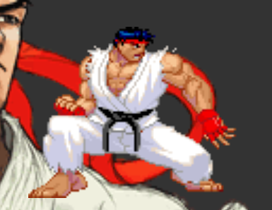
In past Street Fighter games every single character, when blocking, they feel like they're really tightening up. "Turtling" is a great term for it! By contrast, parrying feels loose and fluid. Now look at Jamie. His blocks look like parries!


A new white chillaz pull @ChainChillaz & easing my ocd another pull from @SkullTakes with pink being one of my favourite colours in my collection. Actually love the contrast’s with these two side by side.


🔵 Y haciendo contraste con el juego anterior, tenemos a TOMBI! un juego de plataformas con algunos elementos de RPG, que hace gala de unos gráficos coloridos y una ambientación muy única!
👉https://t.co/Q7iXqUIGug
#RETROGAMING #playstation #PS1 #retrogamer


@CanalBrushRush opa, não sei se demorei demais, porem
eu tive bastante dificuldade em organizar a paleta de cores da pele dele
era pra ser de fato 'palido-azul', mas não parece ter tido um contraste bom o suficiente em relação ao sombreamento

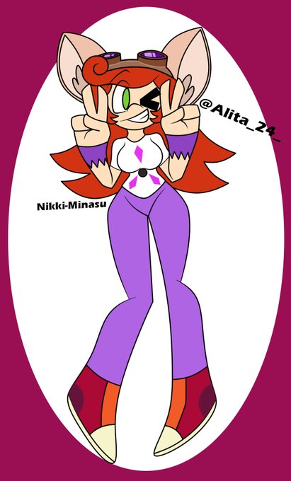
BUENO!
a la hora que subo esta madre jaja en fin
primer dibujo para: @Alita_24_
espero que te guste el resultado nwn
le cambie unos colores para que tengan un poco de contraste...creo XD
pero me salio bonito jaja https://t.co/Gkknzm4yrL


the little moth that represents the adoring swarm was on there too but the contrast was too high,


Early commentators on #VanGogh thought his work was crude and harsh which in many ways it is. But the harshness is mediated with a sure and elevated sense of color and balanced design. Somehow the contrast of crudeness and preciousness creates a tension that holds a viewers eyes.

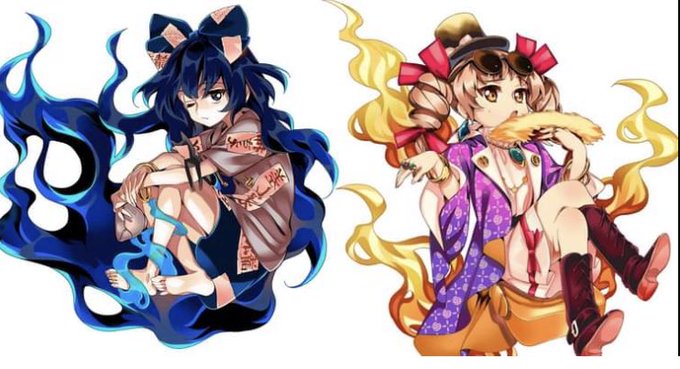
Joon and Shion from Touhou Project, they are the sister goddesses of poverty, pestilence and bad luck. I think their designs perfectly capture their theme and contrasting personalities of the sisters https://t.co/HADATM4go1


the contrast between these two ajdjd tokoyami being emo with darkness surrounding him and hawks winking with sparkles and shit asjdhh
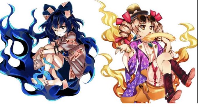
@TBSkyen Joon and Shion from Touhou Project, they are the sister goddesses of poverty, pestilence and bad luck. I think their designs perfectly capture their theme and contrasting personalities of the sisters


@ace_of_dragons I love going all in to the Natural Druid sort of things but my gal had a contrast with being a lawful evil crime boss.
Vyssandra "I'm everybody's Vyse, Darling." Cane. Her energy was just too powerful 😅 and I really need to bring it back!


Daybreaker had an awesome design. Such a fun contrast to Nightmare Moon~
Artwork is by my friend @JJcareksims!
https://t.co/XctEdwLRwP
#mlp #fanart #art


In light of my new artstyle, here is a fullbody of my new sona
I like them a lot!
I wanted a sona that showed off my genderfluidity a bit more while also being something I can enjoy at all times. I always liked pastel colors with some stark contrasting colors, so I went with that