appealingのTwitterイラスト検索結果。 121ページ目


I'm glad this dude got a redesign cleanup. He looks much more appealing in CTR. 🥚
#CrashTeamRacingNitroFueled #CrashBandicoot


I'll admit, I never played Banjo-Kazooie or its sequels, but these characters looked appealing and their recent inclusion in Smash boosted interest on my part, gave me something to draw coming out of a few weeks-long art low :D
#BanjoKazooie


A hero mode icon for @lucanidaez
I'm glad that I was able to make all of the colours to be appealing uwu;;


BRUH why are some of the arcanine/pokemon fusions so aesthetically appealing......


This week's #FF is @nitrodraws , purveyor of appealing apes, busty bandicoots, and other various cute and sexy renditions of popular videogame babes. He has some striking original characters, too!


This is still really ugly and rough but I'm out here appealing to my Ratatouille and Sorikai needs


In my quest to figure out how to be more broadly appealing it turns out all I really need to do is fuck with my colors a little more. What I’d normally do vs looking at color inspiration from what’s more or less “in” the past few years.


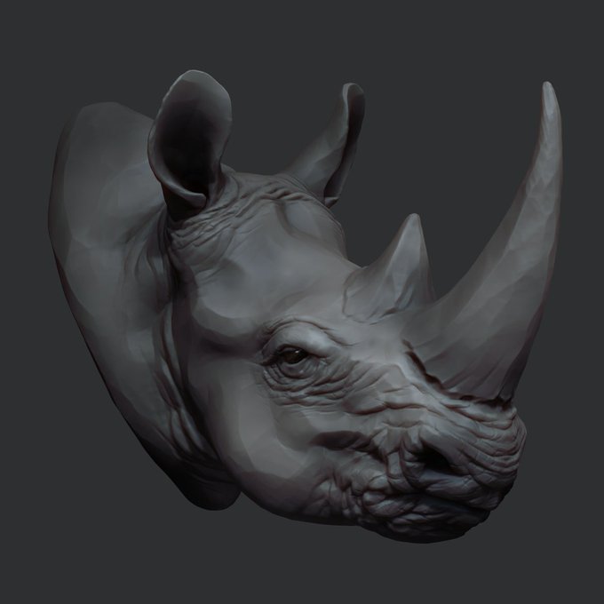
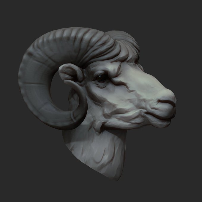
Modelos obra de Marat_Latypov, con un estilo boceto muy atractivo. #ZBrush
https://t.co/qfyBBIQOYd
Sculpts by Marat_Latypov, with a very appealing unfinished style.

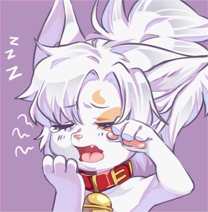
Finally plopped after going non stop since 5am.. don't think I'll be out on the con floor tonight xD
Sleeping is just too appealing


gumball's character designs got a lot less appealing when they got these weird, perfect circles for eyes tbh


I must say this version of Rhombulus is... slightly more appealing then mine."


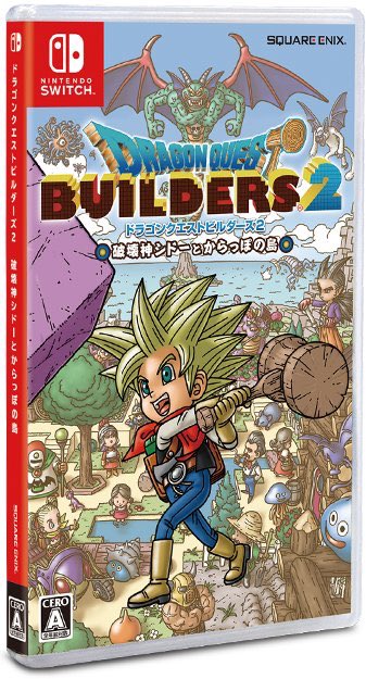
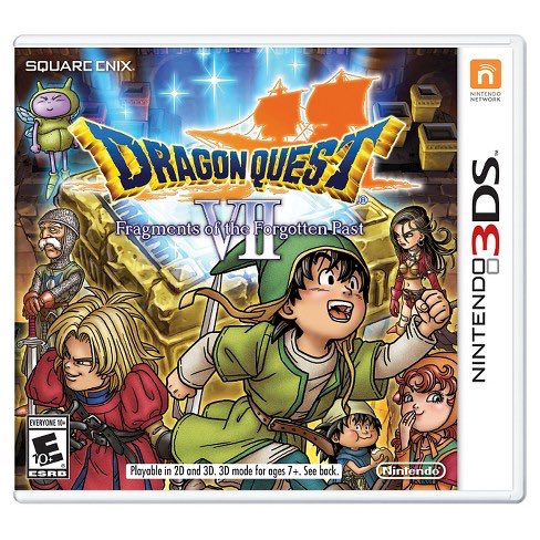

Finally realized why I never tried out Dragon Quest. Any time I would see promo or box art, not only was the art style not very appealing to me, but buy and large, the color pallet used was soooo bland.
I was shocked to see the art for DQ XI which I actually am excited to play.


Also in the Kickstarter you can get an ink drawing with 1 spot color drawn by yours truly!! It may be a lot of Logans in suits. I don't know why that sounds appealing to draw a lot of but it does. (Probably because he would normally never wear one...)
https://t.co/lJOR0bQuBU


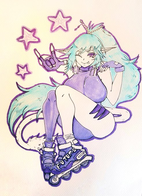
@theycallhimcake Oh I love me some Vaporwave. And here's Ashiyo if you find her appealing enough!

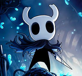

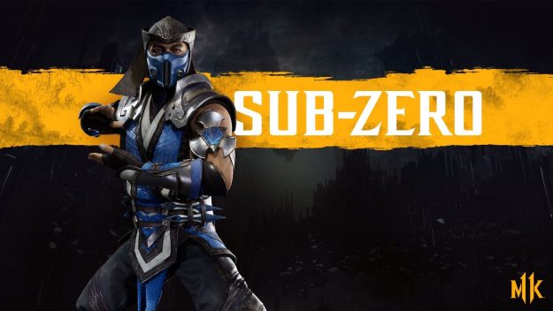

These would be my picks for realizable yet most appealing to me for smash DLC.


@gwaesha Than angles! It’s likely all in the name of improving animation and making designs more appealing over time. They aren’t all “simple”- but they carry a better underlying structure than, say, Geodude, and it shows in their 3D models. See how the newer design translates easier?


Disney Crocodiles just all have a chonky energy I find deeply deeply appealing


Zetazuma has the same color issues with the yellow, white would be more appealing to me. I dislike how the "shield" is just a bunch of fur? idk what i expected really, but not this.