compareのTwitterイラスト検索結果。 22,414 件中 121ページ目


A gif for compare :v sorry for the spam but i am quite hyped after realizing the improvement xD God bless you anon thank you for commission me again 💕🙏🏼✨


#ConScarabicchi #SalaLettura
La figlia che non piange
Sarò puntuale, quando sarà nottr
Starò dalla tua parte, a ravvisarti
Gli anni di molte insonne
E passi calmi, avrò quel viso, che non so di avere
Dirò parole appena per fermarti
Sull unico confine che scompare


Je remet la V1 et la V2 pour que vous puissiez un peu comparer les versions


@RCloset09 He is using a ‘comically large anchor when compared to the wielder’s body’ like the one May from Guilty gear use


When I compare Neo-Precisionism to these pieces, the first big difference is that the old ones feel hand drawn while Neo-precisionism is digitally native. Since the vast majority of art is now digital, the hand drawn aspect makes Precisionism feel a bit outdated.


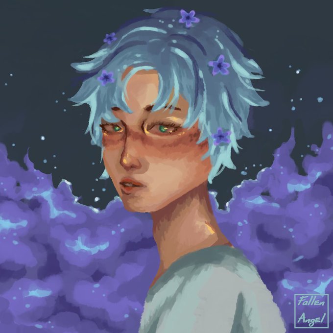
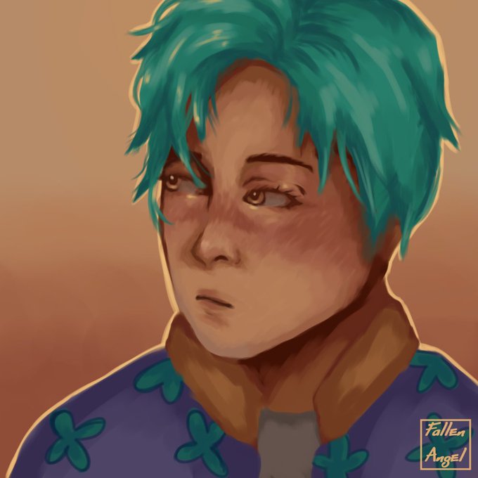
#artmoots INTERACTIVE POST: compare these 2 drawings before and after i figured out how to color my style! Theyre only around 1 month apart from when I drew them but theres a big difference in the way I colored them :>


I’m sorry I’m tweeting so much but also holy shit I compared these two Lunoct drawings and the improvement I made in only a few months is bonkers.


I've gotten used to SD2.
Compared to SD1.5, Latent Space of painting keyword is a bit tangled and difficult to control. Regardless, it has a pretty good base quality.
#StableDiffusion2 #stablediffusion


#emetazem ✨ Emet/Azem ✨ Hades/Azem
She looks at him like he put the stars in the sky.
He looks at her like no flower can compare.
(Art by @mushroomflirter 💖)


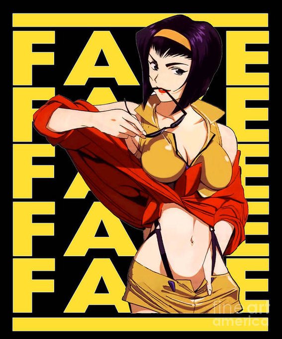

Something that really thru me for a loop with chainsaw man is seeing the fanbase gas up how sexy the girls are only to find out the women actually wear like real people clothes like compare to like the standard anime hot girl/women, like woah.


【 DTIYS 】
finally completed the dtiys after some time! i want to apologize for the inaccuracies or difference compared to the original oc. though, i tried to recreate it as similar as possible, while still keeping my characteristics in the art. i hope you like it! 💗💐


One trend I've noticed is that SD2 feels more incoherent and noisy compared to 1.5, yet also lacking in interesting details. I guess it could work for certain artists. Wayne Barlowe creates interesting creatures, but also more random artifacts in SD2. #StableDiffusion2


i feel insane, theyre angled towards eachother in their birthday art
compared to other's who face the viewer head on in the middle of the banner
annji is too real


A snippet from an upcoming size chart. The two largest dragons so far, compared. https://t.co/sJtxiHFsig


Coming out of the state of artistic burnout, my style has changed a little....😁
I compare my old collections and the new one.. 👀
Not everyone likes my new direction🙄☠️... What do you think?
Old New
Link 👇