visuallyのTwitterイラスト検索結果。 121ページ目


Like for a color and then repost with your favourite characters you associated with that color!
I got pink from @cannorandhonk :) I'm going to be doing two seperate ones - one with characters that visually remind me of pink, and one with characters that don't
Here's the visual :)


Dane deehan as Levi. Chris Evan as Erwin. Visually very fitting. Even though this is just a fan prediction, it would make a great reference for drawing these two characters.


Wanted to test a new brush vs an old one. Visually pretty much the same but far more comfortable and better feedback


I played Pipi tonight in a oneshot and decided I wanted to visually represent the characters that inspire her.
(Pipi art by @delicate_loser)


Want to be visually immortalized in a heartfelt webcomic on @webtooncanvas? Enter for a chance to win a spot in the background of “Ataraxy!!” ❤️ #webtoonsshortstorycontest #webcomic
How to enter:
⭐ Follow me~
⭐ Retweet this post ~
⭐ Leave a comment on the 4th episode!~


@gilchrist_levi Gaghiel, something about the whiteness is terrifying, and I can't read it visually.


We are moving to Tapas!
Even after trying to make the Update fit for it, I was sadly not successful to make it visually appealing for Webtoons. So, if you want to see Neverland's future Updates, please go here instead:
https://t.co/1Le7e5ONhC
Thank you very much!

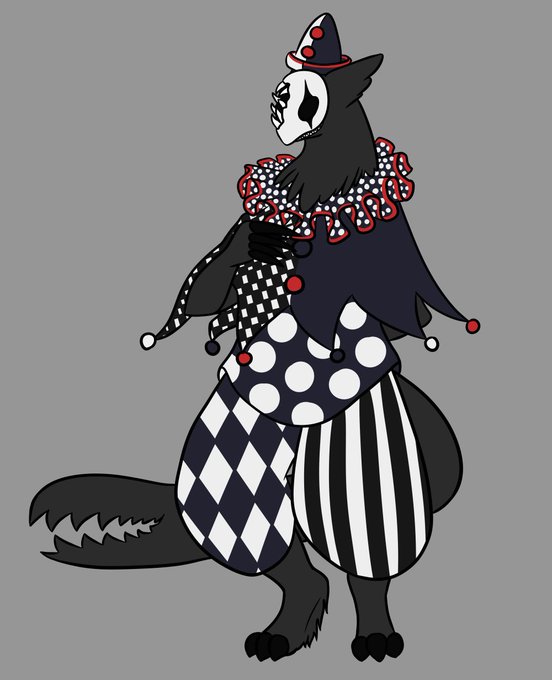

Patches is my most recent OC, so she's had the least amount of time to change and develop visually, but by nature of being a shapeshifter has had the most variation in how I draw her. Her ears got bigger tho.


This sounds like a fun thread to make. Amber is my oldest OC and the one who has gone through the most development visually


@DocShaner Am I right to make this comparison? Maybe even both visually and character wise? @TomKingTK @MitchGerads Absolutely LOVED issue 2. Adam and Mr. Terrific are probably going to become some of my favorite characters by the time this is all done.


Illustrations for @decatorevista on the article of how Covid-19 measures affect the visually impaired who rely on sense of touch to navigate the space around them.
#editorialillustration #illustration #Illustrator


It does make me happy that two of the most visually (and sonically) iconic indie video games of the last decade came from Otis alumni.


Nocturne, to this day, is one of the most visually-striking games of all time, and easily the most visually impressive of the Megaten games.
A remaster that enhances its style would be nothing short of amazing.


WARSHIP JOLLY ROGER is a visually stunning #scifi adventure, written by @SylvainRunberg (Millennium), with breathtaking artwork by @mikimontllo. Space pirates. Political intrigue. #Comics #Art
Order the Series Bundle and Save 35% Off: https://t.co/IQp9rFRNOZ


@splatonoodles Hey there! Just a visually impaired artist doing the drawing thing


@WhimsicalWolfi Hey there! Just a visually impaired artist doing the drawing thing:)


Wulfric Bergerson, as visually designed by @moldykins . Wulfric is a certified good boy who was raised by halflings despite being a bugbear and only ended up adventuring after the local lord caught wind of him and ran him out of town. Hopefully vigilante heroism can help him out!


@PowerLoudGirl @LordofGames98 The term "console wars" is so 1993. Hell, even in the 90s, the rivalry between the SNES and the Genesis was ridiculous. Both consoles have visually impressive games that still look amazing even to this day.


This page is a bit of a nightmare since there's a Lot going on visually, but here is the first panel as a preview that I'm pretty happy wittthhhh