appealingのTwitterイラスト検索結果。 124ページ目


testing some free rigs and uhm. the character might not be great for everything but this one is pretty fucking great?? I really appreciate it when I can get an appealing pose going in less than 5 minutes.


my less appealing aminals (i just wanted to make one of every animal tbh fadjkgh)


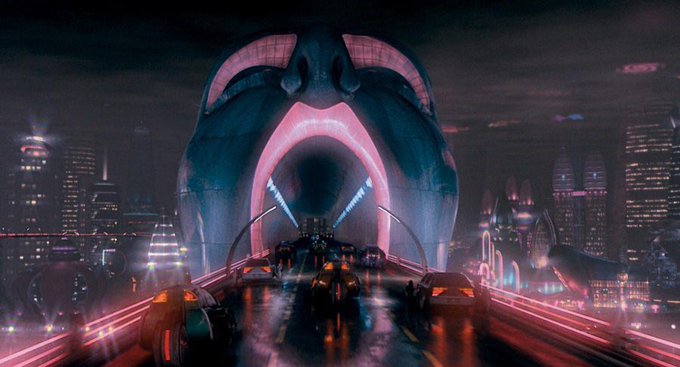


People often describe say the Los Angeles of BLADE RUNNER as dystopian, nightmarish, but to me it’s appealing: I watch the film because it’s a place I want to visit.


Netherlands artist Escha Van Den Bogerd (https://t.co/gKfHDCeBPk) is one of my favourite artists on https://t.co/eadLl7MAR5. Her "Aquablend" is very appealing. Excellent.
#art #originalart #paintings #beautifulart #fineart #onlineartgallery #figurativeart #artist #artwork

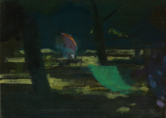
Have you seen this painting? Police are appealing for help to find it after prolific pensioner art thief Paul Whiting was sentenced to 2 years in jail. Read all about the case here:
https://t.co/IyiREM3ECb


I didn't like how my recent drawings were looking, so I decided to change up my style into something a bit more appealing.


A dog
1 smilling
2 says "I don't know."
3 feels blue.
4 appealing that now is the time to go to walk.
#sketch

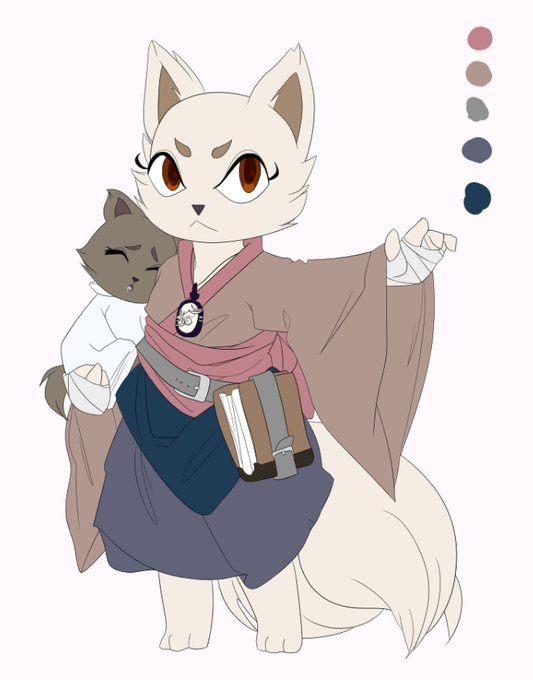
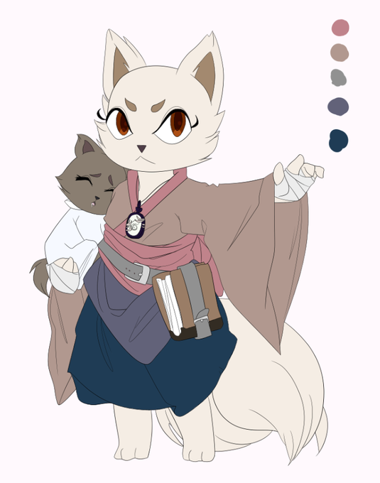
it's been, like, three days and i still can't decide which way i want to color the skirt:
every time i think i've made a decision, suddenly the other option looks more appealing


There's no shortage of inspiration this #WomensHistoryMonth when women #InsidePixar honor their female heroes. From #Bao Director Domee Shi: “Rumiko Takahashi is a renowned Japanese comic artist. Her work is full of appealing characters, wacky romances, and engrossing stories."


I finally get rid of my facial hair only to remember that I look just as unappealing underneath

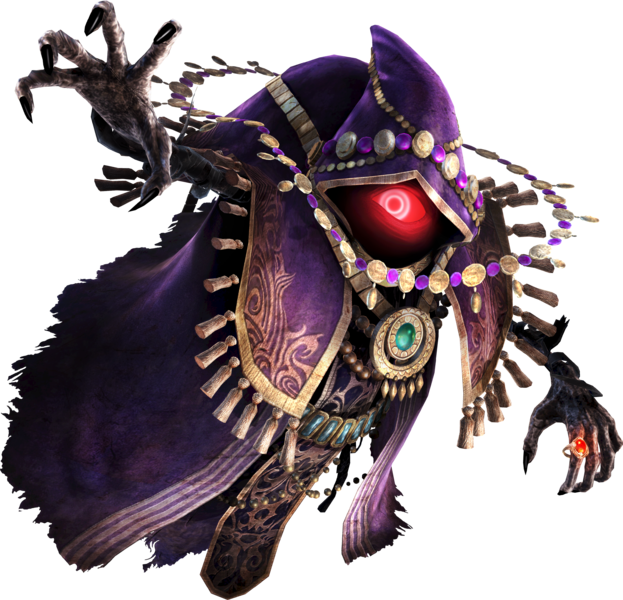
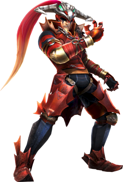


finished re:com recently and i love marluxia... a floral grim reaper is such a simple yet appealing concept 🌹 #kingdomhearts

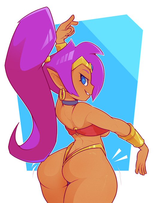


#MurasakiMonday (3/3) How did Purple become such an appealing hair color? Explain that science.


Looking back at my work, I'd honestly say I've really improved and nailed a style I was happy with, and made it look good and appealing. As well as learn a lot of tricks and tips from other folks. Here is hoping I keep it up!


Eventually the DMed proposed for me to give him a second costume as well as one for Robin to compliment their hero envy and treating events in the story as a sort of superhero sort of angle, though I don't think they are quite as appealing in design.


These are pretty appealing colors for me having no fukken idea what I'm doing half the time


"An appealing family story with a sincere and goodhearted protagonist." @KirkusReviews
Happy Perfect Pub Day, #BeatriceMoreandthePerfectParty by @Ahugheswrites , ills. by @Helen_Flook
#OrcaEchoes #earlyreaders


So people said I was an Electric type for that Pokemon meme and I TRIED drawing one?? Drawing appealing Pokemon that are unique and still LOOK like Pokemon is really hard...Game Freak making it to 816 should be in history books tbh #pokemon(?)