appealingのTwitterイラスト検索結果。 2,755 件中 126ページ目


"An appealing family story with a sincere and goodhearted protagonist." @KirkusReviews
Happy Perfect Pub Day, #BeatriceMoreandthePerfectParty by @Ahugheswrites , ills. by @Helen_Flook
#OrcaEchoes #earlyreaders


So people said I was an Electric type for that Pokemon meme and I TRIED drawing one?? Drawing appealing Pokemon that are unique and still LOOK like Pokemon is really hard...Game Freak making it to 816 should be in history books tbh #pokemon(?)

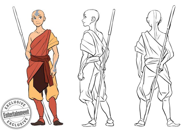
I am obsessed with the way that the artist for Avatar: Imbalance is drawing Aang's resting pose with the glider. It's so...nice? Character driven? I dunno exactly what I find so appealing about it but I LOVE it.
https://t.co/vl6Zleb2wm


Looking at the Sonic OVA VHS box and thinking about how much more appealing it is than the Sonic movie posters...


‘Yet again, Maverick has delivered a book with appealing and amusing illustrations to complement a witty, wacky and well-crafted story.’ Thank you to @IshMotherBec for the lovely review of Shampooch, our new picture book: https://t.co/KCX29rfYLe @HeatherPindar @susanbatori

Born in Italy, New York artist Fulvia Zambon (https://t.co/BOYCdtQQzM) is an excellent figurative and portrait painter. "Friends with Green Eyes" is very appealing. Lovely.
#art #originalart #paintings #beautifulart #fineart #onlineartgallery #figurativeart #artist #artwork


More indie comics goodness now @brokenfrontier as I look at @NicoleGoux and @xDaveBakerx's F*CK OFF SQUAD from @ssbcpunk here: https://t.co/1TlAtzvOnr "A beautifully observed character piece that balances an appealingly in-yer-face attitude with genuine moments of true pathos."


More indie comics goodness now at BF as we look at @NicoleGoux and @xDaveBakerx's F*CK OFF SQUAD from @ssbcpunk here: https://t.co/Gd2L5ZBP2m "A beautifully observed character piece that balances an appealingly in-yer-face attitude with genuine moments of true pathos."

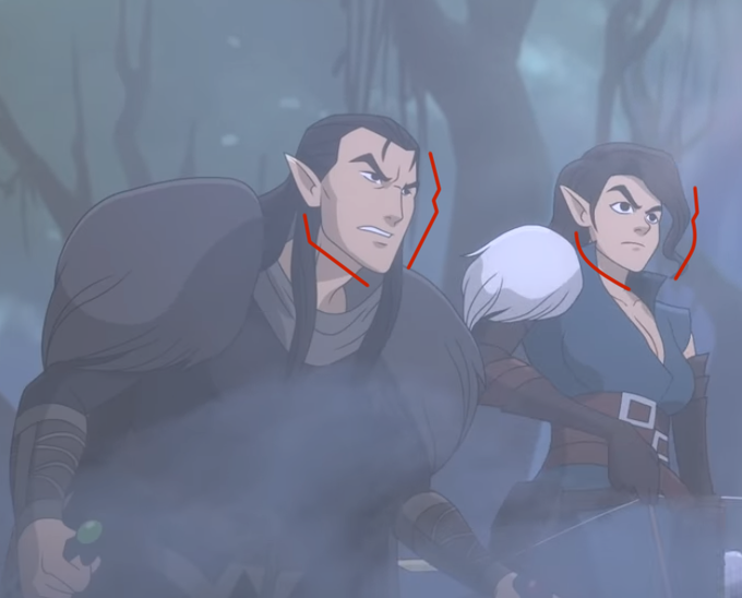
I'm a character artist so I can see why they would do this- it makes them very easy to tell apart, makes them Distinct from each other. Making them both have the Exact Same Face wouldn't be as visually appealing or interesting.


So for #mikumonday I turned random images into appealing color palettes and drew a couple Mikus ok cool


The before and after of #Starbarians fan project! It's the great work that @HappyHarryToons delivers with each episode and @HugoTendaz's appealing style that makes me want to be a part of this. Check this out: https://t.co/wyjbG8EM5l


I seriously need to establish some sort of professional feel for my youtube, instead of it being unappealing, random, and unorganized.


A dip in some permanent rubber, @PainfulElegy & @FlowEXE1 look much more appealing as a blank, featureless mannequin don't they? I even picked out some of Sammy's wardrobe for them to show off~


⚡️⚡️I NEED YOUR HELP!⚡️⚡️
I’m going to be ordering stickers tomorrow and would REALLY appreciate feedback on which ones you all find more appealing. I’ll order both eventually but this round it’ll just be one or the other.


To a fellow who's created appealing characters like Gummiworm and D.I.R.A, here's to you on your birthday, @Inkwell1931!


Watched Demonwarp (1988) What an enjoyable little cheesy horror film that was! I'll run down what is in the film..
-College kids at a cabin in the woods
-multiple boobs
-Bigfoot
-Occult Zombies
-Aliens
-Oscar winner George Kennedy
If none of those things aren't appealing well🤷♂️👍


30 Day Yaoi Challenge - Day 23
Favorite type of male appearance? I find this probably one of the most embarrassing questions, but honestly I find a masculine appearance more appealing. Maki from the @MangaGamer visual novel No Thank You!!! is a perfect example.


What I think it’s appealing and blessing with artists, is their style of design, and here’s few examples of it (credits in the comments)~
#東方project


"Kubo and the Two Strings" is, hands down, Laika's most visually appealing, and aesthetically richest film, next to "Coraline".
I wish it had garnered more praised because of how time consuming stop-motion animation can be.
Thank you Travis Knight, and the phenomenal art team.