compareのTwitterイラスト検索結果。 127ページ目


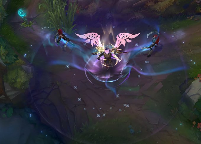
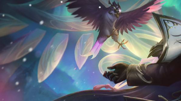
The R is nice and simple! after R2 there are polar lights for a few seonds giving it a little UMPH!
the only thing I would like to be worked on here are the wings and mask;;;
the wings lack detail/texture imo and make them look a little like plastic compared to the splashart :')


Let’s go, Sylveon! I made this in 2021. Should I draw them again this year and compare? 🤔 #pokemon #pokemongo #eeveelution #sylveon #pokemonart #fanart


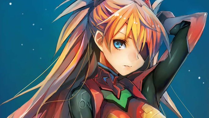
Altho the colors are much different, Ms Tears line work reminded me of Evangelion. The warrior girl vibe and interplanetary theme connect the two for me. It left me curious to see how an animated Ms Tear might look compared to E.


#GMArt
✨Sometimes in the wind of change we find our true direction✨
I am the Air
Women are often compared to natural phenomena.
Woman is necessary as an air, but! She can easily become a hurricane and crash everything on her way.
10/10
0.028 $eth
#NABU #KatoKrew #OGCollective


Compare the proceeding panels to the way these three daily strips by Roy Crane move the story forward.
It's brisk, rhythmic, and easy to understand. Each strip is a step in the story, chronicling a key development.
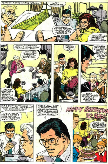


Compare this to comic books. There's much less economy and rhythm to the storytelling. This isn't necessarily a bad thing in a good writer and artist's hands but often it makes stories much harder to jump into.


@Maragondi @illidari_ @Za_barroSFW @MelHavisham @Boiling_Heart hey if you're gonna compare kalec's skin tone you should at least compare wrathion and alexstrasza's in the same image


@bornspiked help my art is so little compared to the others cuz im always too lazy 😭😭

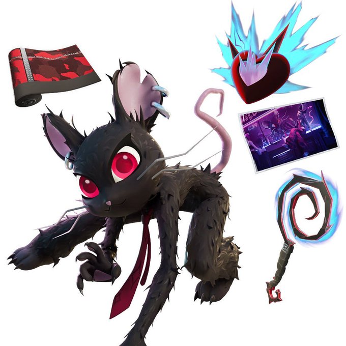

I hate to talk about this but why does the Item Shop Featured render look so off compared to the Loading Screen. She looks absolutely perfect in the Loading Screen, and the Featured render, the one that's supposed to convince you to buy it, she just looks like a big headed mascot


2020 - 2022
I’m genuinely so proud of my journey the more I compare my old art with my recent art
To think this mc was originally just for comedic relief but ended up becoming Lucifer’s wife 🥺
#MCGlowUp


Drew Tae ( Raidou OC ) on CSP to try out, and I actually liked it. What do you guys think compared to the other drawing I made of Sahori on Ibis Paint?


Redid my old art exchange portrait of @chalkdotstick's OC Abigail. Felt bad with the old version just being a cruddy splice compared to what he made for me two years ago, so I fixed that.


I often compare it to Shinichirō Watanabe’s
Cowboy Bebop & Samurai Champloo
with its subtleties, pacing, cinematic scope, etc.
How we really don’t know that much
about the characters’ backgrounds.
How other characters come and go
cause that’s how life is.


Opinion #30: TABM2 was honestly a fine movie. The two things that sucked about it though;
1: The colours and lighting suck compared to Movie 1
2: The M.E. and Zeta subplot felt like it was only there to pander to the parents in the audience and merely felt like an after-thought


Sadly it's true I'm not actually a real dinosaur. Im just a boring old human.
Someone's vtube character looking nothing like the real person is not catfishing. It's really weird you'd even compare it to that. People can design a character to look like whatever they want.


Compared to how cartoony and stylized the Yellow Bellies are, the Baryonx look a lot more intimidating than even the usual sharpteeth of the series look. The leader has that scar running down his face and it gives a nice serious look to him to stand in contrast to how goofy the


And with this, here you have the Team Star heights compared to Sonic.


