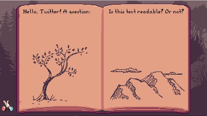
typogrのTwitterイラスト検索結果。 8,015 件中 128ページ目


Prospectus — In-use by @scott_cain for for @boyswithplants Magazine! 😍🪴🔠 #fontsinuse #typography #graphicdesign #font #magazine #plants #editorial


Chameleon logo.
Follow: @logomakers_hq⠀⠀⠀⠀
By: rendycemix
#graphic #logos #creative #branding #logodesign #design #designer #illustrator #logodesigns #vector #artwork #graphicdesign #art #graphicdesigner #bhfyp #logomaker #typography #logo #logotype #photoshop #illustration


Cool Typographic Illustrations by Anna Dittmer | Inspiration Grid https://t.co/JSBK64NVwL #typography #illustrations #inspiration #typedesign


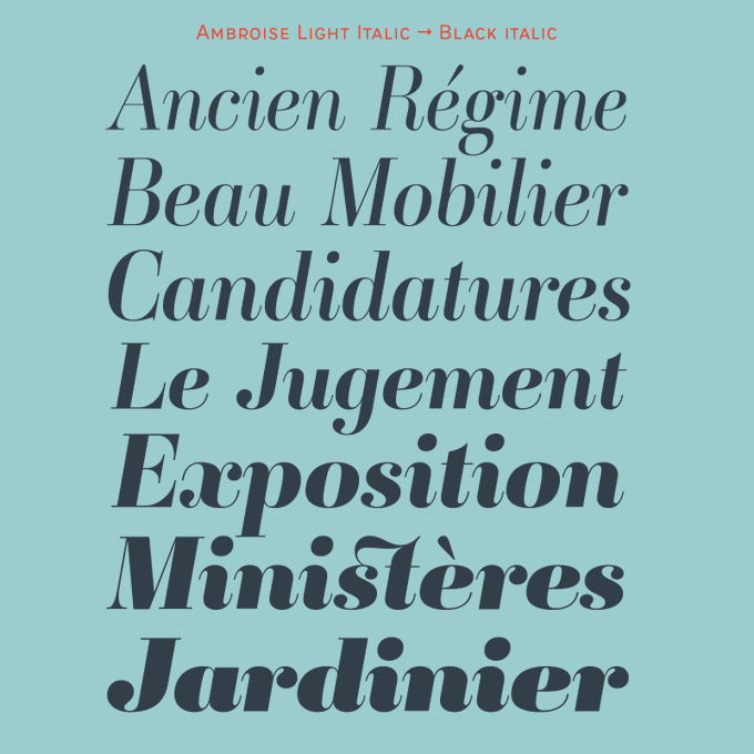
Ambroise is a classic of digital typography. It represents undeniably the Didot à la française, with a certain contrast but not too much, in order to make it usable. Three widths, multiples weights, italics, various alternates & fleurons: Read about it https://t.co/alz9CeyWgn


watermark typography thingy wtv for a person, i also wonder why i added depth to those little dots 🤠 // typography #2 #RobloxDev #Roblox #RobloxArt #RobloxGFX


Rate this work out of 10.
Follow: @logomakers_hq⠀⠀⠀⠀⠀⠀⠀
By: prashanthm_mdg
#dualmeaninglogo #artwork #logotutorials #artist #goldenratio #colorful #logomaker #smartlogo #typography #logodesigns #creative #logocombination #graphic #graphicdesigner #brand #meaningfullogo