visuallyのTwitterイラスト検索結果。 3,295 件中 128ページ目


Really miss this art style that they would use in V2 for flashbacks/exposition. Really wish this was something that they kept doing, would have made the exposition dump episodes in V4+ more visually interesting then just standing around with static camera movement.


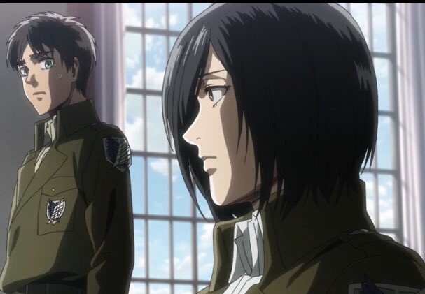
For the Love of Eremika 1/?🧣
~They might be angsty,they might have a complicated sense of emotions right now with everything that's happening. But even so they're visually beautiful & their journey & bond has been a mountain of feelings. Like a flower Eren & Mikasa have bloom

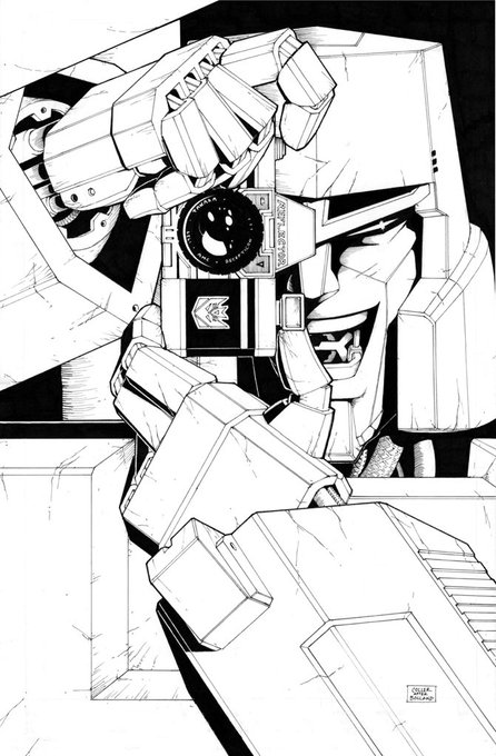

All Hail Megatron #1 Cover Art By @CaseyWColler
This homage cover to Batman: The Killing Joke #1 is one of the most visually appealing covers to ever come out of the IDW era. It also happens to be Casey’s first ever professional Transformers work. A remarkable first impression.

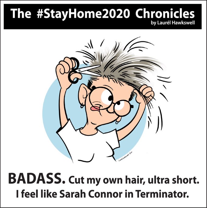
Documenting my thoughts the way artists do ... visually! #Yeg #StayHome #FlattenTheCurve #COVID19 #hair


@thatguyye @Absolonanon @VidelLover111 @Better_w_salt @StrangerMoist Thats really hard, for me its less the visually appealing and more the sentimental value it has after or at the moment of finishing u~u If I had to narrow it down it would be these
I tag @Yeggs8 @Nonnbell @Darkfireballz @Radiostatic3

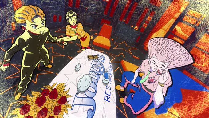

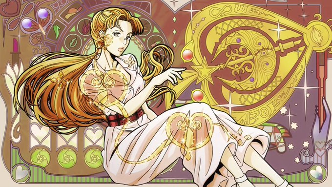

JoJo is one of those shows where instead of being visually appealing by having smooth energetic animation, it instead uses more still shots, but gives more of them a lot of pop and artistic appeal like that of an illustration.

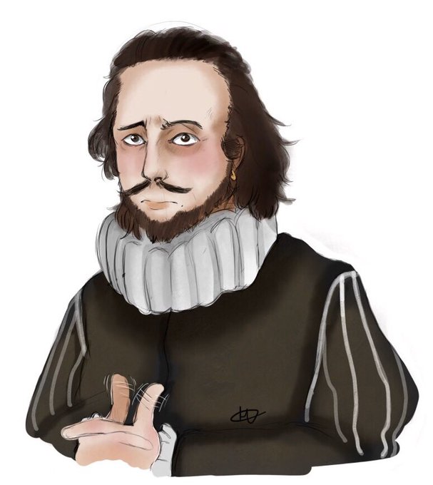

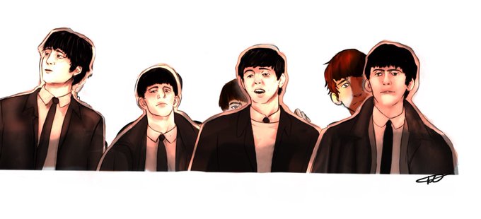


🎵A Bard Days Night is a visually stunning novella that experiments with the blending of visual colour pallets; from the bright and bold complexion of the 60s to the dark and subdued tones of the 17th century.
#DVpit #DVart #PB #LGBTQ 🏳️🌈
@scotwilliams @HollyCairns_

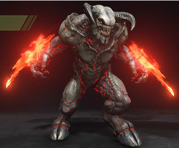
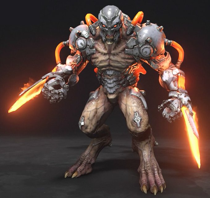
Kinda wish Baron wasn’t changed from his pink and green fire version to this version that ends up feeling too visually similar to the Dread Knight. Very easy to mix them up at quick glances.





Like, the notion that every Toad, Goomba, and Koopa was a unique and visually distinct individual, that didn’t just exist for the sole purpose of supporting or antagonizing Mario, was super cool to me


I am fully convinced official art where Yuuri and Victor are acting intimate are replaced visually with Makkachin https://t.co/cef7CKmIM5


For @TODESRITTER1
Alt color schemes for pre-2199 Kongou-class. Left are canon color schemes adapted for the Kongou, right have blue as a major tone. I tried to keep them visually distinct enough to be identifiable at a distance. #yamato2199 #SBY #宇宙戦艦ヤマト #ヤマト2199


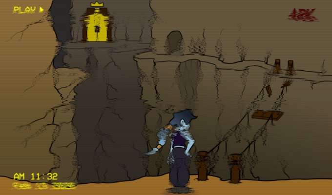
@ShivyShivon Hi; my name is Ark, & I am a character designer! I love Horror, D&D, & Sushi! I make a prolific amount of characters, so expect a ton! I like how expressive my characters are visually.


Comichaus Meets: Darrell Thorpe
G'Man talks to the creator & artist of the visually colourful world called "The FreeDoom Realm”
https://t.co/jUgHfmio0X https://t.co/GqXV9SDNmX
#indiecomics #readmore #staysafe #readmore

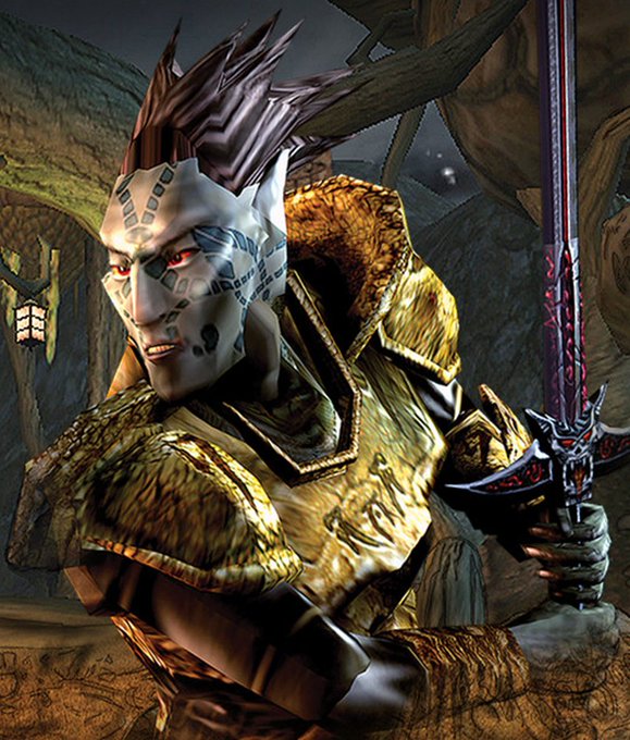


Anyone ever watched this? Lately, I have less interest on the recent animes. Maybe my eyes tired with all the appealing visual that most animes have nowadays. So I looked for any old-good story anime.
It's not visually appealing, but it has better story.


Updated Chimera Lio as well, this looks visually more interesting and all I did was enlarge and tilt our subject!


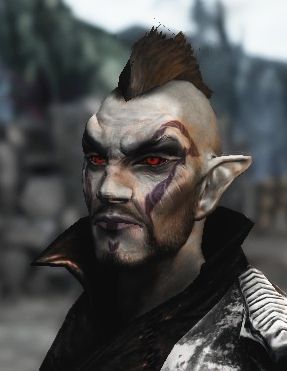
I just met this guy in Bravely Second: Geist the Bloody.
Damn, I've been shocked because it's visually unusual for the series with the blood all over him and this psychopathic look lol


Sousuke!
At first he was an intimidating character both visually and personality wise. However he’s actually a pretty good person and we see that in some scenes like when he gave advice to Ai and also Romio
#freeanime #yamazakisousuke #山崎宗介 #animefanart


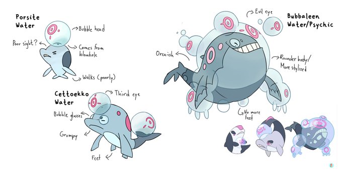
I was watching @Subject1vely 's video about their starters and I had some ideas for the designs as I rather explain visually than just writing
Not trying to 'fix' the designs but just to say what I'd change to them be more pokémon-ish I guess??
Anyway hope you like it :)