jarringのTwitterイラスト検索結果。 595 件中 14ページ目


Distressed by Insect Drimare and how inconsistent their designs are :/ particularly on the "tails" department
Because I literally only give them tails if necessary to make their insect species recognizable but when looking at them in general it becomes jarring :(

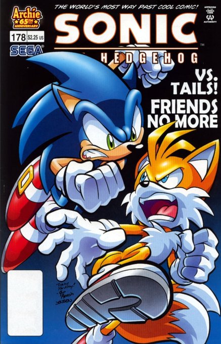

The Archie Sonic House of Cards arc is an unlikable engima for me save for a few moments.
It features needless dramatics pushed by an editorial mandate, jarring characterization especially on Sonic's part that no one can justify to me, and an awful, cookie-cutter resolution.


I'm gonna show y'all history, Something I made before I got popular, had a mind filled with fantasy, or even before the Ashour-Drones.
I'm gonna show you all..... THE FIRST HYPNO PIC I POSTED ONLINE!!!!
And it's very jarring to see this old pic.. may bring that gal back


This was a very experimental piece for me. Daisy spent a few decades in stasis as a tree so the time difference is a little jarring for her. Here are the separate images I put together


One of the jarring things in manhwa: art style changes.
This is the same character, about 20 or 30 chapters apart. She didn't go through any illness or get any augmentations in-story.
I understand it's a #manhwa18 series and maybe popularity or sales are flagging, but...damn


what do you think about an ig feed aesthetic from right to left? is it too jarring? lmk pls

My style is jarringly different and I'm so used to seeing his sona in his style that it took me a week to finish
#furryart https://t.co/rm4wMARe9u


I like how there's an artstyle swap between each of the Shantae games. Not to the point where it gets jarring but instead charming


Raffle prize for @DoctorDoggo_!!!
It was really fun to draw, and I actually was able to do it relatively fast! I really like how it turned out, and this was even more fun than I though it would be!
Only thing I would change is the red glow's jarring contrast, but ah well :)
tyty!


Comparing anime Part 3 Jotaro to Part 6 Jotaro is somehow more jarring to me than comparing his Part 3 manga self to Part 6 one


I think the reason why my OLD Pokémon drawings didn't work was because instead of me drawing the Pokémon in my own art style, I tried to match the official style way to much and it made it look really jarring. It's like-
"Oh, here's two different art styles together awkwardly-"


the difference is jarring like i did bakugou so dirty lmao


ENNEAD S2 spoilers//
I like that the last chapter portayed the darker side in these goddesses through their disregard for human life and hypocrisy. Isis killed an innocent and Hathor didn't react poorly, which is SO jarring, considering that Seth's cruelty was shamed by them.


I'm semi re-watchin dagwon and One thing I'm being reminded is how much of a leap in animation the show gets around 38.
The show looks alright for the time, but that point it looks really good to the point it's almost jarring.