mootherのTwitterイラスト検索結果。 1,052 件中 14ページ目
sketch vs final LMAO
im def getting smoother w my left hand but only when i zoom in a bunch
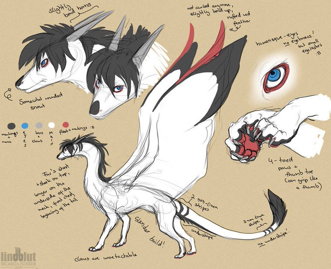
@mosspond_ Riku has been my sona since 2002
Initially she was only black&white, no markings, her muzzle was more squared, leading many to believe she was a horse.
Rarily drawn as anthro
Then she got bangs, first spikier then smoother. Her snout became pointier, then rounder. Red feathers
@MoonieLoonie_ Thanks. I had a references laid under the sculpt and I just followed the rough shapes. Made extracts or raised areas of the shapes like the mouth where I’d want to put thinned black paint into. It could be smoother though.
hacer pixel art y pasarlo por el smoother me parece super entretenido jsjs
Here's your local chu Boobie gremlin collection featuring @cinnaboo_nsfw and @CutestPikaGirl ~ I can't help it! i just love being smoothered in softness! >//u//< ♥
🎨: @cinnaboo_nsfw & @ilovecosmo2019
old vs updated ref
separately they dont look that different but side by side im sure you'' notice the big difference in quality and overall the lines are smoother rather than kinda blurred
A tiny update for the sake of my sanity. The original was 6 frames- I added a frame between 1 and 2 for cushioning/easing. But I didn't do the same between 4 and 5 and it was driving me insane.
It's subtle but it makes the changes just a touch smoother.
#transformation #transfur https://t.co/60fXpmXawG
Man, i am going back to alot of my older "plus Size" model edits ive done and redoing them-
just sub-dividing the original mesh and increasing proportions is so much more effective vs using the pmx editor's knife tool
of course you also get cleaner topology which looks smoother-
@Saturn_Digital_ Drawing is still not easy for me,even after getting better at it. I also wonder why other people's drawings look nicer or smoother, even if it's just sketches. Still gotta find out the secret. Btw here's one of my projects I've never finished.
@TakeshisReturn @farokh @haustwts @MuriNFT @greatmando_nft @justfred_ar The colours may be similar however the overall style is different. Azuki is smoother, whereas Muri uses harsh contrasting shading style. I personally prefer Azuki art better but to say one is a copy of other isn't right. Roadmap, delivery and ecosystem of Muri is also strong.
Made his reference sheet smoother and cleaner hehe
Also for height comparison with other Chelseas canon characters in this au 👏
((Yes hes oc)) https://t.co/dOHKzSBo01
this one is glizzy and looking back i think i kind of did a "modern smoother but less beloved pokemon generation" thing here
Running 🏃🏃🏃
Trying Animation a bit more. I like it so far. What do you think? Could probably be a bit smoother 🤔
#indiegames #animation #artwork
#AtTheSeaNFT - 02 Surfer 🏄♂️
Our current state in the cooperation with Ping. (WIP)
Status:
- Colours are final
- Vortex animation is much smoother now
https://t.co/Kfhfcqwp8S
#NFT #NFTCommmunity
Boom headshots. Now that I have an on screen display tablet I feel like my workflow has become so much smoother!
#furryart #furryartist #headshot #commissionopen
2011 - 2022..
A major clear of jump in skill, yet, what bothers me is that why is it still as hard and taxing on me to draw today like it use to be back then? I thought it would get easier and smoother. But here I am, struguling to draw again because I hit a wall.


