#絵を彩度100にすると超派手のTwitterイラスト検索結果。 14,005 件中 136ページ目
画質
高画質


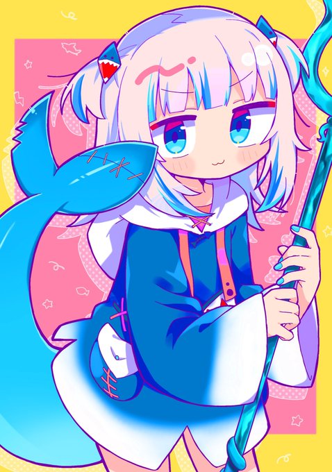


#絵を彩度100にすると超派手
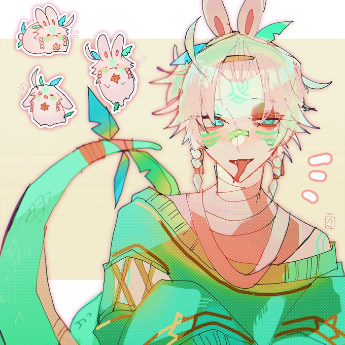
Thought I’ll do this because i find it interesting!
The White one looks decent and cute…
the other illustrations doesn’t seems fit very well with high saturation, maybe because theres so much green (or maybe its just me idk)
30
156


